
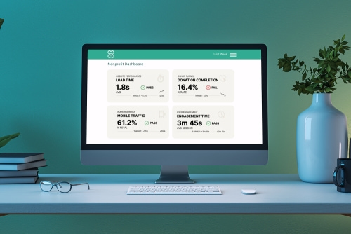
Most nonprofit leaders know their website matters. Fewer know how to tell whether it is actually working. The homepage loads, the donate button functions, the annual report is posted somewhere. But is the site fast enough? Are donors actually finishing their gifts? Are visitors reading the pages that matter, or bouncing after three seconds?
These are the nonprofit website benchmarks we check on every client site we audit. They are the numbers that separate a website that is doing its job from one that looks fine on the surface but quietly loses donors, frustrates visitors, and underperforms in search. Every benchmark below includes the target number, how to check it on your own site, and what to do if you are below the line.
Under 2.5sthe load time target every nonprofit site should hit on mobile, per Google's Core Web Vitals |
60%+of nonprofit website traffic now comes from mobile devices on most sites we audit |
5 benchmarksthat cover the metrics nonprofit leaders should check quarterly, with specific targets for each |
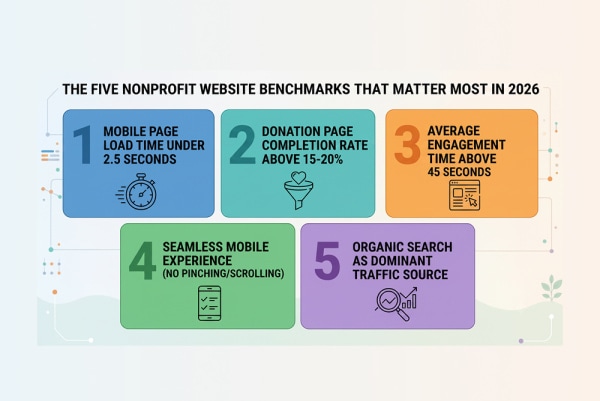
Quick answer: The five nonprofit website benchmarks that matter most in 2026 are: page load time under 2.5 seconds on mobile (test at pagespeed.web.dev), donation page completion rate above 15-20% of visitors who reach the form, average engagement time above 45 seconds on your About and Programs pages, mobile experience that works without pinching or horizontal scrolling, and organic search as your dominant traffic source for content pages. If your site hits all five, it is performing well. If it misses two or more, the site is likely losing donors, visitors, and search visibility without anyone noticing.
Why Most Nonprofits Have No Idea Whether Their Website Is Working
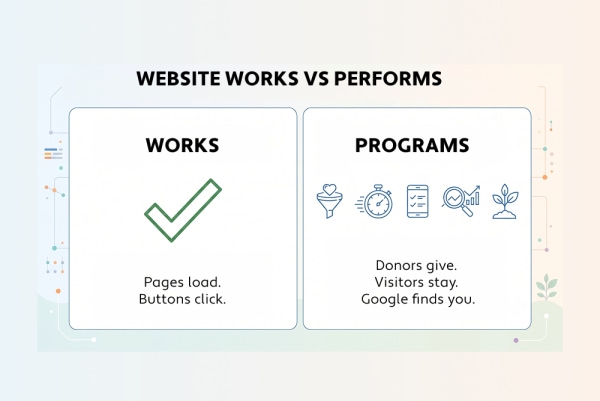
A website that "works" and a website that performs well are not the same thing. Most nonprofit sites function without errors. Far fewer are measured against the benchmarks that predict whether the site is actually helping the organization raise money, serve people, and get found.
In our audit work across nonprofit clients, the most common starting point is an executive director or development director who says some version of "I think our website is fine, but I am not sure." They can not point to a specific problem, but they can not point to specific evidence that the site is doing well either.
The reason is that most nonprofits do not track the right numbers. They might check total pageviews in Google Analytics once a quarter and feel reassured that the number went up. But pageviews alone tell you almost nothing about website performance. A site with high pageviews and a broken donation page is worse than a site with modest traffic and a donation flow that converts.
Benchmarks give you the specific numbers to check, the targets to hit, and the context to interpret what you find. The five benchmarks in this post are the ones we check first on every audit because they are the ones that most reliably predict whether a nonprofit website is doing its job.
"The nonprofits that come to us with the biggest performance gaps are almost never the ones with broken sites. They are the ones with sites that look perfectly fine but have never been measured against anything. A 4-second load time does not look like a problem until you learn the benchmark is 2.5 seconds."
- Brent Lafreniere, Digital Director
Reviewed by Our Team
These benchmarks come from two complementary perspectives: Steven's analytics and measurement work, and Brent's hands-on audit and strategy work across the nonprofit portfolio.
 Steven Calibo, Digital Strategist (Analytics & Measurement) - 15 years in digital strategy across all four of Morweb's verticals. Certified in Google Analytics, Google Ads, HubSpot, and Conversion Rate Optimization. Sets up the GA4 configurations, defines the events and conversions, and interprets the data that produces the benchmarks in this post. If a number in this post has a target attached to it, Steven is the one who determined what "good" looks like from the data.
 Brent Lafreniere, Digital Director (Audits & Strategy) - 19 years in digital across schools, nonprofits, associations, and healthcare. Has audited hundreds of nonprofit sites for performance, trust, accessibility, and engagement. Translates the benchmark numbers into practical recommendations: what to fix first, what to ignore, and what the numbers actually mean for a nonprofit's mission.
Benchmark 1: Page Load Time - Under 2.5 Seconds on Mobile
If your nonprofit website takes more than 2.5 seconds to load on a phone, you are losing visitors before they see your homepage. Page speed is the benchmark that affects everything else: donor conversion, search rankings, and first impressions.
Google's Core Web Vitals define three performance thresholds that affect both search rankings and user experience. The most important one for nonprofits is Largest Contentful Paint (LCP), which measures how fast the main content of the page becomes visible.
|
Metric |
What It Measures |
Good |
Needs Work |
Poor |
|
Largest Contentful Paint (LCP) |
How fast the main content loads |
Under 2.5s |
2.5-4s |
Over 4s |
|
Interaction to Next Paint (INP) |
How responsive the page feels when you tap |
Under 200ms |
200-500ms |
Over 500ms |
|
Cumulative Layout Shift (CLS) |
How much the page jumps around while loading |
Under 0.1 |
0.1-0.25 |
Over 0.25 |
Why Mobile Is the Only Test That Matters
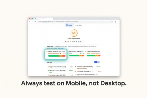
Desktop load times are almost always faster than mobile. A site that scores 95 on desktop and 55 on mobile will pass a quick check on your office computer and fail for every donor who taps the donate link from your email campaign on their phone. In our audits, we always test on mobile first because that is how the majority of visitors experience the site. For the mobile side of this, Arch's piece on mobile optimisation for websites explains why a site has to work well on a phone, from faster page loads to Google's mobile-first indexing.
The Four Most Common Speed Problems on Nonprofit Sites
- Unoptimized hero images. A 3-4MB homepage banner is the single most common cause of slow LCP we find. The fix: compress images to WebP format, serve them at the correct display resolution (not a 4000-pixel image displayed at 1200 pixels), and lazy-load anything below the fold.
- Too many third-party scripts. Analytics trackers, chat widgets, social media embeds, accessibility overlays, and donation processor scripts each add 100-500 milliseconds. Five of them add 1-2 full seconds. Audit your scripts quarterly and remove any that are not actively used.
- No caching or CDN. Static assets like images, CSS, and JavaScript should be served from a content delivery network with browser caching enabled. This is a hosting-level fix that your platform or hosting provider should handle.
- Render-blocking resources. Stylesheets and scripts that load before the page renders add perceived load time even if the page technically loads fast. Defer non-critical scripts and inline critical CSS.
How to Check This on Your Site
Go to pagespeed.web.dev. Enter your homepage URL. Switch to the Mobile tab. Look at the LCP number. If it is green (under 2.5 seconds), you pass. If it is orange or red, scroll down to the "Opportunities" section for specific fixes ranked by impact. Run the same test on your donation page, your About page, and your Programs page.
"I test every client site on mobile first because that is where the donors are. If your email appeal drives someone to tap your donate link on their phone and the page takes 5 seconds to load, you have already lost the emotional momentum that got them to tap. Speed is not a technical nice-to-have. It is a donor experience issue."
- Steven Calibo, Digital Strategist
Benchmark 2: Donation Page Completion Rate - Are Donors Finishing?
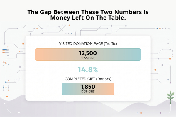
The most expensive metric most nonprofits never track is the donation page completion rate: what percentage of people who see the donation form actually finish a gift? If you do not know this number, you do not know how much money your website is leaving on the table.
A donation page completion rate measures how many visitors who reach the donation form complete the transaction. Industry data from fundraising platforms and payment processors suggests that well-optimized nonprofit donation pages convert between 15-25% of visitors who reach the form. Pages with significant UX issues convert at 5-10% or lower.
In our audit work, we regularly find nonprofit donation pages where the completion rate has never been measured. The organization knows how much money came in through the website, but they do not know how many people started the process and abandoned it. That gap is where the lost revenue lives.
What Drives the Completion Rate Up
- Same-domain donation page with consistent branding. When the donation form lives on your own website with your logo, colors, and typography, donors feel secure. A redirect to a third-party processor with unfamiliar branding creates the "am I still on the right site?" hesitation that kills completions.
- Suggested amounts with impact descriptions. Three to five preset giving amounts, each paired with a one-line description of what the gift funds ("$50 provides one family with a week of groceries"). Removes the "how much should I give?" friction.
- Visible monthly giving toggle. A simple one-time/monthly switch at the top of the form, before the amount selection, consistently increases the percentage of donors who choose recurring gifts.
- Minimal form fields. Ask only for what the payment processor requires plus what IRS receipt rules demand. Every additional optional field (phone number, employer, "how did you hear about us?") adds abandonment risk.
What Drives the Completion Rate Down
- Off-domain redirect to a third-party processor. This is the single most common cause of donation abandonment we see. The donor clicks "Give Now" and lands on a page that looks like a different website.
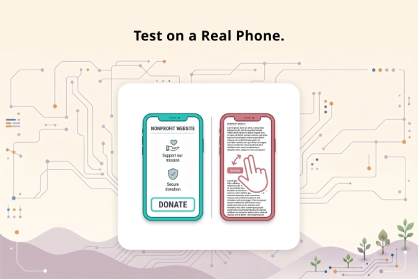
- Broken mobile experience. A form that requires pinching, zooming, or horizontal scrolling on a phone will lose the donors who arrive from email and social campaigns.
- No confirmation of impact. A donation page that says "Enter amount" and "Submit" with no language about what the gift funds treats giving as a transaction instead of a partnership.
How to Check This on Your Site
In GA4, set up a funnel exploration: Step 1 is a pageview on your donation page, Step 2 is the donation completion event (or the thank-you page view). The drop-off between Step 1 and Step 2 is your abandonment rate. If you have not set up conversion tracking on your donation page, that is the first thing to fix, before making any design changes. You can not improve what you do not measure.
If setting up a funnel feels like too much, start simpler: compare the number of thank-you page views in a month to the number of donation page views. That ratio is a rough completion rate.
"The conversation I have most often with nonprofit clients is: 'How many people visited your donation page last month?' They do not know. Then: 'How many completed a gift?' They know the dollar amount but not the count. Without both numbers, you can not calculate the completion rate, and without the completion rate, you can not tell if the page is working or costing you money."
- Steven Calibo, Digital Strategist
Benchmark 3: Engagement Time on Key Pages - Are Visitors Actually Reading?
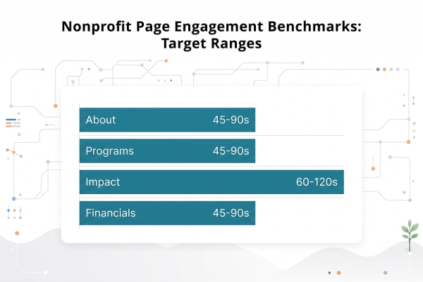
Pageviews tell you who arrived. Engagement time tells you whether they stayed. The pages that matter most on a nonprofit site, your About page, Programs page, Impact page, and Financials page, should hold visitors for at least 45 seconds. If they do not, the content is too thin, too vague, or too hard to scan.
GA4 measures "average engagement time per active user," which tracks how long someone actively interacts with a page, not just how long the tab is open in the background. It is a more honest metric than the old Universal Analytics "time on page," and it is the best single indicator of whether your content is doing its job.
Engagement Time Targets by Page
|
Page |
Target |
What It Means if You Are Below |
|
About / Our Story |
45-90 seconds |
Visitors are not finding the mission, team, or governance information they need. The page is likely too generic or too short. |
|
Programs / Services |
45-90 seconds |
The content does not answer "what do you do, who do you serve, what are the outcomes?" with enough specificity. |
|
Impact / Annual Report |
60-120 seconds |
Donors and grantmakers who land here are looking for numbers and outcomes. If engagement is low, the page is missing concrete data. |
|
Financials / Transparency |
45-90 seconds |
Donors are checking your finances before giving. Low engagement means the 990, annual report, or program ratios are missing or buried. |
|
Team / Board |
30-60 seconds |
Visitors are verifying that real people run the organization. Low engagement often means no photos, no bios, or a stale list. |
|
Blog posts (substantive) |
60-120 seconds |
Readers are scanning, not reading. The content is not deep enough or not scannable enough (walls of text without subheadings). |
|
Donation page |
30-90 seconds |
Context-dependent. Too low means donors leave before deciding. Too high could mean the form is confusing. |
|
FAQ / Compliance pages |
15-40 seconds |
Low engagement is fine here. Users find their answer quickly and leave satisfied. That is success. |
Why Context Matters More Than the Average
A single "average engagement time" across your whole website is meaningless. A 30-second average could mean every page gets 30 seconds of attention (mediocre) or it could mean your About page gets 90 seconds and your FAQ pages get 10 seconds (healthy). Benchmark each page type against its own target.
The most common mistake we see in audits: a nonprofit's About page with engagement time under 20 seconds. That means visitors are landing on the page that should tell the organization's story, scanning for a few seconds, and leaving. The fix is almost always more specificity: a real mission sentence (not vague language about "empowering communities"), named leadership with photos, concrete outcome numbers, and a clear description of who the organization serves.
How to Check This on Your Site
In GA4, go to Reports > Engagement > Pages and screens. Find the "Average engagement time per active user" column. Sort your key pages (About, Programs, Impact, Financials, Donation) and compare against the targets above. If any of them are significantly below the target range, read the page yourself with fresh eyes and ask: would a first-time visitor know exactly what this organization does, who runs it, and why they should trust it within the first scroll?
"When I audit a nonprofit's analytics, the first thing I look at is the engagement time on the About page and the Financials page. If those are both under 25 seconds, the site has a trust problem that no amount of donation page redesign will fix. Donors who do not engage with the trust content do not make it to the donation page."
- Steven Calibo, Digital Strategist
Benchmark 4: Mobile Experience - Does Your Site Work on a Phone?
More than half of nonprofit website visitors are on mobile devices. If your site was designed on a desktop monitor and has never been tested on a real phone, it is almost certainly losing visitors, donors, and search visibility.
Mobile is not a secondary channel for nonprofits. It is the primary device for a majority of visitors on most sites we audit. Email appeals are opened on phones. Social media links are tapped on phones. Google searches happen on phones. The donation page needs to work on a phone as well as it works on a desktop, or it is losing the visitors those channels are generating.
What "Works on Mobile" Actually Means
A site that "works on mobile" is not the same as a site that is mobile-responsive. Responsive design means the layout adjusts to the screen size. A truly mobile-functional site goes further:
- Tap targets are large enough. Buttons and links need to be at least 44x44 pixels, per WCAG guidelines. Tiny links that require precise tapping on a phone cause frustration and abandonment.
- No horizontal scrolling. Every page should fit within the phone's screen width without any side-to-side scrolling. Tables, images, and embedded content that overflow are the most common causes.
- Forms work with mobile keyboards. Dollar amount fields should trigger the numeric keyboard. Email fields should trigger the email keyboard. Phone number fields should trigger the phone keyboard. These small details reduce errors and speed up form completion.
- The donate button is reachable from every page. On mobile, a "Donate" button should be visible in the header without opening the hamburger menu. One tap to the form from anywhere on the site.
- Content is scannable without zooming. Body text should be at least 16 pixels on mobile. Line lengths should not exceed 70-80 characters. Subheadings should break up the page every 2-3 paragraphs.
How to Check This on Your Site
Do not test mobile by resizing your browser window. Pull out your phone (or borrow someone's older phone) and visit your site on a real cellular connection. Walk through the full donor journey: homepage to About page to donation form to thank-you page. Every step should work without pinching, zooming, or horizontal scrolling. If any step breaks, that is a prioritized fix.
For a more structured test, run your site through Google's Mobile-Friendly Test and check the Core Web Vitals mobile scores at pagespeed.web.dev.
"The most revealing test I run in an audit is handing someone a phone and asking them to make a donation on a client's site. No instructions. Just 'try to give $50.' Where they hesitate, where they pinch, where they give up - that is the audit. No analytics tool will tell you what watching a real person struggle will tell you."
- Brent Lafreniere, Digital Director
Benchmark 5: Where Your Traffic Comes From - And Why It Matters
If your nonprofit has a blog or publishes content, organic search should be your dominant traffic source. If it is not, your content is not optimized for the way people actually find nonprofit websites.
Understanding where your visitors come from tells you whether your site is discoverable or just visible to people who already know about you.
What a Healthy Traffic Mix Looks Like
|
Source |
What It Is |
Healthy Range for Content Pages |
|
Organic search |
Visitors who found you through Google or another search engine |
60-85% |
|
Direct |
Visitors who typed your URL or used a bookmark |
10-25% |
|
Referral |
Visitors who clicked a link from another website |
5-15% |
|
Social |
Visitors from social media posts or ads |
2-10% |
|
|
Visitors from email campaigns or newsletters |
3-10% |
What the Mix Tells You
If organic is below 40%: Your content is not ranking in search. This means new people are not discovering your organization through Google. Review your page titles, meta descriptions, and heading structure. Make sure every page answers a specific question someone would search for.
If direct is above 50%: Most of your traffic is people who already know you. That is not growth. It means your website is functioning as a brochure for existing supporters, not a discovery tool for new ones.
If social is above 20%: You may be over-reliant on a channel you do not control. Social algorithms change constantly. A content strategy built on organic search provides more stable, sustained traffic than one built on social sharing.
How to Check This on Your Site
In GA4, go to Reports > Acquisition > Traffic acquisition. Look at the breakdown for your blog or content pages specifically, not the whole site. Your homepage and donation page will naturally have more direct traffic (returning donors, bookmarks). Your content pages should be earning new visitors through search.
The Quarterly Audit: How to Check All Five Benchmarks in One Session
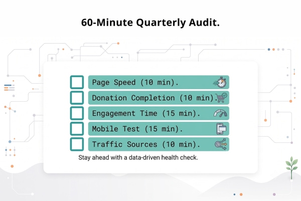
Checking these benchmarks is not a full-day project. A focused 60-minute audit once a quarter catches most problems before they compound into lost donors and lost search visibility.
Here is the process we recommend for a quarterly website health check. A communications director or marketing lead can run this in about an hour.
Step 1: Page Speed (10 minutes)
Run your homepage and donation page through pagespeed.web.dev on the mobile setting. Record the LCP, INP, and CLS scores. If any are in the "Poor" range (red), flag them for your web team or platform provider. If they are "Needs Improvement" (orange), prioritize image compression and script cleanup.
Step 2: Donation Completion (10 minutes)
In GA4, compare donation page views to thank-you page views for the quarter. Calculate the completion rate. If it is below 15%, review the donation page for the common issues: off-domain redirect, missing suggested amounts, hidden monthly toggle, poor mobile experience. If you do not have this tracking set up, make that the priority for this quarter.
Step 3: Engagement Time (15 minutes)
In GA4, pull up the Pages and screens report. Check engagement time on your About page, Programs page, Impact page, Financials page, and donation page. Compare against the targets in Benchmark 3. Flag any page under 30 seconds for a content review.
Step 4: Mobile Test (15 minutes)
Open your site on a real phone. Walk through: homepage, About, Programs, Donate, complete a test donation if possible. Note anything that requires pinching, zooming, horizontal scrolling, or more than one tap to reach the donation form. Screenshot the issues for your web team.
Step 5: Traffic Sources (10 minutes)
In GA4, check the traffic acquisition breakdown for your content pages. Note the organic search percentage. If it has dropped from the prior quarter, check whether a Google core update occurred during that period (they happen roughly every 3-4 months) and review your content against the current quality standards.
"Most nonprofits run their website audit when they are about to redesign, which means every 3-5 years. By that point, the performance problems have compounded for years. A quarterly check catches issues when they are small and fixable. A 60-minute session four times a year is worth more than a full audit once every five years."
- Brent Lafreniere, Digital Director
Common Mistakes Nonprofits Make When Measuring Website Performance
Knowing the benchmarks is half the work. The other half is avoiding the measurement traps that lead nonprofit teams to optimize the wrong things or celebrate the wrong numbers.
- Tracking pageviews instead of engagement. Pageviews tell you how many times a page was loaded. They do not tell you whether anyone read it. A page with 10,000 views and 8-second average engagement is performing worse than a page with 500 views and 90-second engagement. Engagement time is the metric that reflects content quality.
- Testing speed on desktop only. Desktop scores are almost always better than mobile. If your team tests on the office Wi-Fi on a large monitor and reports "the site is fast," they have tested the wrong scenario. Test on mobile, on a cellular connection, on a phone that is a few years old.
- Measuring total donations without measuring completion rate. "We raised $40,000 through the website this quarter" sounds good. But if 2,000 people visited the donation page and only 150 completed a gift, the completion rate is 7.5%, and you likely left $100,000+ on the table. The total is meaningless without the rate.
- Ignoring bounce rate context. A 50% bounce rate on your FAQ page is fine, because users found their answer and left satisfied. A 50% bounce rate on your About page means half your visitors left without exploring further, which is a trust failure. Always interpret bounce rate relative to what the page is supposed to do.
- Comparing yourself to cross-industry averages. "The average website bounce rate is 47%" is a number that includes e-commerce, news, SaaS, and social media sites. Nonprofits have a different audience, a different purpose, and different behavior patterns. Benchmark against similar nonprofit sites, or better, against your own performance over time.
Nonprofit Website Benchmarks: Common Questions Answered
What is the most important benchmark for a nonprofit website?
Donation page completion rate, because it directly measures revenue impact. If you can only track one number, track how many people visit your donation page versus how many complete a gift. Everything else, page speed, engagement time, mobile experience, flows into that conversion. But completion rate is where the money lives.
How fast should a nonprofit website load on mobile?
Under 2.5 seconds for the Largest Contentful Paint metric, per Google's Core Web Vitals. Test at pagespeed.web.dev using the mobile tab. Desktop load times are almost always faster and will give you a misleadingly optimistic picture. The donors arriving from your email campaigns are on their phones.
What is a good engagement time on a nonprofit About page?
Between 45 and 90 seconds. If your About page engagement time is under 25 seconds, visitors are scanning and leaving, which means the page is not answering the questions they came with: who runs this organization, what do you do, and why should I trust you? The fix is usually more specificity: named leadership with photos, a clear mission sentence, and concrete outcome numbers.
How do I set up donation page tracking in GA4?
The simplest approach: create a conversion event for your donation thank-you page view. Then use the funnel exploration to compare donation page views (Step 1) to thank-you page views (Step 2). The drop-off percentage is your abandonment rate. If your platform supports it, also track the "begin checkout" or "add payment info" events to see exactly where in the form donors abandon.
How often should we check these benchmarks?
Quarterly for a full review using the 60-minute audit process in this post. Monthly for page speed, especially after any site update, plugin change, or new script addition (these are the most common causes of speed regressions). After any Google core update (which happens roughly every 3-4 months), run a traffic comparison to identify shifts. A quarterly cadence catches most issues before they compound.
How does Morweb help nonprofit sites meet these benchmarks?
Morweb is built for the organizations these benchmarks apply to. Donation pages live on your own domain with matching branding, suggested amounts, impact descriptions, and a monthly-giving toggle as platform defaults. The CMS is optimized for page speed with built-in image compression, CDN delivery, and minimal render-blocking resources. Mobile-responsive templates with proper tap targets and form keyboards are standard. The goal is to meet these benchmarks at the platform level so your team can focus on the content, not the infrastructure.
More on building a high-performing nonprofit website:
The Nonprofit Website Trust Checklist: 27 Things Donors Check Before Giving. The trust signals behind the engagement time benchmarks. If your About and Financials pages have low engagement, this checklist shows you exactly what is missing.
The Donation Page Mistakes Costing Nonprofits Thousands Every Month. The UX mistakes that drag down donation page completion rates, ranked by impact with specific fixes.
Nonprofit Online Fundraising Compliance: The 2026 State-by-State Guide. The legal disclosures that belong on every donation page, which also affect donor trust and completion rates.

Want to know how your site scores?
Our team will run your nonprofit website through all five benchmarks: page speed on mobile, donation page completion, engagement time on key pages, mobile experience, and traffic source health. You will get a report showing where you hit the targets, where you fall short, and the three highest-impact fixes to prioritize. No pitch, no obligation.
Request a Free Benchmark Report