
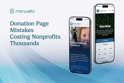
Your donation page is probably losing money. Not because donors do not want to give, but because something on the page is making them hesitate, second-guess, or abandon the form before they finish. In our donation page audits across nonprofit clients, we find the same set of UX mistakes on nearly every site. Each one is fixable. Most can be fixed in an afternoon. And each one, left in place, quietly costs completed donations every month.
This post is not a list of best practices. It is a list of specific mistakes we find on real donation pages, why each one costs completions, and what to do about it. Every mistake below comes from audits our team has conducted on live nonprofit sites. The fixes are prioritized by impact: the ones that cost the most completions come first.
8donation page mistakes we find on nearly every audit, each one costing completed gifts |
-9%traffic drop on donation page content after Google's 2025 update - proving practical UX advice is what Google rewards |
30 secondsthe window between a donor clicking "Give" and deciding whether to finish or close the tab |
Quick answer: The nonprofit donation page mistakes that cost the most completions are, in order: redirecting donors to an off-brand third-party processor page, offering no suggested giving amounts, hiding the monthly giving option, burying the donation page behind multiple clicks, presenting a form that looks different from the rest of the site, failing to explain what each gift amount funds, skipping mobile optimization on the donate flow, and making the thank-you confirmation feel like an afterthought. Most nonprofits have three or more of these on their page right now. Each one is fixable in a single work session.
Why Donation Page UX Matters More Than Your Next Email Appeal
A nonprofit can run a perfect email campaign, social push, or giving-day event and still lose a quarter of the resulting donations to a broken or confusing donation page. The page is the bottleneck, not the ask.
Development directors spend weeks on appeal copy, email segmentation, and campaign timing. Those efforts drive people to the donation page. But the donation page itself gets treated as infrastructure, something IT set up years ago that "works fine." In our audits, "works fine" usually means "processes a payment when someone manages to complete it." It does not mean "converts at the rate it should."
The difference between a donation page that converts well and one that leaks completions is not design talent or expensive tooling. It is a set of specific UX decisions that either remove friction or introduce it. Every mistake in this post is a friction point we have measured, diagnosed, and fixed on real nonprofit sites.
"Most nonprofits think their donation problem is a traffic problem. They want more people on the page. But when I look at their analytics, the page is getting traffic. It is just not converting. The form is doing something that makes people leave. That is a UX problem, not a marketing problem."
- Steven Calibo, Digital Strategist
Reviewed by Our Team
This post draws on donation page audits and CRO analysis from three specialists. Each reviewer below brings a different lens to why donation pages fail and how to fix them.
 Bita Goli, Senior Designer (UX & Donation Flow Design) - 5+ years in UX, branding, and typography across all four of Morweb's verticals. Has redesigned donation flows for dozens of nonprofit clients where small UX changes, clearer form layout, better suggested-amount framing, visible impact language, measurably lifted completed donations without changing the underlying payment processor.
 Steven Calibo, Digital Strategist (CRO & Donor Analytics) - 15 years in digital strategy across all four verticals. Certified in Google Analytics, Google Ads, HubSpot, and Conversion Rate Optimization. Identifies where donors drop off in the give flow, which form fields cause abandonment, and what the engagement data says about donation page performance across client sites.
 Shawn Xiong, Art Director (Visual Hierarchy & Credibility) - 20 years in visual design and art direction, MFA in Graphic Design. Has led visual direction for 30+ nonprofit sites. Brings the visual-credibility lens to donation pages: how typography, color, spacing, and layout signal "this is safe to give to" or "something is off here" before a donor reads a word.
Mistake 1: Redirecting Donors to a Page That Looks Like a Different Website
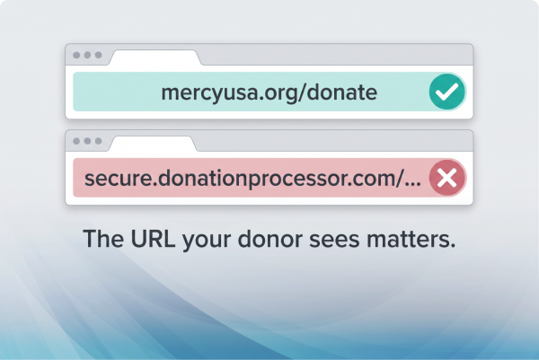
When a donor clicks "Give Now" and lands on a page with different colors, a different logo, and a URL that is not your domain, a significant number of them will close the tab. This is the single highest-cost donation page mistake we see.
This is the mistake we flag first on every audit because it is the one that costs the most completions. The scenario is always the same. A nonprofit has a well-designed homepage. The branding is polished. The mission is clear. The donor clicks the donate button and gets redirected to a third-party payment processor page that looks nothing like the site they just came from.
The URL changes. The logo is either missing or a low-resolution version uploaded years ago. The colors do not match. The typography is the processor's default, not the nonprofit's brand. To the donor, this feels identical to a phishing redirect. They have no way to confirm, in the moment, that they are still giving to the right organization.
What We See in the Analytics
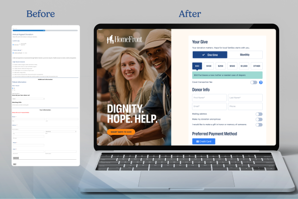
In our work with clients like Mercy USA and HomeFront, same-domain donation pages with consistent branding consistently outperform off-domain redirects. The drop-off happens at the redirect itself: donors who see a URL change and an unfamiliar page design abandon at a measurably higher rate than donors who stay on the same domain with the same visual identity.
The Fix
Host your donation page on your own domain. The URL should be yourorganization.org/donate, not secure.thirdpartyprocessor.com/campaign/12345. The page should use your logo, your colors, your typography, and your tone. If your platform does not support embedded donation forms on your own domain, that is a platform limitation worth solving.
"I have redesigned donation flows where the only change was moving the form onto the organization's own domain and matching the brand. No new copy. No new images. Just visual continuity. The improvement was immediate and measurable in the analytics."
- Bita Goli, Senior Designer
Mistake 2: Showing a Blank Dollar Field With No Suggested Amounts
A blank "Amount" field asks the donor to make a decision with no context. Suggested amounts with impact descriptions remove that friction and consistently lift the average gift size.
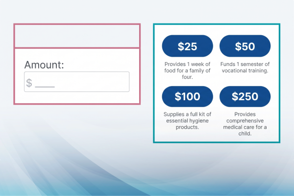
A donation page with a single empty text field that says "Amount: $____" forces every donor to answer a question they are not equipped to answer: "How much should I give?" Without context, donors either default to a low safe number, agonize over the decision, or abandon the form because the blank field feels like a test they were not prepared for.
Suggested amounts solve this. Three to five pre-set options ($25, $50, $100, $250, $500) with a custom-amount field give the donor a frame of reference. They know what is "normal." They know what range other people give in. They can pick quickly and move on.
Why Impact Descriptions Double the Effect
Suggested amounts alone help. Suggested amounts with one-line impact descriptions help more. "$50 provides one family with a week of groceries" does two things: it helps the donor choose by connecting the amount to a tangible outcome, and it publicly discloses how their money will be used, which is a trust signal in itself.
In our work with Fredericksburg Regional Food Bank, the impact descriptions on the donation page connect each suggested amount to the food bank's core operations. The donor does not have to guess what $50 means. They know. That clarity removes a layer of hesitation that a blank dollar field cannot.
The Fix
Add three to five suggested amounts that reflect your real donor distribution. If most of your online gifts are between $25 and $100, your suggested amounts should include $25, $50, $75, $100, and one stretch option ($250 or $500). Add a one-line impact statement under each amount. Keep a custom-amount field for donors who want to choose their own number.
Mistake 3: Hiding the Monthly Giving Option
Monthly donors give more over their lifetime than one-time donors, but most nonprofit donation pages bury the recurring option in a dropdown, a secondary tab, or a separate page. If a donor has to look for it, most will not.
Monthly giving is the single highest-value conversion on a nonprofit donation page. A $50 monthly donor gives $600 per year with no additional solicitation cost. But on the majority of donation pages we audit, the monthly option is either hidden behind a dropdown labeled "Frequency," placed on a separate page the donor has to navigate to, or presented as small text below the one-time form.
The fix is not to force monthly giving. It is to make it equally visible. A simple toggle at the top of the form, "One-Time / Monthly," placed before the amount selection, gives the donor a clear choice without any additional friction. In our experience across clients like Engineers Without Borders USA, visible monthly toggles consistently increase the percentage of donors who choose recurring gifts.
The Fix
Place a one-time/monthly toggle at the top of your donation form, before the amount selection. Make both options visually equal: same size, same weight, same prominence. Do not default to one-time and make the donor work to find monthly. When a donor selects monthly, update the impact descriptions to reflect the annual value ("$50/month provides 52 weeks of groceries for one family").
"The monthly toggle is a case where visual hierarchy directly drives revenue. If the 'Monthly' option is a small radio button below a large 'One-Time' button, the design is telling the donor which one matters. Make them equal, and donors choose monthly at a meaningfully higher rate."
- Shawn Xiong, Art Director
Mistake 4: Burying the Donate Button Behind Multiple Clicks
If a donor has to navigate through more than one click to reach the donation form from any page on your site, you are losing donors who arrived ready to give.
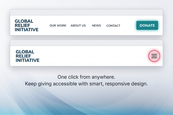
Some donors arrive at your site already decided. They came from an email appeal, a social post, or a peer recommendation, and they want to give now. If the "Donate" button is tucked inside a hamburger menu, placed only on the homepage, or requires navigating through an intermediate "Ways to Give" page before reaching the actual form, that ready-to-give donor has to work to find the form. Some will not.
In our client work, a persistent "Donate" button in the top-right corner of the header, visible on every page including mobile, is the standard we design to. The button should link directly to the donation form, not to a landing page about giving options. A donor who clicks "Donate" expects a form, not a menu.
The "Ways to Give" Detour
Many nonprofits create a "Ways to Give" page that lists online giving, planned giving, stock transfers, matching gifts, and in-kind donations. This page is useful as a resource. It is not useful as the destination of your primary donate button. A donor who clicks "Donate" on your homepage and lands on a page with six different giving categories and no form is a donor who just got handed a navigation problem instead of a donation form.
The fix: link the primary "Donate" button directly to the online donation form. Keep the "Ways to Give" page as a secondary resource, linked from the footer or from within the donation page itself for donors who need other options.
The Fix
Put a "Donate" button in the site header, visible on every page, on every device. Link it directly to the donation form. One click from anywhere on the site to the form. No intermediate pages.
Mistake 5: A Donation Form That Looks Different From the Rest of the Site
Even when the donation page is on your own domain, a form that uses different fonts, colors, or spacing from the rest of the site creates a subtle trust break. Donors notice inconsistency even when they cannot name it.
This is a subtler version of Mistake 1. The donation page is technically on your domain, but the form itself was built with a third-party widget, an embedded iframe, or a plugin that does not inherit your site's CSS. The result is a page where the header and footer look like your site but the form in the middle looks like it belongs to a different organization.
Typography mismatches are the most common version we see. The site uses a custom sans-serif; the donation form uses Times New Roman or the processor's default font. The button color on the form does not match the button color on the rest of the site. The field labels are a different size. These are small details, but they accumulate into a feeling the donor registers as "something is off."
The Fix
Your donation form should inherit your site's stylesheet. Same fonts, same colors, same button styles, same spacing. If your form is an embedded widget or iframe that does not support custom CSS, either switch to a platform that does or work with your developer to override the widget's default styles. The form should be visually indistinguishable from any other page on your site.
"Donors do not think 'the typography on this form does not match the site's brand.' They think 'something feels off' and they hesitate. That hesitation is the cost. Visual consistency removes it before it starts."
- Bita Goli, Senior Designer
Mistake 6: No Language Explaining What the Donation Actually Funds
A donation page that says "Enter amount" and "Submit" treats giving like a transaction. A page that says "Your $100 keeps our food pantry open for one more day" treats giving like a partnership.
Many donation pages are pure forms: a dollar field, billing fields, a submit button. Nothing on the page tells the donor what their money will do. This is a missed opportunity that costs both completions and average gift size.
Impact language on the donation page does not need to be elaborate. A short sentence above the form connecting the gift to a specific outcome is enough. "Every dollar provides two meals through our partner network" or "Your gift funds after-school tutoring for students in [city]." The specificity matters. "Support our mission" is not impact language. It is a placeholder.
In our work with Center for Transforming Lives in Fort Worth, the donation page connects giving directly to the organization's two-generation approach: housing, childcare, and economic mobility for single mothers and their children. The donor knows what their money does before they enter a dollar amount.
The Fix
Add one to two sentences of impact language above the donation form. Connect the gift to a specific program, outcome, or population. If you use suggested amounts, pair each amount with its own impact statement. Use the most recent fiscal year's outcome data and cite a real number ("served 1,032 families in 2025") rather than a vague claim ("helps families in need").
Mistake 7: A Donation Form That Breaks on Mobile
More than half of nonprofit website traffic comes from mobile devices. If your donation form requires pinching, scrolling sideways, or tapping tiny fields on a phone, you are losing the donors who arrive from email, social, and text campaigns.
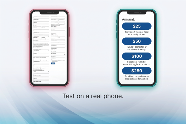
Email appeals drive a large share of donation traffic. Those emails are opened on phones. The donor reads the appeal, taps the donate link, and lands on the donation page on a mobile screen. If the form was designed for desktop and simply shrunk to fit, the experience breaks in predictable ways: fields are too small to tap accurately, the form requires horizontal scrolling, the submit button is below the fold after a long scroll, and error messages are too small to read.
In our design work, the mobile donation form is not a scaled-down version of the desktop form. It is designed mobile-first: large tap targets (minimum 44x44 pixels per WCAG guidelines), a single-column layout, a visible submit button without excessive scrolling, and form fields that trigger the correct mobile keyboard (numeric keyboard for dollar amounts, email keyboard for email fields).
The Fix
Test your donation page on a real phone. Not a browser resize, an actual phone. Walk through the full flow: tap Donate, see the form, enter an amount, fill in your information, tap Submit, see the confirmation. Every step should work without pinching, zooming, or horizontal scrolling. If any step requires those, the form needs a mobile-first redesign.
"I test every donation form on an actual phone before signing off on a project. Not a browser simulation - a real phone, on a real cell connection. The form that works perfectly on a 27-inch monitor at gigabit speed and fails on a five-year-old phone at 4G is the form your email-campaign donors are actually using."
- Bita Goli, Senior Designer
Mistake 8: A Thank-You Page That Feels Like an Afterthought
The moment after a donor completes a gift is the moment they are most emotionally invested in your organization. A generic "Thank you for your donation" confirmation wastes that moment entirely.
Most nonprofit thank-you pages are a single line of text: "Thank you for your donation. A receipt has been sent to your email." Some do not even confirm the amount. Some redirect to the homepage. Some show a blank white page with a transaction ID.
The thank-you page is not a receipt. It is the beginning of the donor relationship. A donor who just gave $100 is, at that exact moment, more likely to share your organization on social media, sign up for your newsletter, read your latest impact report, or make a second gift than at any other point in their relationship with you. A generic confirmation page throws that moment away.
What a Good Thank-You Page Includes
- A specific thank-you message that references their gift. "Thank you for your $100 gift to [Organization]. Here is what that means for our work."
- One concrete impact statement. Connect the gift amount to an outcome, the same way the donation form did.
- A next step. Share on social media, sign up for the newsletter, read the latest annual report, forward the giving link to a friend. One clear call to action, not six.
- A receipt confirmation. "A tax-deductible receipt has been sent to [email]. Keep it for your records."
In our work with nonprofit clients, the thank-you page is designed as part of the donation flow, not added as an afterthought. It matches the site's branding, reinforces the impact of the gift, and gives the donor a clear next step that deepens their connection to the organization.
The Fix
Rewrite your thank-you page today. Add a personalized message that references the gift amount. Add one impact statement. Add one next-step CTA (newsletter signup or social share). Confirm the receipt. Match the page design to the rest of the site. This is a 30-minute fix that extends the value of every donation you receive.
The Priority Fix List: Where to Start If You Can Only Fix Three Things
Eight mistakes is a lot. If your team has limited time, these three fixes address the highest-cost problems first.
We prioritize based on what we see costing the most completions in our audits. If your organization can only tackle three fixes this quarter, do them in this order.
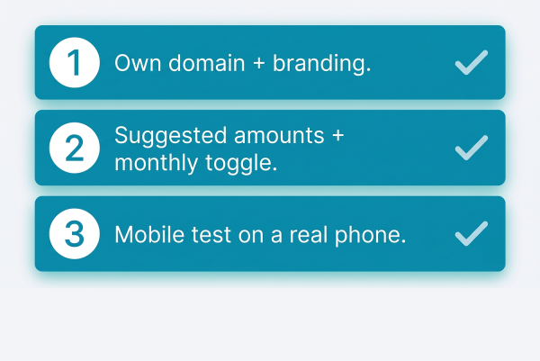
- Move your donation form to your own domain with matching branding. This is Mistake 1, and it is the highest-cost issue on this list. If your donate button sends donors to a page that looks like a different website, fix that first. Every other improvement is undermined if the donor does not trust the page they land on.
- Add suggested amounts with impact descriptions and a visible monthly toggle. This combines Mistakes 2 and 3, and together they address both average gift size and lifetime donor value. A donor who sees "$50/month provides a year of after-school meals" makes a different decision than a donor who sees a blank dollar field and a hidden recurring option.
- Test the full flow on a real phone and fix what breaks. This is Mistake 7. If more than half your traffic is mobile and your form does not work cleanly on a phone, you are losing the donors your email campaigns are generating. Test on an actual device, not a browser simulation.
The remaining five mistakes (buried donate button, visual disconnect, no impact language, weak thank-you page) are real and worth fixing, but they have lower per-incident impact than the top three. Fix those after the first three are solid.
Common Mistakes Organizations Make When Fixing Their Donation Page
Knowing the problems is half the work. The other half is avoiding the traps nonprofit teams fall into when trying to fix them.
- Adding too many form fields. Every additional field (phone number, employer, "how did you hear about us") increases abandonment. Ask only for what the payment processor requires plus what IRS receipt rules demand. Everything else is optional or can be asked after the gift.
- Creating a "Ways to Give" page and calling it the donation page. Planned giving, stock transfers, and matching-gift information are valuable. They do not belong between the donor and the donation form. Link them from a secondary page, not from the primary donate button.
- Redesigning the donation page without looking at the data first. Before changing anything, check your analytics. Where do donors drop off? What is the completion rate? What percentage of traffic is mobile? A redesign informed by data solves real problems. A redesign informed by opinions solves imaginary ones.
- Ignoring the email receipt. The donation page is not the end of the flow. The email receipt is. If the receipt is a plain-text confirmation with no branding, no impact language, and no next step, the donor's last impression of your organization is a generic transaction confirmation. Match the receipt to the thank-you page in tone and content.
- Testing only on desktop. If your development team tests the donation page on a large monitor at high-speed internet and calls it done, the page has not been tested. Test on a real phone on a real cell connection. That is the test that matters.
"The most dangerous assumption in nonprofit CRO is that the donation page is a technology problem. It is not. It is a communication problem. The page has to communicate trust, impact, and ease in a 30-second window. If any of those three are missing, the conversion suffers regardless of how good the underlying payment processing is."
- Steven Calibo, Digital Strategist
Nonprofit Donation Page UX: Common Questions Answered
What is the most important thing to fix on a nonprofit donation page?
Move the donation form to your own domain with branding that matches the rest of your site. An off-domain redirect to a third-party processor with unfamiliar branding is the single highest-cost mistake we see in donation page audits. Donors who encounter a visual disconnect between your homepage and your donation page abandon at a measurably higher rate. Same-domain, same-brand donation pages consistently outperform.
How many suggested donation amounts should we offer?
Three to five suggested amounts plus a custom-amount field. The amounts should reflect your actual donor distribution, not aspirational targets. If most online gifts are $25 to $100, your suggested amounts should span that range with one stretch option ($250 or $500). Pair each amount with a one-line impact description that tells the donor what the gift funds.
Does monthly giving really make that much difference?
Yes. A $50 monthly donor gives $600 per year with no additional solicitation cost. Over a multi-year retention period, monthly donors contribute significantly more than equivalent one-time donors. The key is making the monthly option equally visible on the donation form, not buried in a dropdown or placed on a separate page. A simple one-time/monthly toggle at the top of the form, before the amount selection, consistently increases monthly giving rates.
How do we know if our donation page is underperforming?
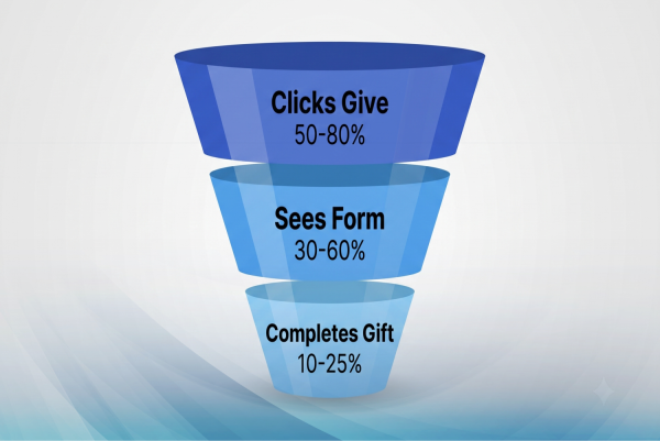
Check three metrics in your analytics. First, the donation page completion rate: what percentage of visitors who reach the form actually complete a gift? Second, the drop-off point: where in the form do visitors abandon? Third, mobile versus desktop completion rates: if your mobile rate is significantly lower, the form has a mobile UX problem. If you do not have these metrics set up, that is the first thing to fix, before changing anything on the page.
Should we use a pop-up donation form or a dedicated page?
A dedicated donation page, not a pop-up. Pop-up forms can work for newsletter signups, but for donations, which require billing information, a trust decision, and often a tax-receipt expectation, donors expect a full page. Pop-ups also create accessibility and mobile-usability problems. A dedicated page at yourorganization.org/donate is cleaner, more trustworthy, and more accessible.
How does Morweb handle donation page UX?
Morweb's built-in donation pages live on your own domain and inherit your site's branding automatically: your logo, colors, typography, and layout. Suggested amounts with impact descriptions, a monthly-giving toggle, and mobile-optimized form fields are platform defaults, not custom builds. The thank-you page and email receipt are part of the same flow, branded consistently. The goal is to eliminate the eight mistakes in this post at the platform level so your team does not have to solve them with workarounds.
More on building a donation experience that converts:
The Nonprofit Website Trust Checklist: 27 Things Donors Check Before Giving. The trust signals donors look for before they reach your donation page, including the four donation-specific trust signals (Items 24-27).
Nonprofit Online Fundraising Compliance: The 2026 State-by-State Guide. The legal disclosures that belong on every donation page and receipt, state by state.
Nonprofit Website Transparency & Trust: What Donors Really Look For. Why transparency content is the highest-engagement content on a nonprofit site, and what that means for how you present financial information alongside your donation page.
Want us to audit your donation page?
Our team will walk through your donation flow the way a real donor does: homepage to form to confirmation, on desktop and mobile. You will get a prioritized list of what is costing completions and what to fix first, based on the same framework in this post. No pitch, no obligation.
Request a Free Donation Page Audit