Your association's website is often the first place a prospective member meets you. It is also where current members go to renew, register for events, and find what their dues pay for. When it works, it does the job of a full time staff member: answering questions, processing renewals, and filling events. When it doesn't, members call the office, renewals slip, and prospects choose an association that looks more current.
Good association website design does both jobs at once. It tells the public why your organization matters, and it gives members a simple place to get value from their membership. This guide covers what separates an effective association website from an average one, five takeaways you can apply to your own site, and 10 association website redesigns our team at Morweb completed, each shown before and after.
What Makes an Effective Association Website Design?
An effective association website gives prospects and members one connected experience, from the homepage to the member portal to event registration. It also shows, not just tells, the value of belonging: the people, the events, and the community that current and future members are part of. The best ones share five qualities.
- A seamless experience from end to end. The homepage, member portal, and event registration look and feel like one website, with one login, so members never land on a dated portal or a checkout that looks like someone else's site.
- Value you can see. Photos of real members, event highlights, and member stories show prospects the community they would be joining, and remind current members what their dues support.
- Navigation built around members. Menus use the words members use, like Join, Renew, Events, Resources, and Directory, instead of internal department names.
- Content that stays current. Fresh news, upcoming events, and recent advocacy wins show the association is active, and staff can update all of it without a developer.
- Easy to use on any device. Most visitors arrive on a phone, so pages, forms, and payments need to work on every screen and meet WCAG accessibility standards.
5 Takeaways for Your Own Association Website
Before the examples, here are five lessons from the redesigns below that you can apply to your own site.
- Lead with your mission, not your news. The strongest redesigns replaced a crowded homepage with one clear statement of who the association serves. See GNYADA and EWB USA.
- Put joining one click away. Join and Member Login belong in the header of every page, so prospects never have to hunt for how to become a member. See GNYADA and DSAA.
- Give every audience its own path. Members, prospects, sponsors, and the public need different things. A clear path for each keeps everyone out of content meant for someone else. See ATS and EWB USA.
- Show proof, not promises. Real numbers, member stories, and sponsor logos build trust faster than adjectives. See EWB USA, MSA, and Clubhouse International.
- Keep your data when you change your website. A redesign should never cost you member records or databases. Plan the migration first, so members notice the upgrade and nothing else. See ATS.
9 Association Website Redesigns: Before and After
The best way to judge an association website is to see what it replaced. Each redesign below shows the old site next to the new one, and exactly what changed for members.
1. GNYADA: From Dated to Dealer Ready
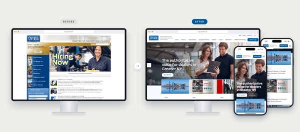
The Greater New York Automobile Dealers Association now has a website that speaks with the authority its members expect. Morweb rebuilt it around what dealers need most: membership, advocacy, events, and education.
What changed
- A clear, confident voice. "The authoritative voice for dealers in Greater NY" leads the page, instead of a job ad.
- Navigation built for members. Membership, Advocacy, Divisions, and Education & Training replace a sidebar of mixed consumer and dealer links.
- Priorities up front. Featured cards spotlight membership, the annual Coat Drive, and advocacy in Washington.
- Joining is one click away. Become a member and Login sit in the header on every page.
See how we rebuilt GNYADA's website →
2. The Association of Theological Schools: Complex Data, Simple Experience
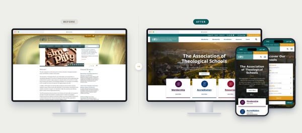
ATS needed a modern website without losing the accreditation database its members rely on. Morweb built both into one platform, so ATS made the switch with no loss of functionality.
What changed
- Database built in. The school finder and accreditation records draw on ATS's existing database, so the data stayed intact through the move.
- Content built for its audiences. Member schools, accreditation teams, and future students each have a clear path to what they need.
- Easier to find everything. Resources, events, and accreditation information are one click from the homepage.
- A modern look that works hard. The clean, confident design feels current and keeps every page easy to use.
See how we rebuilt the ATS website →
3. Driving School Association of the Americas: A Decade of Partnership
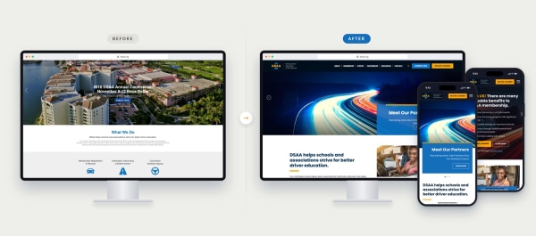
DSAA has run on Morweb since at least 2016, and its new site shows how that partnership grows with a client. The redesign gives the association a bold, modern look and puts membership at the center of every page.
What changed
- Membership front and center. Become a Member and Member Login sit in the header, with a dedicated benefits section and separate paths for individual and corporate members.
- Events that sell themselves. The International Conference leads the homepage with dates, location, and a clear next step.
- A bolder brand. A dark, confident palette with DSAA's orange and blue gives the association a stronger presence.
- Partners on display. Sponsor logos get a featured carousel, adding value for DSAA's partners.
See how we rebuilt DSAA's website →
4. Microscopy Society of America: A Modern Home for a Scientific Community
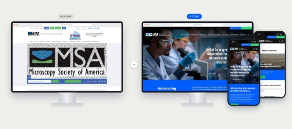
MSA's old homepage had a photo mosaic at the top, with long news posts and scattered links underneath. The new site opens with the society's mission and its numbers, then puts featured members, the annual meeting, events and publications one click away.
What changed
- A bold hero and mission section that shows who MSA is, with members, affiliates and meetings up front.
- Featured Members that put the scientists behind the society front and center.
- A News & Events hub led by the annual M&M meeting, with registration right on the homepage.
- Tabbed resources for publications, education and awards, plus clear Join MSA and Support MSA calls to action.
See how we rebuilt MSA's website →
5. Engineers Without Borders USA: From Hidden Menu to Clear Mission
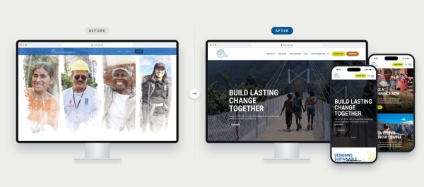
A national engineering organization built on volunteer chapters now has a website that shows its impact the moment the page loads. Morweb rebuilt it so donors, volunteers, and communities each see a clear way to get involved.
What changed
- Mission first. "Build lasting change together" leads the page, instead of a row of portraits with no message.
- Navigation in plain sight. About Us, Our Work, Get Involved, Give, and Stay Connected replace a menu hidden behind a button.
- Impact you can count. 836+ projects, 832+ community partnerships, 4 million+ beneficiaries, and 7,200+ volunteers are front and center.
- Every audience has a path. Donate Now and Volunteer sit in the header, and the programs and project types each have their own showcase.
See how we rebuilt the EWB USA website →
6. CareFlite: From a Recruiting Flyer to a Modern Front Door
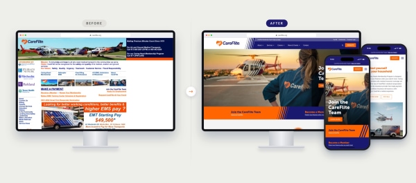
CareFlite's old homepage put job ads, sponsor logos, payment links and long blocks of fine print on one crowded page that was hard to use on a phone. The new site leads with recruiting and membership, gives every service a clear path, and works on any device.
What changed
- Two clear paths at the top of the homepage: Join the CareFlite Team and Become a Member.
- Services organized into Ground Ambulance, Helicopter EMS and Communications.
- The Caring Hearts membership program explained in plain language, with Register Now and Pay Bill buttons.
- A fully responsive design that works for patients, members and job seekers on any device.
See how we rebuilt CareFlite's website →
7. Women in Supply Chain Association (WISC)
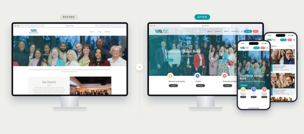
WISC has supported women in the supply chain across Canada since 2012. Morweb built its new site around the associate journey, so professionals and allies can see the value, join, and get involved in a few clicks.
What changed
- Associate levels made clear. Associate Levels and pricing have their own pages, with Join Today in the header.
- A home for associates. The Associate Portal and Associate Directory give members one place to log in and connect.
- Events with personality. Recurring series like WISC & Wine and WISC Unscripted get event cards with date badges.
- The community on display. Testimonials from associates and partner logos show the network behind WISC.
See how we rebuilt WISC's website →
8. Clubhouse International
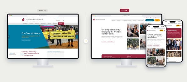
Clubhouse International trains and accredits more than 380 Clubhouses in 30 countries, serving over 200,000 members living with mental illness. Morweb built a site that serves its whole network, from people looking for a Clubhouse to the organizations that start and run them.
What changed
- Help is easy to find. A Find a Clubhouse directory points people to the nearest Clubhouse.
- A path for every audience. Start a Clubhouse, Training, Accreditation, and Ways to Give each have a clear place in the menu.
- Impact backed by evidence. Statistic cards pair key figures with their sources, and Outcomes & Evidence has its own section.
- Real stories up front. Member success stories with photos put people at the center.
See how we rebuilt the Clubhouse International website →
9. American Association for Homecare (AAHomecare)
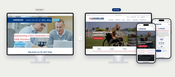
AAHomecare advocates for policies that protect access to home medical equipment, and its members are the providers and manufacturers who supply it. Morweb built a site that serves both its advocacy work and the members who rely on it every day.
What changed
- A directory members use. A searchable directory of home medical equipment providers and manufacturers.
- Advocacy in one place. Policy updates and resources that help members engage lawmakers.
- A resource library that works. Compliance, reimbursement, and industry standard documents are searchable from one library.
See how we rebuilt AAHomecare's website →
Trade Association Website Design
A trade association serves companies, not just individuals. That changes what the website has to do. One member account often covers a whole business with several staff contacts, and those companies expect something back for their dues: visibility, advocacy, and leads.
The strongest trade association websites share five features:
- Company memberships with multiple contacts. A dealership or manufacturer joins once, then adds the staff who need access to events, resources, and member pricing.
- A searchable member directory. For many trade groups, the directory is the main reason companies join. Make it public, filterable by category and location, and easy for members to update themselves.
- Advocacy and industry news up front. Members want to see that the association is working for their industry. Put policy updates and wins on the homepage, not three clicks deep.
- Sponsorship and advertising space. Revenue beyond dues matters. Give sponsors logo placements, event visibility, and directory upgrades they can buy online.
- Events built for registration at scale. Trade shows, conferences, and training sessions need member and nonmember pricing, group registration, and exhibitor sign up in one place.
GNYADA is a good example. Its site puts dealer resources, industry events, and advocacy news in clear paths for a membership made up of businesses rather than individuals.
How to Plan an Association Website Redesign
Most association redesigns go wrong before any design work starts. The scope is unclear, content is copied over as is, and nobody plans how member data will move. Here is a plan that avoids those problems.
- Start with discovery, not design. List what members actually do on your site today: renew, register, search the directory, download resources. Check your analytics for the pages that matter most and the ones nobody visits. Talk to staff about the tasks that eat their week.
- Decide your content strategy. Cut or merge pages that get little traffic. Rewrite the pages that matter for members and prospects. A smaller, clearer site almost always outperforms a bigger one.
- Choose your platform and design. Decide whether your website and membership tools will live in one system or stay separate. Then pick a design that fits your brand and can be customized without a developer every time you need a change.
- Plan the migration. Map every member record, event, and resource to its new home. Set up redirects from old URLs so you keep the search rankings you already have. Agree on a launch date with no downtime for members.
- Test, train, and launch. Check every form, payment, and login on desktop and mobile. Train the staff who will update the site, so the new website stays current after launch day.
A typical redesign for a small or midsize association takes about six to twelve weeks from discovery to launch. For more detail, see our guide to association website best practices.
How to Choose an Association Website Design Partner
Associations usually choose between three kinds of partners:
- Creative agencies make beautiful sites but often struggle once member logins, dues, and directories come into play.
- AMS vendors handle member data well, but their website tools tend to be rigid and dated.
- Association website platforms combine a website builder with membership, events, and directory tools, so everything works together and staff can update it without a developer.
Whatever you choose, ask every partner these questions:
- How many association websites have you built, and can we see before and after examples?
- How will our member data, events, and resources move to the new site?
- Can our staff update pages, events, and the directory without calling you?
- What does the site cost each year after launch, including hosting, security, and support?
- Who do we call when something breaks, and how fast do they respond?
Where Morweb fits. Morweb is a website platform for associations that starts where most AMS products stop: the website. Many AMS tools bolt a dated website onto a member database. Morweb does the reverse. You get a website your members actually love, plus a membership module with the tools an AMS gives you: online join and renewals, a member portal, a searchable directory, dues, and event registration, all in one place. Our team handles the strategy, design, and migration, then trains your staff so you can run the site yourselves. All 10 redesigns above are Morweb sites.
See Our Association Work | Request a Demo
Frequently Asked Questions
What is an association website?
An association website is the public home and member hub for a professional, trade, or membership organization. It explains the association to prospects and gives members a place to join, renew, register for events, and access resources.
What features does an association website need?
At minimum: online join and renewal, a member login area, event registration, a member directory, and a resource library. It also needs to work well on mobile and meet accessibility standards.
How much does an association website cost?
It depends on whether you hire an agency for a custom build or use a platform made for associations. Custom agency builds often carry a large upfront fee plus ongoing hosting and support. Platforms bundle these into a monthly cost. Morweb offers both paths. Associations that want to launch quickly can start with a professionally designed theme customized to their brand, with a low setup cost and plans from $149 per month. Associations that want a best in industry website can choose a fully custom build, led by a strategy and design process tailored to their members and goals. Custom builds can include unique workflows, custom member portals, multiple directories, and third party API integrations.
How long does an association website redesign take?
For a small or midsize association, plan on about six to twelve weeks from discovery to launch. Larger sites with complex member data can take longer.
Should we use a website builder or hire an agency?
General website builders are cheap but were not made for memberships, dues, or directories. Agencies offer custom design but can leave you dependent on them for every update. A platform built for associations gives you both: professional design and tools your staff can run themselves.
How do we find the right web solutions for associations?
Look beyond basic website builders. The right platform connects your public website to your member data, with secure member logins, automatic dues renewals, and event registration with member pricing, all in one system.
Should we partner with a specialized association web design agency?
Usually, yes. A partner who knows associations can set up member levels, gated content, directories, and accessibility from day one, which saves your staff months of trial and error. Ask to see before and after examples of association websites they have built.
Takeaway
Your association website is not an online brochure. It is where prospects decide to join, members renew, and your community comes together. Use the examples and takeaways above to guide your next redesign. If you want a partner who has done it many times, see our association work or request a demo.