

Your college’s website isn’t merely a virtual storefront; it’s a strategic platform that drives recruitment, retention, and fundraising. As we move through 2026, the stakes are higher than ever:
- 97% of prospective students visit a school’s website before applying, making it the most critical touchpoint in the recruitment funnel.
- 82% of prospective students say they watch videos on college websites, and 83% find those videos helpful in their decision-making process.
- 63% of prospective students have clicked on online ads from colleges, showing the growing importance of digital advertising.
- 73% use virtual tours or virtual reality experiences to explore campus before engaging with admissions.
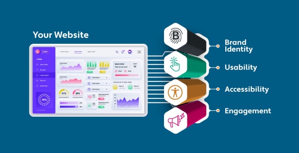
What Defines a High-Performing Higher Ed Website Design?
From attracting prospective students to inspiring alumni support, your website must excel across four essential pillars of digital strategy.
1. Why Is Visual Brand Identity Crucial for First Impressions?
Your website is often the first interaction a visitor has with your institution—so it must convey your mission, values, and personality instantly.
- The power of design: 75% of users judge a site's credibility based on its visual design alone—including layout, typography, and color scheme.
- First impressions: A Stanford study found that 94% of first impressions are related to design, not content.
- Consistency is key: Your color palette, tone of voice, logo placement, and imagery should all tell the same story: who you are and why you matter.
2. How Do Usability and Speed Impact User Retention?
A beautiful website means nothing if users can't navigate it easily. With diverse audiences—including students, parents, alumni, and faculty—intuitive paths are vital.
- Speed of judgment: Users form an opinion about your site in just 0.05 seconds.
- The cost of bad UX: According to Adobe, 38% of people will stop engaging if a website is unattractive or difficult to navigate.
- Performance requirements: Sites should load in under 3 seconds to retain users.
- Mobile-first: Mobile usage among college searchers exceeds 70%, making responsive design mandatory.
3. Why Is Accessibility a Legal and Ethical Imperative?
Accessibility is both a legal requirement and a user experience imperative.
- The audience: Over 61 million adults in the U.S. live with a disability.
- Legal risks: ADA lawsuits related to website inaccessibility rose by over 23% in 2023 alone.
- Compliance benefits: Meeting WCAG 2.1 AA compliance ensures your site works for everyone, lowers bounce rates, and improves search engine indexing.
4. What Drives True Student Engagement Online?
An engaging website motivates action—whether it's applying, donating, or registering for a campus tour.
- The impact of video: Videos increase time on site by up to 88% and lead to 34% more conversions on landing pages. 82% of prospective students watch videos on college websites, and 83% find them helpful for decision-making.
- Interactive tools: Virtual tours and financial aid calculators are used by more than 50% of students researching schools online. Furthermore, 73% use virtual tours or VR experiences to explore campus before engaging with admissions.
- Connection: Story-based content builds emotional connection and trust, especially among Gen Z audiences.
In this guide, we've analyzed the top-performing college and university websites of 2026, showcasing how institutions across the U.S. and Canada are mastering these four pillars. Each example demonstrates how to integrate brand identity, usability, accessibility, and engagement into a truly effective and future-proof digital experience.
Top Picks: Best College & University Website Examples
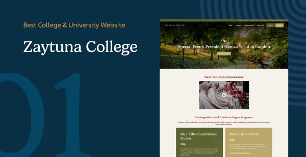
1. Zaytuna College
Berkeley, California, USA
Zaytuna College, located in Berkeley, California, is the first accredited Muslim liberal arts college in the United States. Its website reflects its commitment to intellectual tradition and holistic education through a clean, elegant design that prioritizes accessibility and engagement.
Key Features
- Academics & Admissions: The website highlights Zaytuna’s unique curriculum, blending the Islamic and Western intellectual traditions. Prospective students can seamlessly access admissions details, faculty profiles, and program offerings.
- Campus Life & Events: A well-structured events page keeps students and the broader community informed about lectures, programs, and campus happenings, reinforcing the college’s focus on engagement and lifelong learning.
- Ways to Give: Zaytuna provides multiple giving opportunities, including zakat-eligible donations, recurring gifts, and endowment contributions. A dedicated giving page simplifies the process, making it easy for supporters to contribute to the college’s mission.
With its thoughtful design, strong visual hierarchy, and intuitive user experience, Zaytuna College’s website effectively communicates its values while making information easily accessible to students, faculty, and donors alike.
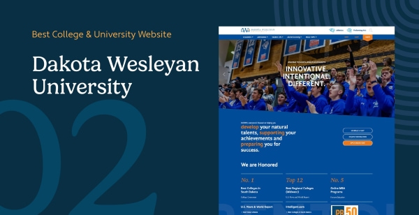
2. Dakota Wesleyan University
Mitchell, South Dakota, USA
Dakota Wesleyan University (DWU), based in Mitchell, South Dakota, reflects its faith-driven, student-centered mission through an approachable, bold website design. The color palette of blue and gold creates a vibrant, trustworthy tone while the layout balances professionalism with warmth.
Key Features
- Tailored User Pathways: The homepage features segmented pathways for prospective students, current students, and alumni. Each group is guided to relevant content, such as financial aid, course offerings, and alumni success stories.
- Storytelling Integration: Student spotlights, faculty interviews, and news snippets are woven throughout the site. These stories build emotional engagement and portray DWU as a supportive, close-knit community.
- Streamlined Giving: Their giving portal offers a clean design with options for one-time gifts, recurring donations, and legacy contributions. The process is clear and mobile-optimized, enhancing donor experience.
DWU’s website excels in using narrative content and segmented journeys to create a welcoming and action-oriented digital space for every user.
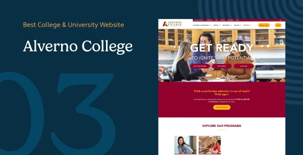
3. Alverno College
Milwaukee, Wisconsin, USA
Located in Milwaukee, Wisconsin, Alverno College is a Catholic liberal arts institution renowned for its student-centered learning model. The website serves as a highly functional recruiting tool with strategic CTAs, intuitive navigation, and a strong representation of the college’s values.
Key Features
- Visual Call-to-Actions (CTAs): The homepage prominently displays color-coded CTAs such as 'Apply Now', 'Financial Aid', and 'Virtual Tour'. These buttons help visitors quickly take meaningful action based on their needs.
- Segmented Navigation: The main menu is divided into four key areas—Academics, Apply & Afford, Campus, and Current Students. Hover menus provide specific page recommendations to improve usability.
- Data-Driven Messaging: Statistics like '100% internship and clinical placement rate' and '93% of undergraduates receive financial aid' are showcased prominently to build trust and credibility.
Alverno’s website leverages strong branding and Morweb’s CMS functionality to drive student conversions and build confidence through structured design and compelling data.
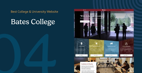
4. Bates College
Lewiston, Maine, USA
Bates College, located in Maine, offers a web experience that reflects its values of inclusivity, community, and academic rigor. The website uses open layouts and storytelling techniques to create emotional engagement with visitors.
Key Features
- Interactive Involvement Features: The homepage highlights four primary student engagement opportunities with brief descriptions and CTA buttons that direct users to learn more or take action.
- Comprehensive Fundraising Tools: The donation section includes features like recurring giving, donor-advised fund instructions, and matching gift lookup, making it easy for donors to give.
- Personalized Storytelling: Alumni and student testimonials are seamlessly woven into the design to create an authentic, mission-driven appeal.
Bates College’s website creates a compelling user journey by combining rich media, easy navigation, and giving tools that encourage deeper involvement.
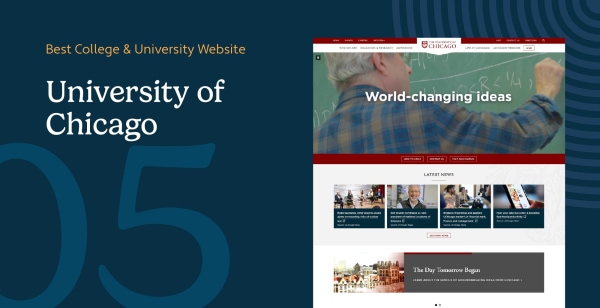
5. University of Chicago
Chicago, Illinois, USA
The University of Chicago’s website combines tradition with innovation, mirroring its status as a leading research institution. Designed with both academic depth and user experience in mind, the site offers intuitive access to robust content, visually rich elements, and structured paths for different audiences.
Key Features
- Image Sliders for Immersion: The homepage features high-resolution image sliders that rotate through snapshots of campus life, student achievements, and timely news. This dynamic presentation captures attention while reinforcing the institution’s vibrancy and relevance.
- Audience-Specific Navigation: Navigation is organized by user type—Students, Faculty, Staff, Alumni, Parents, Visitors—streamlining access to targeted resources. This segmentation ensures that each visitor quickly finds content relevant to their needs, which reduces bounce rates and enhances satisfaction.
- Academic and Research Highlighting: Program pages are richly layered with multimedia, course details, and faculty bios. In addition, the website prominently features interdisciplinary research initiatives and lab profiles, appealing to prospective graduate students and academic collaborators.
- Recognition and Awards: The University of Chicago’s site has received top honors, including two prestigious Webby Awards for “Best School Website” and the “Webby People’s Voice Award.” These accolades reflect both the technical quality and user engagement the site consistently delivers.
With a clean layout, emotionally engaging imagery, and intelligent content structuring, the University of Chicago’s website exemplifies excellence in higher education web design. It balances prestige with usability and continues to serve as a digital benchmark for academic institutions globally.
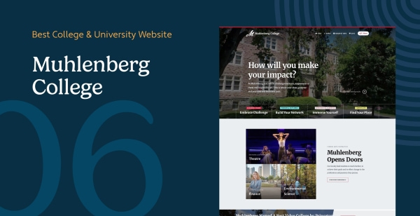
6. Muhlenberg College
Allentown, Pennsylvania, USA
Muhlenberg College in Pennsylvania communicates academic excellence and campus culture through simplicity and visual immersion. The minimalist site structure supports fast access to information while emphasizing core school values.
Key Features
- Streamlined Menus: A five-item top navigation limits overwhelm and guides users by category: About, Admissions, Academics, Student Life, and Community. Each expands into user-focused subpages.
- Dynamic Visual Content: Static images and videos showcase student experiences inside classrooms, dorms, and athletic settings, giving users an authentic glimpse into college life.
- Quick Search Tool: A search bar powered by a site-wide index helps users find targeted information without browsing through multiple layers.
Muhlenberg’s website provides a clean, no-frills design that aligns with its liberal arts focus and enhances user trust through straightforward design.
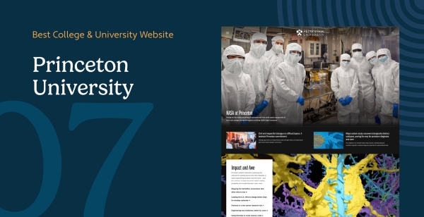
7. Princeton University
Princeton, New Jersey, USA
As an Ivy League institution, Princeton’s website maintains a minimalist design that allows its academic and research excellence to speak for itself. The user interface communicates prestige through clarity and restraint.
Key Features
- 'Meet Princeton' Microsite: The reimagined About page offers data-rich snapshots, institutional timelines, and human interest profiles, making the university’s identity both personal and prestigious.
- Extensive Footer Navigation: Links to academic calendars, social media, search tools, and directories are neatly organized at the bottom of each page, enhancing access for frequent users.
- Consistent Branding Standards: Strict adherence to font, color, and tone guidelines ensures consistency and authority across all departments and microsites.
Princeton’s website is a masterclass in brand stewardship, academic positioning, and accessibility for varied audiences—from prospective students to donors and media.
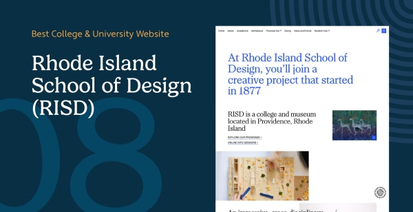
8. Rhode Island School of Design (RISD)
Providence, Rhode Island, USA
The Rhode Island School of Design (RISD) showcases creativity and academic excellence through a website that functions as both a gallery and information hub. Designed in-house, the site reflects the school’s mission to inspire the next generation of artists and designers.
Key Features
- Showcase of Student Work: Images and portfolios of current student projects are integrated across pages, immersing prospective applicants in the creative output and academic culture.
- Minimalist Design with Purpose: The use of white space draws attention to high-value content like events, admissions, and academic programs, improving information retention and UX.
- Award-Winning Aesthetics: Honored as a Webby Award nominee, the site balances design creativity with clear user flows and modern web standards.
RISD’s digital presence stands as a model for design schools, blending authenticity, functionality, and inspiration to engage artistically driven audiences.
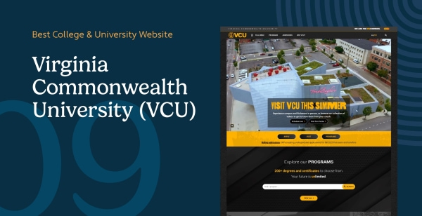
9. Virginia Commonwealth University (VCU)
Richmond, Virginia, USA
VCU’s website is a dynamic mix of ambition, research focus, and accessible design. With bold color themes and a layout designed to convert visitors, the site caters to prospective students, alumni, and partners alike.
Key Features
- Prominent CTAs: High-contrast buttons for 'Apply', 'Visit', and 'Programs' are above-the-fold, turning passive browsing into active engagement.
- Image Carousels & Video: Dynamic visuals highlight campus diversity, student success, and program depth without overwhelming users.
- Alumni & Donor Access: A separate section for alumni provides resources and updates, strengthening long-term engagement and community.
VCU’s website is bold and future-forward, leveraging smart visual design and strategic navigation to appeal across multiple stakeholder groups.
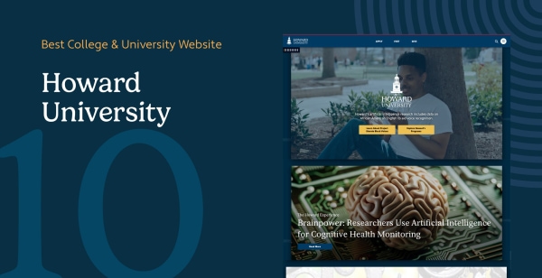
10. Howard University
Washington, DC, USA
Howard University’s website reflects the institution’s commitment to Black excellence, inclusion, and STEM advancement. With rich media and interactive features, Howard invites users into a dynamic and mission-driven campus culture.
Key Features
- Introductory Video Banner: The homepage opens with a short video montage showing students, faculty, and research activities—an emotional, inclusive welcome.
- Virtual Campus Tour: Interactive navigation helps prospective students explore facilities and learn more from wherever they are.
- Diversity Branding: The bold blue and red theme represents institutional pride while reinforcing Howard’s legacy and vision.
Howard’s site strikes a powerful balance between inspiration and information, using technology and visual narrative to attract new generations of leaders.
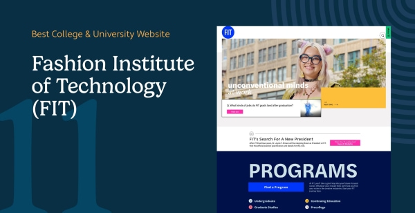
11. Fashion Institute of Technology (FIT)
New York City, New York, USA
The Fashion Institute of Technology (FIT) aligns its digital experience with its creative brand. Every element of the site—from color choice to content structure—reflects innovation, visual storytelling, and user-centered design.
Key Features
- Vibrant Visual Language: The homepage resembles a collage, using energetic yellow, pink, and blue accents and bold visuals to mirror the energy of student life.
- Complete Program Index: Prospective students can browse every program in one scrollable interface, categorized by degree type and industry.
- Creative Authenticity: Photography and video spotlights real students, faculty, and projects in the design, business, and tech space.
FIT’s website showcases the power of aligning design with brand identity, creating an interactive experience that informs and inspires future creative professionals.
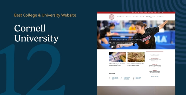
12. Cornell University
Ithaca, New York, USA
Cornell University’s website blends elite academic credibility with high-impact storytelling and a strong focus on accessibility. Located in Ithaca, New York, the site showcases academic rigor, community, and campus beauty in equal measure.
Key Features
- Research Focus: Cornell dedicates an entire section to current research initiatives, featuring multimedia case studies and lab profiles that underscore the school’s contribution to innovation.
- Live Campus View: A webcam on the homepage offers real-time visuals of the central campus, emphasizing the school's connection to nature and day-to-day campus life.
- Accessibility Commitment: Clear navigation, high-contrast design, and an accessibility contact statement ensure inclusive access for all users.
Cornell’s web experience delivers an ideal mix of scholarly impact and emotional appeal—essential for converting top-tier applicants and supporting institutional transparency.
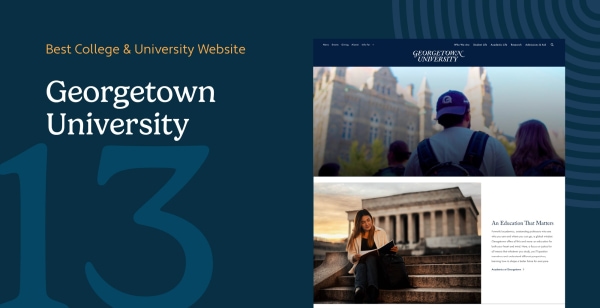
13. Georgetown University
Washington, DC, USA
Georgetown’s website reflects its legacy as an international Catholic and Jesuit institution. It combines deep history with a user-first approach and clearly segmented resources.
Key Features
- Audience Segmentation: Students, faculty, alumni, and prospective enrollees all have tailored access paths from the navigation menu, streamlining the user experience.
- Institutional Storytelling: The website includes robust historical archives and statistics that demonstrate Georgetown’s impact in healthcare, law, and diplomacy.
- Comprehensive Navigation: A multi-layered menu and content filters allow users to browse research, degrees, events, and admissions pathways without friction.
Georgetown University uses clear segmentation and authoritative messaging to build trust and offer a seamless journey across diverse audience needs.
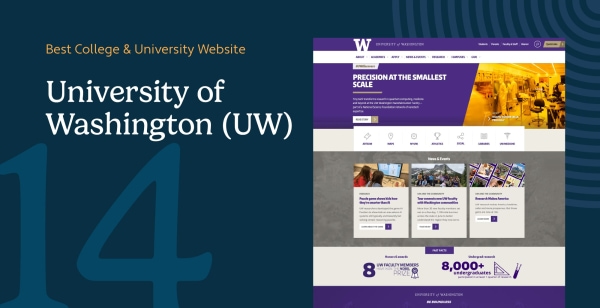
14. University of Washington (UW)
Seattle, Washington, USA
As one of the largest public universities in the U.S., UW's website is bold, structured, and inclusive. Its navigation hierarchy and donation UX are standout features.
Key Features
- Streamlined Donation Funnel: UW’s giving page breaks down the donation process into three steps, offering suggested amounts, impact areas, and contactless payment options.
- Icon-Based Navigation: Visitors are guided through visual icons to explore athletics, maps, campus tours, and social media—supporting different learning styles.
- Social Integration: The site integrates live social feeds and student videos to keep content fresh and community-focused.
With a blend of practical design and community energy, UW’s site fosters engagement from prospective students to lifelong alumni supporters.
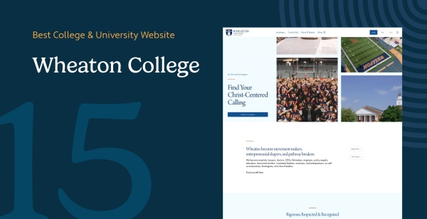
15. Wheaton College
Wheaton, Illinois, USA
Wheaton College’s website offers a personal and community-driven experience. It places a strong emphasis on student voices and Christian liberal arts values.
Key Features
- Student-Driven Blog: A dedicated blog captures campus life through articles written by students and staff, offering insight into academic and spiritual life.
- Social & Testimonial Feeds: Instagram and video testimonials are embedded across pages, giving visitors a feel for campus community before even visiting.
- Event-Focused UX: An accessible calendar includes student recitals, lectures, and athletics, helping foster engagement even from first-time visitors.
Wheaton’s website fosters belonging and trust, using firsthand stories and visual warmth to welcome potential students into its close-knit culture.
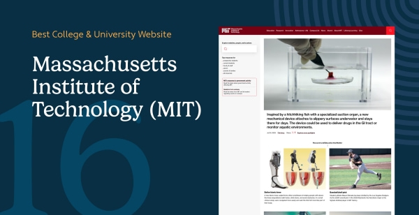
16. Massachusetts Institute of Technology (MIT)
Cambridge, Massachusetts, USA
MIT’s website reinforces its reputation as a global leader in science and engineering. The digital design is data-rich, modern, and centered on innovation.
Key Features
- Unconventional Layout: A static vertical navigation bar on the left gives space to an auto-scrolling feed of news and breakthroughs, maintaining continuous engagement.
- Content-Driven UX: Rather than relying solely on visuals, the homepage features rich academic content—research briefs, student interviews, and department links.
- Accessibility & Caution: Though creative, the unconventional structure may be challenging for mobile users or screen readers, highlighting the need for alternative navigation support.
MIT’s site successfully mirrors its campus: technologically advanced, highly intellectual, and built for discovery—but may require refinement to maximize accessibility.
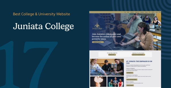
17. Juniata College
Huntingdon, Pennsylvania, USA
Juniata’s website stands out for its narrative approach. It uses human-centered storytelling and motivational language to build emotional connection.
Key Features
- Conversational Homepage: With headlines like 'Become the Author of Your Own Powerful Story', the homepage invites personal reflection and direct interaction.
- Student & Alumni Profiles: Real-life success stories take center stage, building credibility through authenticity and shared experience.
- Interactive Calls-to-Action: Prompts to explore, visit, or apply are written in empowering language that reflects Juniata’s community-driven mission.
The Juniata website creates a deep emotional connection, establishing a sense of belonging and inspiration that helps convert curious visitors into applicants.
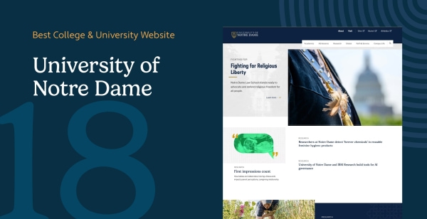
18. University of Notre Dame
Notre Dame, Indiana, USA
Notre Dame’s website is traditional and polished, aligning with its heritage and academic brand. It incorporates responsive design and branding best practices.
Key Features
- Strict Branding Consistency: Every page adheres to defined design standards for colors, typefaces, and layout—preserving credibility and identity across departments.
- Mobile Optimization: Design elements seamlessly adapt to different screen sizes, ensuring that both prospective students and alumni have an excellent experience on all devices.
- Photographic Storytelling: High-resolution photography tells the story of campus life, student activities, and institutional pride.
Notre Dame’s web presence is a premium example of legacy branding and responsive functionality merged for maximum trust and user satisfaction.
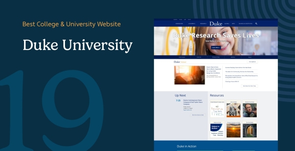
19. Duke University
Durham, North Carolina, USA
Duke University’s site is accessible, well-organized, and built for impact—supporting enrollment, donor engagement, and academic reputation all at once.
Key Features
- Audience-Tailored Menus: Navigation anticipates user intent with clearly labeled tabs for prospective students, alumni, and researchers.
- Donor-Focused Design: The 'Giving to Duke' section emphasizes transparency and outcome-driven philanthropy, using testimonials and visuals to motivate support.
- Visual Flow: Strong layout hierarchy, iconography, and whitespace help streamline decision-making for new users.
Duke combines design elegance with functional clarity, supporting a full-funnel strategy for applicants, donors, and institutional partnerships.
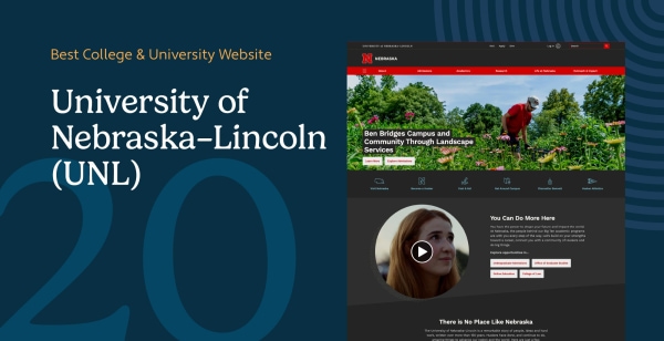
20. University of Nebraska–Lincoln (UNL)
Lincoln, Nebraska, USA
UNL’s website exemplifies digital simplicity done well. It is visually clean and action-oriented, emphasizing navigation clarity and usability.
Key Features
- Segmented Navigation by Audience: The menu is sorted into user types (prospective students, faculty, etc.), each receiving focused content paths.
- Strategic Use of White Space: Negative space helps isolate important actions like applying or giving, increasing engagement through clean contrast.
- Efficient Search Tool: An intuitive site-wide search bar ensures that even niche queries can be addressed quickly and effectively.
UNL’s website is a great example of how minimalist design and smart segmentation improve usability and foster meaningful engagement.
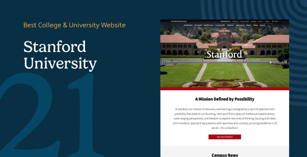
21. Stanford University
Stanford, California, USA
Stanford’s site is built around its research leadership, academic depth, and global community. It serves as both a marketing hub and informational gateway.
Key Features
- School-Based Navigation: Users can easily explore specific academic schools (e.g., Law, Medicine, Engineering) through distinct microsites.
- Blogroll & News Integration: High-visibility news updates and features humanize Stanford’s achievements while keeping the homepage dynamic.
- Campus Imagery: Photo galleries and embedded video highlight student life, sustainability efforts, and international reach.
Stanford's site is a benchmark for how a global academic institution can scale design, content, and technical performance in one seamless digital experience.
22. Athabasca University Graduate Students Association
Athabasca, Alberta, Canada
The Athabasca University Graduate Students Association (AUGSA) website serves as a vital hub for advocacy and student support, reflecting its mission to represent distance learners effectively. The design prioritizes access to essential services, funding, and community connection in a clean, user-friendly interface.
Key Features
- Centralized Advocacy Resources: The site clearly outlines advocacy efforts at both university and government levels, ensuring students understand their representation and rights.
- Financial Support Portal: A dedicated 'Awards & Bursaries' section simplifies the application process for funding, covering specific needs like childcare, accessibility technology, and research grants.
- Community & Event Integration: Features like the annual 'Graduate Student Research Conference' and peer networking forums foster a strong sense of community and academic exchange among remote students.
AUGSA's digital presence effectively bridges the gap for remote students, offering a centralized and supportive platform for academic and personal success.
23. PSU Foundation
Portland, Oregon, USA
The Portland State University (PSU) Foundation website is a powerful engine for philanthropy, designed to connect donors with meaningful impact opportunities. Its strategic layout and compelling storytelling highlight the foundation's role in advancing the university's mission through "Breakthrough Giving" and "Equitable Success."
Key Features
- Streamlined Giving Pathways: The 'Give Now' and 'Ways to Give' sections offer diverse options—from recurring monthly gifts to planned giving and real estate—making philanthropy accessible and tailored to donor preferences.
- Partner Resource Hub: A dedicated 'Resources for Partners' area empowers faculty and staff with essential tools, electronic forms, and crowdfunding support ("Grow the Green") to facilitate fundraising efforts.
- Impact-Driven Storytelling: The site uses a 'Strategic Framework' to showcase long-term visions, connecting donations directly to tangible outcomes like student emergency funds and faculty support.
The PSU Foundation website masterfully balances donor stewardship with operational utility, creating a seamless experience for supporters and university partners alike.
Bonus: How Can You Improve Your Existing College Website in 2026?
You don't need to start from scratch to see results. Whether you're revamping an outdated site or optimizing a current one, the following strategies can elevate performance and credibility.
1. How Can SEO Strategies Drive Organic Traffic?
With 93% of online experiences beginning with a search engine, visibility is paramount. Google processes over 40,000 search queries per second, and higher ed search intent continues to rise.
- Targeting: Focus on keywords like "best liberal arts college in [State]" or "online nursing degree program".
- Optimization: Use descriptive, keyword-rich meta titles and optimize images for faster load times.
- Technical SEO: Implement schema markup for events and faculty to appear in rich snippets.
Tools like Morweb's built-in SEO module make this process easier by enabling custom URLs, automatic sitemap generation, and metadata configuration—all without code.
2. Do Faculty Directories Influence Enrollment Decisions?
Yes—52% of prospective students say that faculty credentials influence their application decision.
- Showcase strength: Use a faculty directory to humanize your institution by including bios, credentials, and research interests.
- Enhance usability: Add filters by department or degree and include headshots and office hours for accessibility.
Morweb's Teachers Directory Module makes it easy to manage and update profiles institution-wide.
3. How Can Institutions Leverage Google Ads and Grants?
Digital advertising is growing in importance, with 63% of prospective students having clicked on online ads from colleges. In fact, 1 in 3 students discovers a school through paid digital advertising.
- Grant opportunity: If your institution has a 501(c)(3) arm, you may qualify for the Google Ad Grant, offering $10,000/month in ad credits.
- Goals: Use these funds to drive traffic to "Apply Now" pages or promote specific programs like Nursing or MBAs.
4. What Tools Increase Donor and Student Engagement?
Don't just collect support—build community. Institutions that use digital stewardship tools see a 26% increase in repeat donations.
- Tactics: Utilize digital eCards for donors to share their impact and create automated "thank you" sequences after donations.
- Student interaction: Allow students to send appreciation notes to peers or professors to foster stronger relationships.
5. Which Metrics Should You Track and Optimize?
The average higher ed site has a bounce rate of 52%—but that can drop below 35% with performance-based optimization.
- Key metrics: Monitor New vs. Returning Visitors, Donation Conversion Rates, Time on Page, and Click-throughs on CTAs.
- Tools: Use Google Analytics 4 to establish baselines and measure growth.
Improving your college website is about more than aesthetics. By implementing a smart SEO foundation, promoting your faculty, activating digital campaigns, and enhancing user experience, your site can become a true asset. Remember: A good website doesn't just inform—it inspires.
Ready to Transform Your School's Digital Presence?
A great college website doesn't just inform - it inspires. Whether you want to boost enrollment, engage parents, or grow support, let these examples guide your next redesign.
Explore more school-focused web tools:
- 9 Best Website Builders for Schools and Teachers
- 18 of the Best School Website Designs
- Top 12 Nonprofit Website Templates
Talk to Morweb's team to design a school website built for success in 2026.