

Parents form their first impression of a school on the website long before they walk through the front doors. A school website needs to reflect the institution's culture: its values, mission, curriculum, teachers, and the community it serves. A thoughtfully crafted site is the first conversation between a family and a school, and it shapes the expectations of prospective families, current families, students, and staff. The sites below earn that conversation well.
64%of global web traffic comes from mobile devices, a ratio that holds across school sites where parents are the primary audience (StatCounter, Q3 2025) |
3 clicksthe point at which users abandon a site if they cannot find what they need |
10 schoolsreal production sites broken down for design and UX lessons |
Quick answer: The best school websites do three things before a prospective family clicks past the homepage: they show why this school — not just any school — with a specific proof point above the fold; they separate current-family and prospective-family content paths so neither audience wades through content meant for the other; and they make the school's defining difference a navigation element, not a paragraph buried in About. The ten sites below are real production examples of those patterns working.
How We Judged These Sites
To keep this list useful rather than promotional, our design team evaluated every site against the same four criteria, and we included nine Morweb-built sites and one independent example so the comparison stays honest.
| Criterion | What We Looked For |
| Mobile-First Responsiveness | How cleanly the layout adapts across phones, tablets, and desktops, and whether tap targets and hierarchy hold up on small screens |
| Core Web Vitals | Loading speed, interactivity, and visual stability on real devices |
| Accessible Color Contrast & Structure | Alignment with WCAG 2.1 AA, including contrast ratios and a logical heading structure |
| Navigation & Conversion Paths | How quickly a parent can reach Apply, Tour, or Donate from any page |
Each entry below highlights a specific Standout Feature, a concrete UX Win, and a What to Steal takeaway — something any school can apply in a redesign.
"The first thing I look at on any school site is whether a prospective family can find the admissions path in under ten seconds without knowing anything about the site. If I have to hunt for Apply or Schedule a Visit, the site is working against its own goals. The schools in this post get that right."
— Brent Lafreniere, Digital Director, 19 years in mission-driven web design
What Makes an Exceptional School Website Design?
An effective school website is not just about looking good. It needs to be functional, accessible, and aligned with the school's goals for each audience it serves.
Why Is Mobile Responsiveness Essential in 2026?
More than 64% of global web traffic comes from mobile devices (StatCounter, Q3 2025), and school sites — where parents are the primary audience — follow that same pattern. A responsive design ensures your site performs well on every screen size, from tap-friendly navigation to fast-loading mobile layouts. Google uses mobile-first indexing, so a site that is not mobile-friendly loses rankings and reach. Poor mobile experience also frustrates applicants and disengages donors.
How Important Is Clear Navigation and Quick Access?
Users typically abandon a site if they cannot find what they need within three clicks. Design navigation to minimize friction: group content by audience — Prospective Students, Parents, Faculty — and keep high-priority pages like Apply Now, Tuition and Aid, and Event Calendar no more than one or two clicks away. Use dropdowns and mega-menus to guide users, and always include a search bar for deeper content.
Why Do You Need Strong Calls-to-Action?
Sites with clear calls-to-action see higher conversion on key pages. Guide visitors toward outcomes that match your goals: Apply Now for enrollment, Donate Today for fundraising, Schedule a Visit for in-person engagement, and Subscribe for ongoing communication. Use high-contrast buttons and action-oriented language on every landing page.
How Should You Use Calendars and Event Listings?
Schools with regularly updated event sections tend to see longer time on site. Your calendar is a storytelling tool, not just a utility. Segment events by type — Academics, Athletics, Fundraising — link each to a registration page, and offer audience filters, calendar sync, and a mobile-friendly month or list toggle.
Why Are Engaging Visuals and Video Necessary?
Pages with video tend to hold attention longer. Invest in authentic, high-quality media — student interviews, campus walkthroughs, classroom action shots — and avoid stock imagery where you can. Background video headers, virtual-tour embeds, and student highlight reels all work well.
Are You Meeting Accessibility Standards?
School websites are increasingly subject to accessibility requirements, and lawsuits against districts have risen in recent years. Meeting WCAG 2.1 Level AA is both a legal safeguard and a usability upgrade for everyone: proper contrast ratios, keyboard navigation, screen-reader labels, captions, descriptive alt text, clear language, and logical heading structures. As a bonus, these improvements make your site more crawlable and improve SEO. For a deeper look, see our guide on school website accessibility.
"A common mistake is treating WCAG compliance as something you do after the site is live, instead of making it a key part of the design from the start. This leads to sites that look great but aren't easy to use — text that's hard to read, menus that are confusing for keyboard users. Schools and nonprofits are working against their own mission of inclusion when accessibility is an afterthought."
— Shawn Xiong, Art Director, MFA in Graphic Design, 20+ years in visual design and art direction, 30+ school and nonprofit websites
How Do Dynamic Content Modules Drive Engagement?
Sites with regularly updated blogs generate more leads than static ones. Use dynamic modules to surface fresh content across the homepage, a news section, and program pages: blog modules with tag filters, a program finder with subject and degree filters, and auto-publishing event tiles.
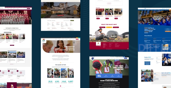
School Website Examples Worth Studying
These schools represent strong work in design, function, and user experience. We have noted which run on Morweb and which are independent, and we have included a concrete takeaway for each one.
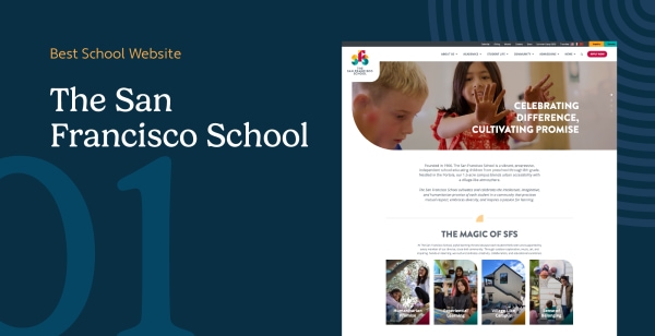
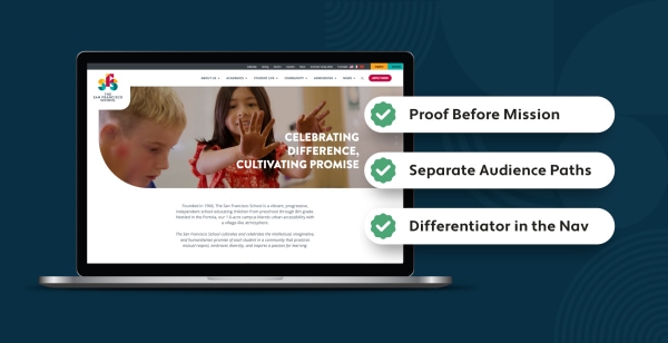
1. The San Francisco School — Built on Morweb
San Francisco, California, USA
The Standout Feature: A rotating hero that pairs taglines like "Celebrating Difference, Cultivating Promise" with a stats dashboard — 282 students, 65% students of color, and a 1:6 faculty ratio — all visible above the fold before a prospective family scrolls.
The UX Win: Four clear primary CTAs (Apply, Inquire, Donate, Calendar) and audience-aware mega-menus turn a small-school site into a frictionless admissions funnel, without losing the warm, community-first tone the school is known for. The stats dashboard matters specifically because it converts abstract mission language — "community-centered," "inclusive" — into verifiable numbers. A prospective family doesn't have to take the school's word for its values. They can see them expressed as fact on the first screen. Built on Morweb's CMS. Visit the site.
What to steal: If your homepage leads with mission language, replace or supplement it with one concrete proof point above the fold. A student-to-teacher ratio, a graduation rate, a program count, a years-in-operation figure — any specific number anchors the mission claim and gives a prospective family something to remember.
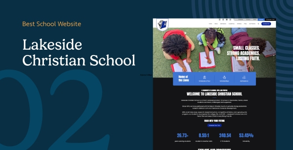
2. Lakeside Christian School — Built on Morweb
Clearwater, Florida, USA
The Standout Feature: A full-width hero carousel of candid student photography — athletics, group work, playground scenes — anchored by the tagline "Small Classes. Strong Academics. Lasting Faith." The photography earns that line. Each image shows a student doing something, not posing.
The UX Win: A single "Schedule Your Tour" CTA carries the homepage. That constraint is intentional. Most school homepages present five equally weighted CTAs and ask a prospective family to choose. Lakeside makes the choice for them. Quick visual program cards for Elementary, Middle, High School, Athletics, Arts, and Scholarships appear one scroll below — for families ready to go deeper — but the primary action is never competed with. Visit the site.
What to steal: Audit how many equal-weight CTAs appear on your homepage. If there are more than two, you are asking visitors to make a decision you should make for them. Pick the one action that matters most for your enrollment goals and give it visual priority.
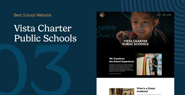
3. Vista Charter Public Schools — Built on Morweb
Los Angeles, California, USA
The Standout Feature: Parent and student testimonial videos placed in the primary scroll path — not in a sidebar, not behind a carousel, and not below the program overview. In the main reading flow, before a prospective family reaches any curriculum description.
The UX Win: Prospective families choosing a charter school face a question that no amount of program copy can answer on its own: "Is this school for a family like mine?" Vista Charter's homepage answers that question before a visitor reads a single line of institutional text. The video thumbnails show real students and real parents in recognizable Los Angeles settings. That social proof doesn't just reassure — it short-circuits the comparison-shopping that leads families to leave the site before they engage. A Visit and Enroll CTA sits directly below the videos, positioned to catch families who are ready to act while the impression is fresh. The mobile-first layout means the videos load fast and scale cleanly on the phones most of their audience is using. Visit the site.
What to steal: If your school serves a community that is underrepresented in traditional private or charter school marketing, show that community on your homepage before you describe your curriculum. Parent and student voices answer the belonging question faster than any headline. Place video or authentic photography in the primary scroll path — not as decoration below the fold.
"The schools that convert prospective families fastest are the ones that answer 'Is this school for a family like mine?' before they explain what they teach. Video and authentic photography do that in seconds. Curriculum copy does it in paragraphs, if at all."
— Bita Goli, Senior Designer, specializing in UX and design psychology for schools and nonprofits
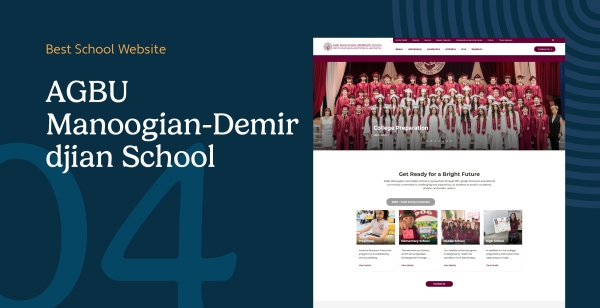
4. AGBU Manoogian-Demirdjian School — Built on Morweb
Canoga Park, California, USA
The Standout Feature: Bilingual content — English alongside Armenian script — and shield branding that treat the school's cultural identity as a primary design choice, not a translation toggle at the footer. The school is celebrating its 50th anniversary; the design communicates continuity and pride without nostalgia.
The UX Win: Two audiences, one site, no confusion. A Quick Links sidebar (parent portal, tuition, lunch menus) keeps current-family logistics one tap away. The main navigation — About, Admissions, Academics, Arts, Athletics — stays focused on prospective families evaluating the school. Neither audience has to navigate through content meant for the other. The bilingual treatment reinforces the school's cultural mission for both groups simultaneously: current families see their community reflected in the design; prospective families understand immediately that Armenian language, history, and culture are not electives here — they are foundational. Visit the site.
What to steal: If your school has a cultural or religious identity that defines its mission, build that identity into the primary visual language — not as a logo detail, but as a design system. Typography, color, imagery, and structural choices should communicate who you are before a prospective family reads a single word.
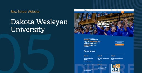
5. Dakota Wesleyan University — Built on Morweb
Mitchell, South Dakota, USA
The Standout Feature: Recognition badges (U.S. News, Fortune Education, RegisteredNursing.org) and outcome stats — 100% nursing and education job placement, 99% alumni recommendation rate — placed exactly where prospective families look for proof. Not in a sidebar. Not in the footer. In the hero, where the eye goes first.
The UX Win: Four anchored CTAs (Apply for Free, Schedule a Visit, Request Information, Give) repeat through the page without feeling pushy because they serve different stages of the decision journey. A mega-menu split between Why DWU, Who We Are, and Our Services routes prospective students and alumni without forcing them down the same path. The outcome stats do specific work: a smaller university in a less prominent market cannot compete on brand recognition alone. Dakota Wesleyan competes on outcomes and backs that claim with third-party validation at the top of the page, before a visitor has to decide whether to trust the school's own copy. Built on Morweb's CMS. Visit the site.
What to steal: Third-party validation (rankings, accreditations, survey results from alumni or parents) carries more trust weight than first-person claims. If you have outcome data or external recognition, move it above the fold. Let the proof lead. The story can follow.
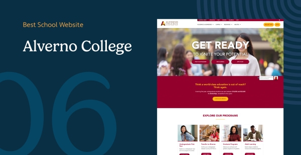
6. Alverno College — Built on Morweb
Milwaukee, Wisconsin, USA
The Standout Feature: A hero that leads with scholarship math — $18,000 to $23,000 renewable for four years — instead of generic mission copy, then backs it with outcomes: ranked #5 by Newsweek, 100% internship placement, and 95% career readiness. The financial commitment comes first. The story follows.
The UX Win: Alverno's competency-based pedagogy — the "8 Abilities" framework — is a primary navigation tab, not an About page paragraph. A program finder surfaces how that pedagogy applies to specific majors. These two decisions together mean that the thing that makes Alverno different from any other liberal arts college in Milwaukee is also the first thing a prospective student can explore. Most colleges bury their pedagogical identity in mission statements. Alverno makes it the organizing principle of the entire site architecture. Built on Morweb's CMS. Visit the site.
What to steal: What is the one thing that makes your school different from every comparable school in your market? That differentiator belongs in your primary navigation, not your About page. If a prospective student or family can't find it in the main menu, it is not doing conversion work.
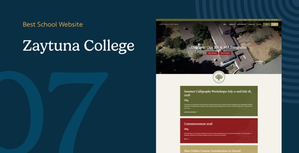
7. Zaytuna College — Built on Morweb
Berkeley, California, USA
The Standout Feature: An interactive academic programs section built around the curriculum — classical Islamic studies integrated with the Western liberal arts tradition — rather than a standard program directory. The curriculum is the product. The site makes it explorable before a student fills out an inquiry form.
The UX Win: Zaytuna is the first accredited Muslim liberal arts college in the United States. That credential is both its strongest selling point and its steepest conversion challenge. Prospective students who find Zaytuna are already curious; the question is whether the site can move them from curious to committed. The interactive programs section answers that by letting a prospective student spend fifteen minutes understanding exactly what a Zaytuna education looks like — the texts, the approach, the integration of traditions — before they ever enter the admissions funnel. That session time converts to higher-intent inquiries, because the students who complete the curriculum explorer are the ones who are genuinely interested.
The typography carries the same strategic logic. The font choices signal academic seriousness and cultural continuity simultaneously — not decorative choices, but a brand position. When the design matches the institution's identity this precisely, it removes cognitive friction for the audience the school is trying to reach. Visit the site.
What to steal: If your curriculum or pedagogy is your primary differentiator, make it the first thing a prospective student can explore, not the last thing they find in a program PDF. Interactive course explorers, curriculum maps, and sample syllabi belong in the primary conversion path. Put them where the curious come first.
"For schools like Zaytuna, the visual choices — typography, spatial composition, color — are the institution's character made visible. The design is not wrapping around the content. It is the argument. When those choices are made with real intention, a prospective student understands the school before they read a single program description."
— Shawn Xiong, Art Director, designed Zaytuna College's website among 30+ school and nonprofit sites
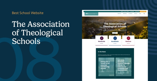
8. The Association of Theological Schools — Built on Morweb
Pittsburgh, Pennsylvania, USA
The Standout Feature: Three icon-driven pillars — Membership, Accreditation, Resources — that turn a complex accrediting body's mission into a one-screen orientation. A visitor understands the organization's structure before they read a single paragraph of institutional copy.
The UX Win: A "Find a School" directory and a four-pillar navigation (Who We Are, Membership, Accreditation, Resources, Events) routes administrators, faculty, and prospective students down separate paths without requiring them to wade through institutional copy to find the right door. This is a useful pattern for any organization that serves multiple distinct audiences with different information needs — and a direct model for school districts whose sites need to serve parents, staff, students, and the community simultaneously. Built on Morweb's CMS. Visit the site.
What to steal: If your school or district serves multiple distinct audiences — parents, prospective families, current students, alumni, staff, donors — consider organizing your homepage navigation around audience paths rather than content categories. "For Parents," "For Prospective Families," and "For Staff" are clearer entry points than "About," "Academics," and "Resources."
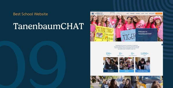
9. TanenbaumCHAT — Built on Morweb
Toronto, Ontario, Canada
The Standout Feature: A visual identity built from Jewish educational symbolism — icons, color, and typographic choices that communicate the school's cultural character immediately, before a prospective family reads a headline. The iconography is not decoration. It is the school's identity made visible at a glance.
The UX Win: TanenbaumCHAT serves two audiences with fundamentally different needs. Current families visit regularly for operational logistics: the parent portal, calendar, lunch menu, emergency alerts. Prospective families visit once, maybe twice, during the school evaluation process: they need to understand what makes TanenbaumCHAT the right choice for their child. Most school websites fail both groups by mixing these content types into a single navigation structure that feels designed for neither.
TanenbaumCHAT separates those paths at the structural level. Current-family logistics live in a consistent, predictable location. Prospective-family content — curriculum, culture, admissions — leads the primary navigation. Neither group has to scan past content meant for someone else. The cultural iconography reinforces the school's mission for both audiences simultaneously: current families see their community reflected in the design; prospective families understand the school's identity before they open a single page. Visit the site.
What to steal: Audit your current site navigation for audience mixing. If Apply Now and the lunch menu appear at the same navigation level, you are asking prospective families and current parents to share a structure designed for neither. Separate those paths at the top level — it is one of the highest-leverage navigation decisions a school can make.
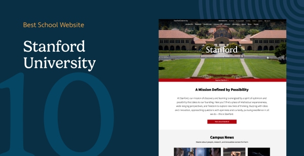
10. Stanford University — Independent Example
Stanford, California, USA
The Standout Feature: A consistent global header and brand system that holds together fully independent school microsites — each with its own homepage, visual language, editorial calendar, and admissions path. A prospective law student lands on a page that looks, feels, and communicates like a law school. A prospective engineering student lands on a page that does the same for engineering. The global header tells them they are at Stanford. Everything below it tells them why that specific school is right for them.
The UX Win: Stanford's challenge is not unique to Stanford. Any school district managing multiple campuses, any K-12 school with separate lower, middle, and upper divisions, or any institution with distinct colleges or programs faces the same architectural question: how do you maintain brand coherence while letting each unit speak directly to its audience?
Stanford's answer is an information architecture pattern that scales: a global layer — logo, primary nav, search — that carries institutional identity across every page, plus a school-specific layer below it that each unit controls independently. The global header signals institutional credibility. The unit-level content does the actual conversion work.
The main homepage's humanized news feed is the other element worth studying. Stanford could fill that space with rankings and research output. Instead it leads with human stories — researchers, students, communities, projects with visible impact. That editorial choice at the most visible page of one of the world's most recognized universities is not accidental. It is a reminder that mission-driven websites at any scale convert better when they lead with people. Visit the site.
What to steal: If your school has sub-brands — divisions, campuses, grade-band sites, programs — build a shared template with a locked global header and unlocked content sections below it. This lets each unit speak to its specific audience while the institutional brand holds everything together. A CMS that supports this pattern saves you from maintaining a dozen independent sites with no common identity.
How Do Public and Private School Websites Differ?
Public and private schools serve different goals, and their websites reflect that.
- Public schools emphasize transparency, resource access, policy documents, and translation tools to serve geographically diverse districts. Cotati-Rohnert Park USD's homepage, for example, anchors an interactive school map with one-tap access to Parent Portal, Calendar, and Transportation — function over decoration, because current families are the primary audience.
- Private and charter schools prioritize storytelling, enrollment conversion, donation forms, and CRM integrations. Their primary audience is prospective families who are choosing, not current families who are enrolled. The stakes of that first impression are higher, and the homepage design reflects it.
Both types benefit from the same underlying principles: separated audience paths, proof before mission copy, and accessible structures that work for every visitor. The execution differs; the strategy doesn't.
The 3 Patterns Every Site on This List Shares
These ten schools span independent K-8 schools, public charter networks, religiously affiliated colleges, a large public university, and an accrediting body. Different audiences, budgets, and platforms. But three things show up in every site that works.
1. They Lead With Proof, Not Mission
Alverno College's homepage leads with scholarship math: $18,000 to $23,000 renewable for four years. Dakota Wesleyan leads with recognition badges and outcome stats. The San Francisco School's hero stat bar puts enrollment size, student diversity, and faculty ratio in the first scroll. None of these sites ask a prospective family to read three paragraphs before understanding why this school is worth considering. They show the proof immediately, then tell the story.
If your homepage leads with "Welcome to [School Name], where we believe every student deserves..." you are asking prospective families to take your word for something they could see in five seconds if you showed them the data. Replace or supplement mission language with one specific, verifiable number above the fold.
2. They Separate Current-Family and Prospective-Family Paths
AGBU uses a Quick Links sidebar for current-family logistics while keeping the main nav focused on prospective families. TanenbaumCHAT does the same structurally. Lakeside Christian anchors the entire homepage on a "Schedule Your Tour" CTA for prospective families, then routes current families through a separate path. The Association of Theological Schools segments its audience at the navigation level before a visitor clicks anything.
A parent who enrolled their child last year and a parent evaluating schools for next fall are visiting the same website for completely different reasons. Designing for both from a single undifferentiated navigation means neither audience feels like the site was built for them. Separate those paths at the top level. It is one of the cheapest, highest-leverage changes a school site can make.
3. The School's Defining Difference Is a Navigation Element, Not a Footnote
Alverno's "8 Abilities" competency framework is a primary nav tab — not an About page paragraph. AGBU's bilingual content is woven into the design as a first-class structural choice, not a translation toggle at the bottom. Zaytuna's curriculum explorer is the homepage centerpiece. What makes your school different should be the first thing visitors can explore, not something they stumble across after they've already decided to look deeper.
Ask yourself: if someone looked only at your navigation bar, would they understand what makes your school different from the next one in a Google search? If the answer is no, your differentiator is doing no conversion work.
"Most schools come to us focused on features — a better calendar, a new photo gallery, a parent portal upgrade. The sites in this post work because someone made a strategic decision first: who are we trying to reach, and what do we need them to understand in the first ten seconds? Features follow from that. They don't substitute for it."
— Murad Bushnaq, CEO & Creative Director, Morweb, over 25 years in web design, 500+ websites built across schools, nonprofits, associations, and healthcare
Essential Features for School Websites in 2026
- Donation and giving tools for one-time and recurring gifts, integrated with your CRM or donor management system.
- Event calendar module with audience filters (Parents, Students, Staff), registration links, and calendar-sync options.
- Accessibility toolkit aligned to WCAG 2.1 AA: font-size toggles, sufficient contrast across all color combinations, alt text on every image, captions on every video, and keyboard-navigable menus.
- Blogging and news engine to publish student stories, program updates, and campus news — the content that builds search visibility and gives families a reason to return between enrollment cycles.
- Parent and student portal integration surfaced at a consistent, predictable location so current families never have to search for it.
- Multi-campus or multi-site support if your school or district runs more than one location — a shared template with independent content editors per site, not a separate CMS installation per campus.
Have Questions About School Web Design?
What should a school website include?
At minimum: core pages — Home, About, Admissions, Academics, Events, News, and Contact — plus a donation path, a parent or student portal, a calendar with audience filters, and an accessible structure aligned to WCAG 2.1 AA. Schools with multiple programs or campuses should also include a program finder or campus map.
How can I improve SEO on a school website?
Use structured data markup (Article, Organization, BreadcrumbList), write page titles and descriptions around the specific queries your prospective families are typing, publish regular news and blog content, and build internal links between related pages — program pages to faculty pages, events to program overviews, news to About. Google uses these connections to understand your site's topical structure.
What specific features make a school website WCAG 2.1 AA accessible?
A contrast ratio of at least 4.5:1 for normal text, full keyboard operability with visible focus indicators, descriptive alt text on every meaningful image, captions and transcripts for video, properly labeled form fields, and a logical heading hierarchy — one H1, then nested H2s and H3s. Every one of these also improves usability for non-disabled users and search engine crawlability.
How can a private school improve homepage enrollment conversion?
Lead with one high-contrast Schedule a Visit button above the fold, supported by a secondary Apply Now. Place authentic student or parent video in the primary scroll path — not below the fold. Follow with short proof points: outcomes, testimonials, third-party recognition. Keep the visit-registration form to the minimum number of fields. The enrollment path should reach an action in two clicks or fewer from any page.
How do I design a school website that works for both current and prospective families?
Separate the two paths at the navigation level. Prospective families need curriculum, culture, admissions, and outcomes. Current families need the portal, calendar, lunch menu, and emergency alerts. If both audiences share a single flat navigation, neither feels like the site was built for them. Give prospective families the primary nav and current families a predictable Quick Links section or secondary nav path.
What platform is best for school websites?
The right platform depends on your staff's technical capacity and your school's content structure. Morweb offers drag-and-drop editing with built-in tools for accessibility, events, multi-campus support, and donations — designed for non-technical teams. Other platforms suit schools with in-house development resources. Whichever platform you choose, prioritize one that your communications team can update without filing a support ticket every time the calendar changes.
Expert Panel
This post was built from firsthand work on the Morweb-built sites above. The contributors below either designed, directed, or audited the sites referenced in this post.
 Bita Goli, Senior Designer (UX & Design Trust Signals) — 5+ years in UX, branding, and typography. Designs donation pages, About pages, and trust sections where the UX has to carry the credibility. Has rebuilt dozens of nonprofit flows where a small design change, clearer hierarchy, visible EIN, a single honest impact number, lifted donations without any new code.
 Shawn Xiong, Art Director (Visual Credibility & Branding) — 20 years in visual design and branding. MFA in Graphic Design. Has led the visual direction for 30+ nonprofit and school sites including Engineers Without Borders USA, Mercy USA, and MEND Poverty, and Zaytuna College. Focuses on the visual credibility cues, typography, color, hierarchy, and photography, that tell donors an organization is real before they read a word.
 Steven Calibo, Digital Strategist (Analytics Behind Donor Behavior) — 15 years in digital strategy. Certified in Google Analytics, Google Ads, HubSpot, and CRO. Brings a measurement lens to trust: which trust signals correlate with completed donations in the analytics, where donors drop off, and what a “healthy” trust page looks like in GA4 engagement data.
 Brent Lafreniere, Digital Director (Transparency Audits) — 19 years in digital. Has audited hundreds of nonprofit sites for transparency, compliance, and donation performance. Acts as the cross-check on every item in this list: does the signal actually hold up when a regulator, a grantmaker, or a skeptical donor lands on the page?

Ready to transform your school's digital presence?
A great school website does not just inform — it inspires. Whether you want to boost enrollment, engage parents, or grow community support, our team can show you how your current site stacks up and what a Morweb-powered redesign would look like for your community.
Explore more school-focused resources:
9 Best Website Builders for Schools and Teachers. Compare the top platforms for building a school website.
The Best College and University Websites. See how higher education institutions approach web design.
Top Nonprofit Website Templates. Browse template ideas for mission-driven organizations.