30 Best Nonprofit Websites + 6 Tips For Designing Your Own


Want an engaging website?
.png?resize=600x0)
In today's digital age, your non-profit website is often the first impression you make on potential donors, volunteers, and community advocates. A well-designed non profit organization website does more than just look good, it actively builds trust, tells your story, and drives your mission forward. Whether you are starting from scratch and need a website for nonprofit success, or you are simply looking to revamp your current digital presence, getting inspired by the best in the sector is the perfect place to start. To help spark your creativity, we have curated a list of the most engaging, high-performing not for profit sites on the web today.
However, creating a top-notch website design for nonprofits can feel impossible, especially if your team is new to using web design tools and tips. Research shows that 75% of online consumers would trust the organization based on its website design.
In this article, we'll showcase 30 of the best nonprofit websites on the internet today, and then set you up to dig into creating your own with a few design tips. Specifically, we'll cover:
- What Should a Nonprofit Website Include
- Best Nonprofit Websites to Get Inspired By
- Tips for Designing Your Own Nonprofit Website
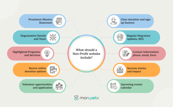
The Essential Functionalities a Nonprofit Website Should Include
Best Nonprofit Websites to Get Inspired By
Designing a high-quality website for your nonprofit doesn't need to be a stressful experience. Once you take the time to study other well-designed nonprofit sites and take note of the design practices you see in action, you'll be well-equipped to make your own website one of the best.
Ready to get inspired? Let's jump right in and look at some of the top non profit organization website examples below:
- Engaging Visual & Video Banner
- Fundraising & Donation Optimization
- User-Friendly & Mobile-Friendly Design
- Interactive & Community Engagement
- Content-Rich & Educational
1. Engaging Visual & Video Banner
.png?resize=600x0)
The combination of dynamic visuals with intuitive navigation serves to not only captivate visitors but also to reinforce the nonprofit's brand identity, mission, and community engagement. This approach is key to making a lasting impact and fostering deeper connections with audiences.
- Community Foundation of Sarasota County
- The Africa Center
- Colorado Ballet
- Red Panda Network
- Brown Girls Doc Mafia
- World Trade Center Institute
Community Foundation of Sarasota County
.png?resize=600x0)
The Community Foundation of Sarasota County (CFSC) is a charitable organization with three areas of impact: community care, empowerment and success, and belonging and culture. Their motto—"Be the One"—reflects the belief that anyone can be a philanthropist and give back to their community, regardless of means.
The community foundation's mission is clear throughout its nonprofit website design. The homepage banner showcases smiling community members and highlights the organization's statement of impact. This not for profit sites has many engaging design elements including smooth mouseover effects and dynamic media galleries. The site looks equally great on mobile devices, with all content seamlessly adjusting to fit smaller screen sizes.
CFSC's navigation menu lends itself to a great user experience. The mega menu organizes the pages in a clean format, and the Donate page is highlighted with a large button.
CFSC's website theme was custom-developed and comes with dozens of prebuilt templates that are consistent with the organization's branding.
Our favorite feature? This website for nonprofit offers a web accessibility feature in the top right corner of its navigation menu. Site visitors can change the font size, switch to greyscale, or change the font in order to improve their viewing experience.
For the functionality of the site, CFSC took advantage of Morweb's nonprofit-specific features, including customizable donation forms, resource galleries, blogs, and event registration and ticketing to best serve their constituents.
The Africa Center
.png?resize=600x0)
The Africa Center is transforming the world's understanding of Africa, its Diaspora, and the role of people of African descent in the world.
The Africa Center's website stands out with its use of a video background, creating an immediate and immersive visual impact. This design element effectively draws visitors in and sets the tone for the center's mission, making the experience more engaging and memorable. The video background also seamlessly integrates with the site's clean, modern layout, enhancing the overall user experience.
Our favorite feature? Interactive elements, such as video background and scrolling animations, create a dynamic experience. Regularly updated blogs and event calendars further connect the community, while clear and well-placed calls to action, such as "Donate" and "Join Us," encourage active participation and support for the center's mission.
Colorado Ballet
.png?resize=600x0)
Colorado Ballet is a nonprofit organization that has been performing world-class ballet in the Denver, Colorado area since 1961.
The greatest strength of this nonprofit website is its jaw-dropping imagery. The site is fully-loaded with beautiful, high-resolution images of dancers in action, but these images especially stand out in its rotating banner. These photos immediately immerse you in the world of ballet and generate interest in Colorado Ballet's upcoming productions.
The site offers a library of video features and information about performances. It also hosts an easy-to-use donation form.
Our favorite feature? The "My Account" page allows frequent ballet-goers to register for an account through which they can easily purchase tickets. You can also use your account to register young ballet performers for classes and intensives.
Morweb empowers organizations like Colorado Ballet to offer secure and easy-to-use password-protected resources like member accounts.
Red Panda Network
.png?resize=600x0)
The Red Panda Network (RPN) is an NGO that has a mission to conserve wild red pandas and their habitats through the education and empowerment of local communities.
The RPN website is a resource for learning about red pandas and the risks they face, and a tool for donating, buying merchandise, and partnering with the organization.
This website has clear branding, with a tasteful red and green color scheme that brings to mind red pandas and their habitats. It also showcases numerous pictures of red pandas and offers quick-to-digest information about RPN's impact on the red panda conservation effort.
The homepage features campaigns that need urgent attention and recent news that allows supporters to stay up-to-date on all things relating to red panda conservation.
Our favorite feature? RPN's website features a page that's just for kids. With a whole slew of fun activities, kids can become "Red Panda Rangers" as they have fun and learn about conserving red pandas. The branding of the page is still clearly connected to RPN's overall branding, but the cartoonish look makes the page extra inviting for a younger audience.
Using Morweb's tools, RPN showcases stunning image galleries, offers an easy-to-use donation form, and facilitates its "Adopt a Panda" program.
Brown Girls Doc Mafia
.png?resize=600x0)
Brown Girls Doc Mafia (BGDM)'s mission is to nurture, amplify, and invest in the creative capacity and professional success of BIPOC* women and nonbinary people working in the documentary industry. BGDM embarked on their journey in 2015, and grew exponentially through back channels and word of mouth. Now an official 501(c)(3) nonprofit, and with 5,000+ members all over the world, the "Mafia" has grown into a movement.
Our favorite feature? From the moment you land on the homepage, you're met with strong imagery and sleek design elements that immediately communicate the organization's mission of empowering women of color in documentary filmmaking. The video banners and high-quality visuals set a professional and inclusive tone, enhancing emotional connection with visitors.
The use of these visual elements is crucial for nonprofits like Brown Girls Doc Mafia because they not only grab attention but also help convey the organization's story in an impactful way. In a digital space where first impressions matter, this feature draws visitors in and encourages deeper exploration of the site, while also fostering engagement with the community and potential donors.
World Trade Center Institute
.png?resize=600x0)
The World Trade Center Institute (WTCI) seeks to empower globally-minded leaders from the Mid-Atlantic with ideas and connections that drive business growth and global good.
WTCI clearly displays this mission on its homepage and from the outset gives website visitors four different ways to get involved with its work—events, insights, fellowships, membership, and global exchanges. Its homepage also features stats that illustrate the organization's impact and a "Faces of WTCI" section that highlights the contributions of individual members.
Our favorite feature? WTCI has a clear "Subscribe" form at the bottom of main category page that invites visitors to stay in the loop by signing up for their email newsletter.
With Morweb's tools, this website can be easily updated and added to as WTCI offers different events and opportunities to its members.
2. Fundraising & Donation Optimization
.png?resize=600x0)
When prioritizing user-friendly donation experiences with features like streamlined donation forms, recurring gift options, transparent fund allocation and easy navigation to giving opportunities, your nonprofit website effectively guides visitors through the donation process, boosting donor engagement and finally maximizing support for their causes.
- The Dayton Foundation
- Mercy-USA
- Mobilize Recovery
- Fredericksburg Regional Food Bank
- buildOn
- Elton John AIDS Foundation
The Dayton Foundation
.png?resize=600x0)
Since 1921, individuals, families, organizations and others have partnered with The Dayton Foundation to transform lives and make a lasting, positive change in Greater Dayton.
The Dayton Foundation family of more than 4,100 funds represent a diverse group of individuals who share a common goal, that is to help others and support causes important to them. It offers short- and long-term fund options that meet the giving and financial needs now and in the future.
The Dayton Foundation - an award winning nonprofit website is a visually striking and professional platform, expertly designed to inspire community engagement and philanthropy. The clean layout, combined with bold imagery, emphasizes their mission and effectively highlights the diverse services they provide. Key sections, such as For Donors, For Nonprofits, and For Advisors, are strategically placed to ensure easy navigation, allowing visitors to quickly access critical resources like scholarships, grants, and ways to contribute. This thoughtful design not only enhances the user experience but also strengthens the foundation's commitment to serving diverse audiences.
Our favorite feature? It's the Interactive Fund Finder, offering donors a personalized and impactful way to contribute to various causes. This tool allows users to explore various fund options based on their philanthropic goals, such as donor-advised funds, field-of-interest funds, and scholarship funds. It helps donors navigate through different giving opportunities to select the one that aligns with their values and desired impact.
Mercy- USA
.png?resize=600x0)
Mercy-USA is dedicated to alleviating human suffering and supporting individuals and their communities in their efforts to become more self-sufficient.
The Mercy USA website features a streamlined, intuitive design that using a clean layout with ample white space, making navigation easy and ensuring that key information stands out.
Our favorite feature? The website excels in visual storytelling, using impactful images and videos to highlight Mercy-USA's humanitarian efforts. It also features a straightforward donation process, with a prominently displayed "Donate" button that makes contributing easy. The combination of clear calls to action and engaging multimedia content creates a user-friendly experience that encourages visitor interaction and support. Rich content, including detailed reports and success stories, provides transparency and keeps users informed about the impact of their contributions.
Mobilize Recovery
_(1).png?resize=600x0)
Mobilize Recovery is a non-profit website that seeks to bring together activists, supporters, and partners to come up with sustainable action plans for resilient recovery communities.
The mission of Mobilize Recovery is to change America's perception of the recovery process by backing 23 million citizens who have successfully recovered from addiction.
This organization focuses on achieving results and creating informed and supportive environments. Sections such as "Our Programs" & "Initiatives," "Latest News," or "Support Our Work" appear on the home page to help users easily navigate through some programs, be updated about news, and participate in its activities.
Our favorite feature? The platform highlights Naloxone's role as a lifesaver medication that rapidly reverses overdoses related to the opioid crisis happening in America today.
Fredericksburg Regional Food Bank
Why This Nonprofit Website Is One of the Best?
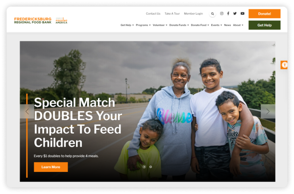
Fredericksburg Regional Food Bank, its website stands out with its clean, user-friendly design that effectively highlights its mission - eliminate hunger. The homepage's clear layout and well-organized navigation make it easy for visitors to find essential information quickly.
Our favorite feature? The website's mission-focused design, with impactful imagery and statistics, immediately conveys the urgency of hunger relief. It effectively engages users with clear calls to action like "Donate" and "Volunteer," while the well-organized "Get Help" section ensures easy access to essential resources. Emphasizing donor and volunteer involvement, the site highlights the impact of contributions and offers various ways to get involved.
buildOn
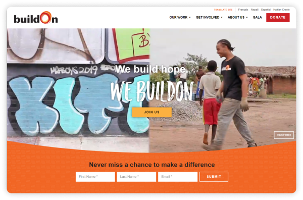
buildOn is a movement dedicated to breaking the cycle of poverty, illiteracy, and low expectations around the world. The organization offers Service Learning Programs to mobilize students in under-resourced urban areas and uplift communities.
The organization's website utilizes captivating videos and imagery to convey its mission and communicate its various programs and services. The site does an excellent job of guiding visitors to its donation page.
Our favorite feature? buildOn has a unique donation page that highlights the organization's global impact and options for how supporters want their donations to be used. The form itself is extremely straightforward and guides donors through the giving process.
Elton John AIDS Foundation
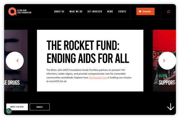
Elton John AIDS Foundation has one goal—to end the AIDS epidemic. The foundation funds partners that provide medical treatment and fight stigma.
Elton John AIDS Foundation website exemplifies effective nonprofit design, balancing both elegance and functionality. With a focus on storytelling, the homepage features bold imagery and compelling calls to action that reflect the foundation's commitment to ending the AIDS epidemic.
Key features include a streamlined donation process and interactive sections that highlight the impact of donor contributions. The site also boasts an informative global impact map, visually showcasing the foundation's reach, and an easy-to-navigate structure, making it simple for users to explore their mission, programs, and ways to support.
Our favorite feature? When you land on the Elton John AIDS Foundation site, you are first met with an introduction video that sets the tone for the rest of the website experience. The images and music in the video highlight the severity of the AIDS epidemic while also bringing hope that there is work to be done to save and improve lives.
3. User-Friendly & Mobile-Friendly Design
.png?resize=600x0)
With the increasing number of users accessing websites via mobile devices, having a responsive design is essential for maximizing engagement and driving action. By ensuring that nonprofit organizations improve their ability to connect with supporters, encourage donations, and expand their reach. This focus on usability enhances the impact of their digital presence, ensuring that visitors stay engaged and can quickly take action—whether it's signing up, donating, or exploring their resources.
- Education Alliances
- Prairie State Legal Services
- Teamsters Local 911
- Greenwich YMCA
- Athabasca University Graduate Students' Association
- Bill & Melinda Gates Foundation
- MAHUBE-OTWA Community Action Partnership, Inc.
Education Alliance
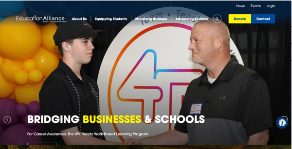
The Education Alliance is an independent voice, earnest advocate, and statewide participant that advances policies and practices to continually improve public school student achievement in West Virginia. It commemorated 40 years of school business partnerships and celebrated the donors and programs that are part of its rich history.
The Education Alliance website demonstrates a well-executed design that prioritizes user experience, accessibility, and effective communication of the organization's mission and activities.
Our favorite feature? Its mobile-friendly approach and clean, intuitive layout are particularly noteworthy features that contribute to its overall effectiveness. The site is indeed optimized for mobile devices, demonstrating responsive design principles. This ensures a seamless experience across various screen sizes and devices, including adaptive layout that adjusts to different screen dimensions, touch-friendly navigation elements, and readable text sizes on smaller screens without the need for zooming.
Based on the statistics of 2024 NPTforgood study, mobile users represented 52% of all visits to nonprofit websites, with 48% of traffic from users on desktop devices. Nonprofit can't miss those half of consumers from mobile!
Prairie State Legal Services
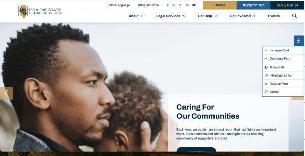
Since 1977, Prairie State Legal Service (PSLS) envisions a community where all low-income, elderly and vulnerable people have ready access to legal services to meet their basic needs and where everyone knows, understands and can exercise their rights and be treated fairly in their pursuit of justice.
The design of the PS Legal website is exemplary in its user-centric approach, featuring a clean and intuitive layout that facilitates easy navigation. The top-level navigation bar provides clear access to key sections such as Services, About Us, and Resources, while the responsive design ensures a seamless experience across devices. Prominent calls-to-action guide users efficiently to relevant information and contact options, and the well-organized service overview on the homepage allows for quick understanding and engagement with their offerings.
Our favorite feature? The PS Legal website incorporates several accessible features to ensure an inclusive user experience. It adheres to best practices for web accessibility, including a responsive design that adjusts to various screen sizes and devices, enhancing usability for users with different needs. The site uses clear headings and well-organized content to aid navigation for users who rely on screen readers. High-contrast text and background combinations improve readability, and straightforward language helps users quickly understand the site's purpose and services. These features collectively contribute to a more accessible and user-friendly experience for all visitors.
Teamsters Local 911
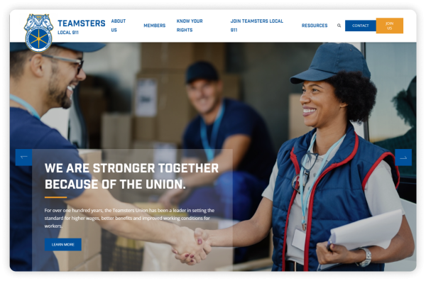
Teamsters Local 911 is a California affiliate of the International Brotherhood of Teamsters, a labor union in the U.S. and Canada. This organization specializes in contract negotiations, leadership training, and political participation.
Teamsters Local 911's website has a clean, professional design that provides clear information about the purpose of the organization and how to become a member.
The site's branding stands out in particular, matching up with the organization's logo and creating a cohesive look and feel throughout the entire site. This branding extends to Teamster Local 911's "Contact" and "Join Us" pages, which are branded to look consistent with the rest of the site instead of looking like suspicious third-party pages.
Our favorite feature? The organization's "Know Your Rights" page offers helpful information about representational rights, the Family Medical Leave Act, and Weingarten rights that empower members to take action to improve their working lives.
Greenwich YMCA
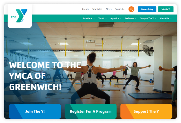
The YMCA of Greenwich has a rich history dating back to its founding in 1916 as a gift from Mrs. Nathaniel Witherell. When the YMCA first opened, it offered short-term housing that was seen as a more wholesome alternative to the seedier boarding houses of the time. Over the past century, it has evolved from a small community organization into a cornerstone of the Greenwich community, dedicated to promoting healthy living, youth development, and social responsibility.
The Greenwich YMCA website offers a clean and welcoming design, effectively reflecting the organization's mission to promote healthy living and community engagement. The homepage greets visitors with vibrant, high-quality imagery, showcasing the various activities and programs available, from fitness classes to youth programs. The navigation is intuitive, ensuring users can easily find information about memberships, schedules, and events. A standout feature is the Programs & Classes section, which is well-organized and allows users to filter offerings based on their interests, making it easy for families and individuals to explore available activities.
Our favorite feature? Its Membership & Join section provides clear information on membership tiers and pricing, encouraging new sign-ups. The site also promotes community involvement through its Giving and Volunteer Opportunities sections. Mobile-friendly and accessible, the website effectively connects users to the YMCA's services. This website is a great example of what NGOs can accomplish with an accessible content management system.
Athabasca University Graduate Students' Association
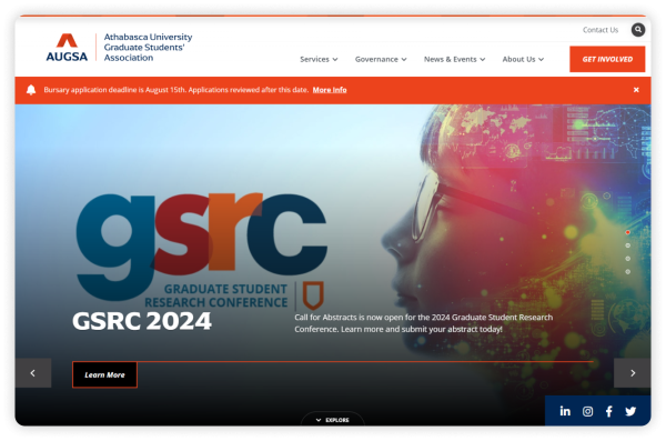
The Athabasca University Graduate Students' Association (AUGSA) offers services and representation for AU graduate students through university and government relations. The organization strives to ensure graduate-level education at the university is accessible, affordable, and of high-quality.
From the moment you land on the AUGSA homepage, it becomes clear who the target audience is. By using high-quality images of students, classrooms, and graduation, AUGSA communicates that it is an organization dedicated to improving the student experience at AU.
The website features a clear "Get Involved" button in its static menu and a newsletter sign-up in its footer, encouraging students to engage with all of its operations.
Our favorite feature? The "Governance" page has all the resources a website visitor needs to bring themselves up to speed on AUGSA's operations. From policies to meeting minutes, website visitors have a wealth of knowledge at their fingertips that can help them orient themselves on everything AUGSA is doing to improve graduate-level education at AU.
Bill & Melinda Gates Foundation
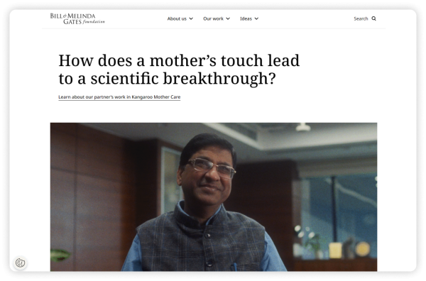
The Bill & Melinda Gates Foundation is a nonprofit organization dedicated to fighting poverty, disease, and inequity around the world for more than 20 years.
The Bill & Melinda Gates Foundation website is an impressive example of nonprofit web design. Its clean, modern layout is visually appealing while effectively communicating the foundation's mission. The homepage features impactful imagery and concise messaging, drawing attention to key initiatives like global health and education. Its user-friendly navigation, makes it easy for visitors to explore areas of interest such as funding opportunities, news, and research. The dynamic content updates regularly with stories and progress reports, keeping the audience engaged and informed.
Our favorite feature? The website's interactive timeline tells the history of the foundation with engaging images and stories. Users can scroll down the section to get a high-level overview of the organization's growth over the years.
The Bill & Melinda Gates Foundation built its website on Sitecore. Sitecore is a powerful CMS that is ideal for large organizations that require highly customized, interactive features.
This CMS requires a knowledgeable web developer to create the website and updating it can be tricky for non-technical designers. Partnering with a skilled Sitecore web design agency will ensure your nonprofit has the resources to build your nonprofit website and keep it updated.
MAHUBE-OTWA Community Action Partnership, Inc.
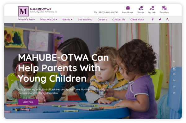
MAHUBE-OTWA's mission is to eradicate poverty by promoting self-sufficiency in children, adults, and older people.
Its website is branded to look consistent with its logo, using a purple and white color scheme that is both eye-catching and professional. With an easy-to-use menu and clear buttons for "Board Login," "Donate," "Get Help," and "Translate," this website is designed to help its audience get information and complete important tasks.
Our favorite feature? The KIOSK MENU at Mahube-Otwa Community Action Partnership provides quick links to necessary services and applications. Energy Assistance Applications, Housing Intake Forms, Head Start (English & Spanish), Early Learning Scholarships, SNAP Benefits Applications are among the items offered. Job listings with MAHUBE-OTWA, job searches through Indeed.com, Rural MN CEP opportunities and general internet search capabilities for employment resources.
The MAHUBE-OTWA website was built using Morweb's easy-to-use CMS platform. Morweb's nonprofit-specific web design features make it easy to include all of the elements relevant to nonprofits, including easy-to-use, built-in donation forms.
4. Interactive & Community Engagement
.png?resize=600x0)
Below nonprofits' community engagement efforts are particularly notable, as they foster connections through social media integration, interactive blogs, and forums where supporters can share their experiences. This level of interaction not only strengthens community bonds but also keeps visitors coming back to stay informed and involved.
Each of these organizations has developed interactive elements like live event calendars, volunteer sign-up forms, and educational resources that encourage visitors to actively participate in their cause.
- The Center for Collaborative Study of Trauma, Health Equity, and Neurobiology
- First Stage
- Rain
- Oahu Society for the Prevention of Cruelty to Animals
- IGNITE Pathways
- Rainbow Community Care
The Center for Collaborative Study of Trauma, Health Equity, and Neurobiology
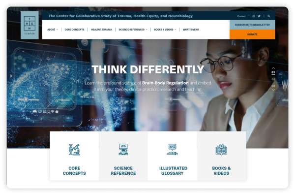
The Center for Collaborative Study of Trauma, Health, Equity, and Neurobiology (THEN Center) works toward health, equity, and justice for all by researching the direct connection between trauma, chronic disease, and health disparity.
THEN Center's website features a wealth of educational resources to explain the connections between trauma, chronic disease, and health disparity. On top of providing information about core scientific concepts, it also offers resources to help visitors learn about preventing and healing trauma and preventing discrimination.
THEN Center's main call-to-action is to get people to sign up for its newsletter, which is apparent with its large "Subscribe" buttons and footer fields.
Our favorite feature? THEN Center offers a "What's New?" page that visitors can navigate to in order to learn about the most recent updates on THEN Center's research. This easy-to-find, one-stop-shop is a great resource for those who want to keep up with THEN Center's work.
First Stage
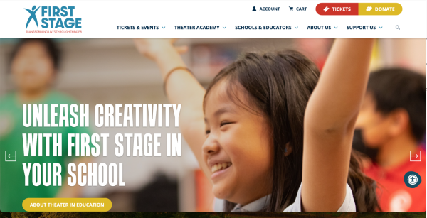
As one of the nation's most acclaimed theaters for young audiences and families, First Stage touches hearts, engages minds, and transforms lives by creating extraordinary theater experiences for young people and families through Professional Theater Productions, unparalleled Theater Academy training, and dynamic Theater in Education programs.
The First Stage website features a vibrant and engaging design that effectively captures the essence of a dynamic performing arts organization. Its best design elements include a visually appealing layout with bold colors and high-quality images that reflect the energy and creativity of their productions. The intuitive navigation menu allows users to easily explore various sections, such as upcoming shows, educational programs, and ticket purchasing options.
Our favorite feature? Its engaging, interactive program highlights that visually showcase their offerings and make it easy for users to explore and connect with their initiatives.
RAIN
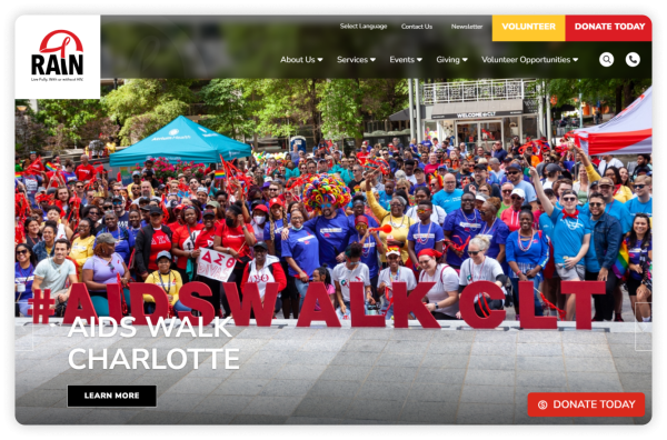
RAIN was founded in 1992 to empower people living with HIV and those at risk of HIV to be healthy and to live stigma-free.
This organization offers a number of ways to get involved like volunteering, serving as a social media ambassador, and donating. They clearly promote these opportunities with bright yellow and red call-to-action buttons. In addition, RAIN also offers a wealth of information about their services for those affected by HIV, like testing, counseling, and support groups.
Our favorite feature? We love RAIN's donation wishlist page, which provides a list of goods and services that RAIN's current clients need. This page helps supporters know what they can do or give to be as effective as possible in the current moment.
Oahu Society for the Prevention of Cruelty to Animals
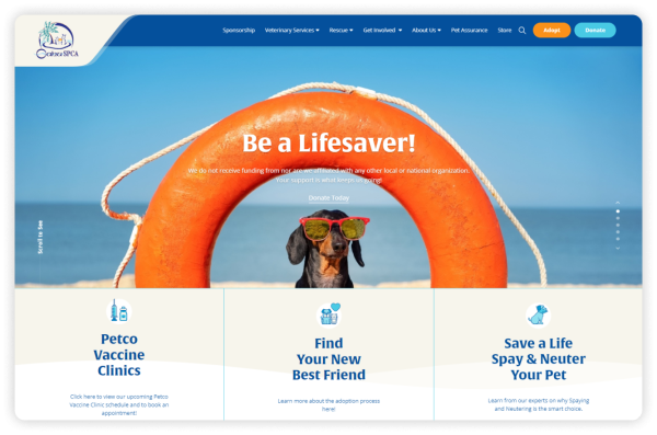
The Oahu Society for the Prevention of Cruelty to Animals (SPCA) is a no-kill animal shelter in Oahu, Hawaii.
Just like its mission, the organization puts animals at the forefront of its website, including pictures of cats and dogs on its homepage, and gives website visitors ideas for how they can support the Oahu SPCA's work.
Halfway down the homepage, the organization features a video with moving images and music that reinforce the importance of animal wellbeing. The website also offers an easy-to-fill-out newsletter sign up.
Our favorite feature? Oahu SPCA's donation page stands out for its sleek and thoughtful design. The page includes a picture of a cute cat and a reminder of the organization's mission at the top. When you move on, you'll find the Below are suggested donation amounts a donor can select, as well as an option to donate a monthly contribution. Then there are two clear sections a donor must fill out to complete their donation.
The look of the website is consistent from page to page, including the donation page, which helps tie the entire site together and centers visitors on what matters most—this nonprofit's mission to protect and rehome animals on Oahu.
IGNITE Pathways
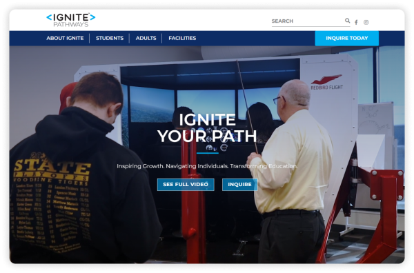
IGNITE Pathways is an organization for students who want to learn by doing. With its transformational approach to education, IGNITE Pathways sets students up to earn college credits and industry certifications.
This organization's website has a clean, simple design that provides an overview of the organization's purpose from the get-go. With engaging video content on the homepage, you're soon pulled into learning about IGNITE Pathway's story and offerings. The homepage showcases the program's impact, listing information like the number of certification programs offered and the amount of money saved in college costs, as well as the students' feedback on the training.
Our favorite feature? IGNITE Pathways has an easy-to-fill-out "Inquire Today" form that can help website visitors kickstart their own participation in the organization's programs. It's quick to fill out and doesn't ask for too much information, which increases the likelihood of interested people filling it out and submitting it to the organization.
Morweb empowers the organization to offer an easy-to-access contact page and form, and clear and effective CTA buttons that encourage visitors to take action on the information they get about IGNITE Pathways.
Rainbow Community Care
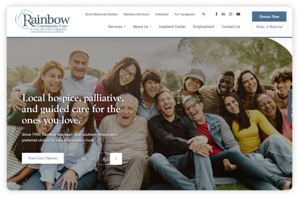
Rainbow Community Care provides advance care planning, care management, hospice care, and community bereavement support in southern Wisconsin.
The homepage features service briefs that clearly convey the website's purpose. A key highlight is the testimonials, which provide authentic insights into the effectiveness of its services.
The "Donate Now" and "Make a Referral" buttons stand out with bright, inviting colors, capturing visitors' attention and encouraging them to take action. Additionally, visitors are invited to engage with Rainbow Hospice Care on social media, with social media icons conveniently located in the static menu and footer.
To stay updated on announcements and news, the "Subscribe" button at the bottom of the page is highly beneficial.
Our favorite feature? This website's "Employment" page offers clear information about currently available job opportunities and links out to job descriptions and an application portal.
5. Content-Rich & Educational
.png?resize=600x0)
For nonprofits, having content-rich websites is vital as it helps educate their audience, promote transparency, and build trust. These organizations use their platforms to showcase research, success stories, and educational materials that provide in-depth knowledge of their missions. This approach not only engages visitors but also supports long-term learning, community engagement, and donor confidence. By presenting rich, well-organized content, nonprofits create an authoritative online presence that elevates their cause and reinforces their impact.
- The Association of Theological Schools and The Commission on Accrediting
- New Futures
- Turning Point
- The Wilderness Land Trust
- Earth Discovery Institute
The Association of Theological Schools and The Commission on Accrediting
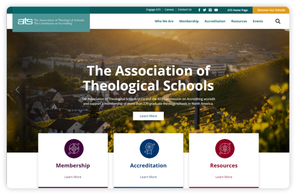
The Association of Theological Schools (ATS) and its sister group, The Commission on Accrediting, share one mission: to promote and enhance theological schools, thereby benefitting communities of faith and the broader public.
This dedication to the enhancement of theological schools is reflected on ATS's website. On the homepage, rolling banner images set the tone for the website with places of worship and people working together to learn. In addition, the "In the News" blog roll and "Upcoming Events" calendar on the homepage invite visitors to engage with the site right away.
Our favorite feature? The ATS website features distinct social media icons in the header and footer of the site. These invite visitors to further engage with the organization on other platforms.
With Morweb, ATS was able to build a website that clearly communicates its brand and mission. The organization has also been able to easily add valuable resources for its administrator and faculty member audience and create a private Canvas portal for its users.
New Futures
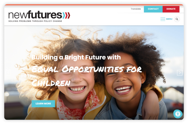
New Futures has provided nonpartisan, evidence-based solutions to New Hampshire's health challenges for over 25 years.
Our favorite feature? The New Futures website features a clean, modern design that enhances readability and user experience, with a clear focus on its mission to support education and career opportunities. Engaging content, including success stories and news updates, showcases the organization's impact, while comprehensive resources provide easy access to essential information for users.
Turning Point
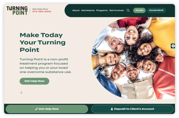
Turning Point, is a non-profit treatment program focused on helping you or your loved one overcome substance use.
Our favorite feature? The Turning Point website effectively communicates its mission with compassionate and clear messaging, creating an inviting atmosphere that builds trust with visitors. Designed with accessibility in mind, it features easy-to-read fonts and clear contrasts, ensuring it is usable across different devices and by individuals with visual impairments. Additionally, the site emphasizes community engagement through sections on events, success stories, and opportunities for involvement, fostering a sense of connection and support.
The Wilderness Land Trust
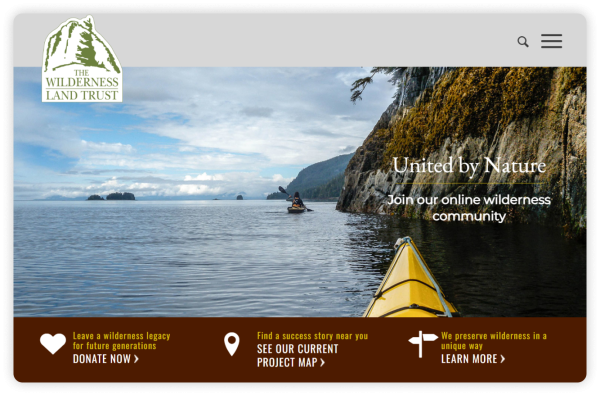
The Wilderness Land Trust (WLT) works to acquire private lands and transfer them to public ownership, thereby protecting wilderness.
WLT's website is imagery-rich, inviting website visitors to get a taste of the beautiful lands WLT strives to protect. The rotating banner on its homepage showcases various terrains that evoke a deep appreciation for the outdoors. Additionally, the facts provided about the extensive reach of its services enhance the website's credibility and trustworthiness.
Another element of the WLT homepage is the stats and map that showcase the organization's impact. These numbers, paired with the map graphic, ensure that everyone who encounters the website will understand just how important WLT's work is.
Our favorite feature? We love WLT's blog-style "Stories" page. Each entry tells the story of a different place and the people who have worked to protect it. The stories combine high-quality images with well-written text to further showcase WLT's impact.
Earth Discovery Institute
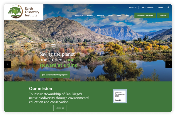
The Earth Discovery Institute (EDI) is another nature-focused nonprofit. This organization seeks to encourage stewardship of San Diego's native biodiversity through education and conservation efforts.
The first thing you notice when you land on the EDI homepage is the buttons that encourage you to "Become a Member" and "Donate." With their bright green coloring and strategic placement in the center and top right corner of the page, it's no wonder that they catch your eye.
The homepage also invites visitors to explore each of EDI's programs with easy scroll-over capabilities, and illustrates the organization's impact with customized icons.
Our favorite feature? EDI has live X and Instagram feeds on its homepage, showing thatthe organization is extremely active online. Visitors can easily click through each post to share, like, and comment, further spreading EDI's mission to the world.
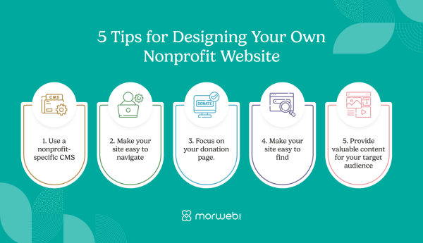
Tips for Designing Your Own Nonprofit Website
Now that our list of best nonprofit and NGO websites has inspired you to begin designing your own organization's website, you may be wondering, "How do I get started?" and "What tools do I need?"
Look no further. In this section, we'll explore five essential tips to kickstart your design journey and help you create a standout website.
1. Choose the Best Platforms to Create Nonprofit Website
As you likely noticed while reading through the list of best nonprofit websites, there are a number of different website builders you can use to create a site. Morweb and WordPress are two examples of website builders, also known as content management systems (CMSs).
While generic CMS platforms (WordPress, Squarespace, Drupal, Ghost, Hubspot, etc.) come with a lot of capabilities, you'll often need to spend a lot of time getting used to these platforms' tools and learning some code to make your website exactly what you want it to be.
On the other hand, a nonprofit-specific CMS is built with your needs in mind. It keeps things simple, so that you don't have to spend excessive amounts of time and money achieving a website look that exceeds you and your supporters' expectations. Instead of a steep learning curve and the need for tons of plugins and widgets, you'll find front-end editing tools, seamless customization capabilities, and more.
2. Make Your Site Easy to Navigate
A great-looking website won't do your cause much good if it's difficult to use! As you're designing, prioritize navigation. When you create your site menu, try thinking about it from a website visitor's perspective and anticipating their needs. For example, if you know that most of your website visitors come to give and learn more about your cause, you might include links to your donation page, "About Us" page, most recent annual report, and your blog at the top of the menu.
You should also keep your menu simple. It may be tempting to create a mega menu with multiple sub-menus, but that may just confuse and frustrate website visitors, like a 10-page dinner menu at a diner. Stick to just a few menu items, and break up your menu by including call-to-action buttons throughout your site that link to important pages you want to be sure your visitors see.
3. Focus on Your Donation Page
For nonprofits like yours, your donation page is of paramount importance. If you're short on time to design your website, focus most of your attention on your donation page. After all, this is where your supporters come to show their support!
Here are a few design best practices you should implement on your donation page:
- Brand your donation page to match the rest of your website. This will show that your donation page is trustworthy and that donors can be sure their personal information will be secure with your organization. Plus, it will professional to have your donation page branding be consistent with the look of the rest of the site.
- Include multiple ways to give. Many of the nonprofits included in our list of the best nonprofit websites offer multiple ways to give on their donation pages. Why? Because donors love to have options! Customizing the giving experience to their needs make it more personal and meaningful. Consider offering the option to make a donation a recurring monthly gift, the chance to check for matching gift eligibility, or to dedicate the donation to a loved one.
- Keep form questions to a minimum. Donors want a donation experience that is fast, easy, and convenient. Keep it simple by only asking for necessary information, like contact information and payment details. If you do want to request further information, mark additional questions as optional.
Your donation page is one of the most important assets your nonprofit has for pulling in support. By using these three best practices, you can ensure your donors will return to use it again and again!
4. Make Your Site Easy to Find
Great design is only useful if potential supporters actually see your website, so it's important to get your web pages in front of the right audience! Luckily, there are resources available to help you drive traffic to your website and market all your hard work.
The Google Ad Grant program provides $10,000 each month in free advertising credits to eligible nonprofits. The grant can be used to create Google Ads targeting specific keywords so that nonprofits websites show up at the top of the search engine results page (SERP).
However, your nonprofit must maintain the quality of its website and ads in order to continue receiving the grant each month. To monitor this, you can use the following tools:
- Google Search Console: This tool gathers website performance metrics to help you create and track valuable content for your website. You can use it to learn what search queries bring people to your website, what websites link back to yours, whether or not searchers can use your website on their mobile devices, and more!
- Google Analytics: This tool gives you a well-rounded view of your Google Ads performance, including identifying engagement metrics and conversion drivers. Using this data, you can measure how much traffic your website is bringing in, how long visitors stay on your site, and other important information to help you gauge the effectiveness of your content.
- Google Trends: This tool can help you explore the trends of searches over time to better understand what internet users are looking for. That way, you can cater your website content to meet their needs and attract more visitors!
By optimizing your website and your Google Ads, your nonprofit will reap the benefits of search engine marketing, including a broadened reach and greater audience understanding. When your website connects more specifically to a greater audience, you'll engage more and empower support for your cause!
5. Provide Valuable Content for Your Target Audience
If maintaining top-tier website navigation is your first priority, providing valuable content should be your second. To create compelling content for your specific website audience, answer these questions:
What Blog Topics Would They Be Interested in Learning More About?
Your blog roll or resource hub is a go-to place for many visitors who are interested in learning more about your cause, values, and recent projects. So, if your website keeps an updated blog, it's important to share your thoughts on topics that are relevant to both your nonprofit and your supporters.
For example, The Community Foundation of Sarasota County's blog titles provide insight into their operations while giving value to the reader. Topics like "Why Should I Choose a Community Foundation Donor Over a Commercial Advised Fund?" anticipate reader's questions and provide straightforward answers that inform curious visitors. Though not lengthy, the article gives valuable information about the organization's services in a way that educates new or potential clients.
What Would Inspire Them to Take Action?
Testimonials, impact reports, and related statistics can help readers visualize the importance of your cause.
Another way you can incorporate this strategy is by zooming in on the lives you've impacted by using individual testimonials. As a example, buildOn's blog does a great job of highlighting individual stories that describe their value of leading through service and invite readers to join in.
By considering what your visitors would like to know more about, you'll transform your website into a relevant resource. Additionally, think about targeting not only your current audience but also related ones. An organization wanting to connect with companies thatdonate to nonprofits, for instance, could create a dedicated corporate philanthropy page explaining why and how corporate partners can get involved.
6. Partner with a Dedicated Nonprofit Web Design Firm
While modern platforms make it incredibly easy to manage your content, designing your initial site architecture and strategy from scratch can still be a heavy lift for a busy team. If you want to ensure a flawless, high-converting launch without draining your internal resources, investing in professional nonprofit website design services is a smart move. A specialized nonprofit web design firm understands the unique digital challenges organizations face, from mapping out the perfect donor journey to ensuring strict ADA accessibility compliance. By partnering with experts to design your foundation, you get a stunning, strategically built website that your team can then easily manage and update moving forward.
Frequently Asked Questions (FAQ)
How do I find a nonprofit organization's website?
If you are looking for design inspiration or want to support a specific cause, the best way to find a nonprofit organization's website is to browse design showcases published by top nonprofit website design companies. You can also search trusted charity databases like GuideStar or Charity Navigator, which link directly to verified not for profit sites.
What are the most modern platforms for nonprofit and charity organization websites?
When evaluating modern platforms for nonprofit and charity organization websites, it is crucial to choose a Content Management System (CMS) built specifically for your sector. Generic website builders require clunky third-party plugins for donations. Instead, the best platforms to create nonprofit website experiences like Morweb will offer built-in fundraising tools, event registration, and accessible layouts right out of the box.
How much do nonprofit website design services cost?
The cost to build a nonprofit website depends heavily on the route you choose. DIY website builders have low monthly fees but require a massive time investment from your team. Conversely, hiring a professional nonprofit web design firm can range anywhere from a few thousand dollars to much more for enterprise-level custom builds. Ultimately, investing in expert website design for non profit organizations pays for itself by dramatically increasing your donor conversion rates.
What makes the best websites for nonprofits stand out?
The best websites for nonprofits all share a few core traits: they are incredibly fast, mobile-responsive, and donor-centric. Expert non profit web designers know that your primary "Donate" button should be highly visible, and your mission should be clearly stated above the fold using authentic, high-impact imagery.
The Additional Resources
Equipped with inspiration from the best nonprofit websites and some basic design tips, you're ready to create or revamp your nonprofit website!
When focusing on web design for nonprofits, continue to learn from other websites' best qualities and consider the audience you're designing for. This is a surefire way to create an online resource for your cause that will stand the test of time!
Want to learn a bit more about nonprofit website design? Check out these additional resources:
- Find the Best Nonprofits Website Builders: 10 Top Options. Right CMS can make all the difference in your website design journey. Check out all of the website builders available for nonprofit use!
- Top 10 Nonprofit Payment Processors: Accept Donations Online. Having a payment processor that integrates with your CMS is an important part of hosting a healthy website. Learn all about payment processing and check out 10 top providers!
- Medical Website Design: The Ultimate Guide + Best Examples. There's no need to limit your web design research to the nonprofit sector. Check out these medical website design examples and best practices!
