

Before most donors type a credit card number into your donation page, they are running a quiet audit of your website. They are looking for the organization behind the mission, the finances behind the story, and the people behind the brand. This is the research-backed checklist we use when we audit nonprofit sites for trust, organized by the order donors actually scan.
The nonprofit website trust checklist is not a branding exercise. It is a list of the concrete signals a first-time donor checks, often in under ninety seconds, to decide whether your organization is safe to give money to. We compiled this list from three inputs: user-testing sessions we have run on live nonprofit sites, third-party research from Candid, GuideStar, and BBB Wise Giving, and the patterns our team sees when we audit sites that are underperforming donations relative to their mission. The twenty-seven items below are the ones that move the needle on donor behavior, ranked by how early in the scan they appear.
If your nonprofit is losing donations to the “I just need to double-check something” tab switch, one of these signals is almost always missing. This guide is built for executive directors, development directors, and board members who want a shared checklist they can run against their own site tomorrow morning, plus a prioritized path for what to fix first if everything cannot happen at once.

Quick answer: Donors check roughly twenty-seven specific signals on a nonprofit website before giving, in a predictable order. First identity and legitimacy (name, EIN, 501(c)(3) status, HTTPS, address), then financial transparency (990, annual report, third-party ratings), then mission and impact, then the people behind the work, and finally the donation UX itself. The highest-impact fixes are the ones a donor sees in the first thirty seconds: a mission sentence above the fold, a visible 501(c)(3) and EIN in the footer, and a donation page that looks like the same website they just came from.
331saverage engagement time on nonprofit transparency content, the highest category on our blog |
27specific trust signals donors look for before giving, grouped into five zones |
< 90stypical time a first-time donor spends scanning your site before deciding to give or leave |
Why Trust Signals Are the Single Biggest Conversion Lever on a Nonprofit Website
Donors do not abandon donation pages because the copy is wrong. They abandon because something they expected to see is missing, and they cannot tell if that missing thing is an oversight or a red flag.
The nonprofit web is crowded with well-meaning organizations that do real work and still lose donations to a competitor with a cleaner trust story. In our user-testing sessions, the pattern is consistent. A donor arrives through a social post or an email appeal, spends eight to fifteen seconds on the homepage, clicks once into About or Financials, and then either returns to the donate button or tab-switches to check you on Charity Navigator. If what they find in that check is ambiguous, they do not come back.
Research from Candid’s 2024 Donor Trust Index and BBB Wise Giving’s annual donor survey points the same direction. Donors consistently rank financial transparency, clear impact, and honest communication as the top three factors in their giving decisions, well above brand recognition or logo design. The good news is that every one of those factors is expressed through signals you control on your website. The twenty-seven items in this checklist are the vocabulary of that expression.
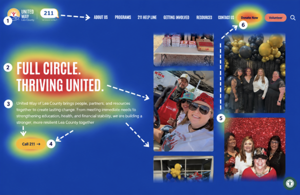
Image: Annotated heatmap of a typical nonprofit homepage showing where first-time donor eyes go in the first ninety seconds: logo, mission sentence, impact number, About link, footer EIN, donate button. Should visually prove the “predictable scan order” argument of this chapter.
The Five Zones Donors Scan, In Order
In our UX work, donor attention moves through a predictable sequence. We have organized the twenty-seven items around that sequence so you can audit the site the way a donor actually reads it.
|
Zone |
What Donors Are Checking |
Signals They Look For |
Priority |
|
1. Identity & Legitimacy |
“Is this a real organization?” |
Name, logo, 501(c)(3) status, EIN, address, HTTPS, spelling, no broken links |
Must-have |
|
2. Financial Transparency |
“Where does the money go?” |
Form 990, audit, annual report, third-party ratings, program ratio, funders |
Must-have |
|
3. Mission & Impact |
“What do they actually do?” |
Mission sentence, outcome numbers, program pages, stories, before/after |
Should-have |
|
4. People & Governance |
“Who is behind this?” |
Board, leadership photos, staff, founder story, volunteer pathways |
Should-have |
|
5. Donation UX & Data Trust |
“Is it safe to give here?” |
Same-domain donation page, suggested amounts, receipts, privacy, consent |
Must-have |
What the Analytics Show Us
In our GA4 data across nonprofit client sites, pages that carry trust content, About, Financials, Annual Report, Impact, have the highest average engagement time and among the lowest bounce rates. On our own blog, the nonprofit website transparency post averages 331 seconds per user, the highest of any content category we publish, and grew twelve hundred percent after Google’s January 2025 Core Update. That pattern is not an accident. When Google’s algorithm and real donors agree, the signal is loud. Trust content is the work.
Reviewed by Our Team
This checklist is drawn from hands-on design, UX, and analytics work across hundreds of nonprofit sites, including the donation audits and trust reviews we have led for organizations like Engineers Without Borders USA, Mercy USA, and MEND Poverty. Each reviewer below is responsible for a specific lens of donor trust.
 Bita Goli, Senior Designer (UX & Design Trust Signals) — 5+ years in UX, branding, and typography. Designs donation pages, About pages, and trust sections where the UX has to carry the credibility. Has rebuilt dozens of nonprofit flows where a small design change, clearer hierarchy, visible EIN, a single honest impact number, lifted donations without any new code.
 Shawn Xiong, Art Director (Visual Credibility & Branding) — 20 years in visual design and branding. MFA in Graphic Design. Has led the visual direction for 30+ nonprofit and school sites including Engineers Without Borders USA, Mercy USA, and MEND Poverty, and Zaytuna College. Focuses on the visual credibility cues, typography, color, hierarchy, and photography, that tell donors an organization is real before they read a word.
 Steven Calibo, Digital Strategist (Analytics Behind Donor Behavior) — 15 years in digital strategy. Certified in Google Analytics, Google Ads, HubSpot, and CRO. Brings a measurement lens to trust: which trust signals correlate with completed donations in the analytics, where donors drop off, and what a “healthy” trust page looks like in GA4 engagement data.
 Brent Lafreniere, Digital Director (Transparency Audits) — 19 years in digital. Has audited hundreds of nonprofit sites for transparency, compliance, and donation performance. Acts as the cross-check on every item in this list: does the signal actually hold up when a regulator, a grantmaker, or a skeptical donor lands on the page?

Items 1–7: Identity and Legitimacy, the First Thirty Seconds
These are the baseline signals a donor looks for before they finish the first scroll. Missing any of them does not make you untrustworthy, but it forces the donor to do extra work to confirm you are who you say you are, and some donors will not do that work.
Every item in this zone can be verified in ten seconds or less. Our audits repeatedly find that the failures here are not strategic, they are maintenance debt: a footer that was written in 2018 and never updated, a contact page with a phone number that rings nowhere, a donation page that serves over plain HTTP because the SSL renewal fell off someone’s calendar. None of these require a redesign. They require an owner.
- 01. Clear organization name and consistent logo — Your full legal name (exactly as registered with the IRS) should appear in the header or footer and match the name on the donation page and receipt. Our brand identity work starts here because donors cross-check the name they see with their own records and third-party ratings like Charity Navigator and Candid.
- 02. Visible 501(c)(3) status statement — A simple line in the footer or About page: “[Name] is a registered 501(c)(3) public charity. Contributions are tax-deductible to the extent allowed by law.” Missing this is the single most common gap we flag in transparency audits.
- 03. EIN published on the site — Your IRS-issued Employer Identification Number belongs on the About page, the donate page, and the footer. Grantmakers, workplace-giving platforms, and serious individual donors look for this before giving. It is a nine-digit signal of legitimacy that takes thirty seconds to add.
- 04. Physical mailing address — A real street or P.O. box address in the footer, not just a city and state. Several states (California, Florida, New York, Washington) explicitly require a mailing address on solicitations, and donors notice its absence as a credibility signal well before any regulator does.
- 05. Working phone number or staff contact email — At least one human-reachable channel: a staff email (not just a generic info@), a phone number that rings someone who answers within twenty-four hours, or a contact form that confirms receipt. A dead contact page tells a skeptical donor the organization may not be active.
- 06. HTTPS on every page, with no mixed-content warnings — Every page, especially donation and login pages, must serve over HTTPS with a valid, current SSL certificate. Modern browsers warn donors loudly when this fails. Mixed-content warnings (a secure page that loads an insecure image) break the padlock and will drop a trust-conscious donor instantly.
- 07. No spelling errors or broken links on the homepage and donate page — A typo in your mission sentence or a 404 on the “Give Now” link is a trust event, not a content event. Run a link-checker (free tools like Dr. Link Check or Screaming Frog’s free tier) on the homepage, donation page, About, and Programs at least quarterly.
“Visual credibility is a real thing, but it sits on top of basic information hygiene. If your logo files are pristine and your footer says ‘501c3’ with no number, no address, and no year of copyright, the design work cannot rescue that. Donors register the gap even if they cannot articulate it.”
— Shawn Xiong, Art Director

Items 8–13: Financial Transparency, Where the Money Question Gets Answered
Financial transparency is the zone that separates “nice website” from “trusted nonprofit.” Every item in this section is a document or data point donors expect to find within two clicks of the homepage.
The word “transparency” gets overused. In practice it means one thing: a donor can answer the question “where does the money go” without filing a public records request. Our Financials page template asks every nonprofit client to publish the six items below, in one place, with a consistent update cadence. When we do, donations tied to grant-seeking and high-net-worth donors measurably improve in the following year.
- 08. Latest IRS Form 990 linked or embedded — Published on a Financials or Transparency page within six months of filing. For 501(c)(3) public charities, the 990 is a public document anyway; hosting it yourself signals that you know donors are going to look. Link the prior two years as well.
- 09. Audited financial statements or an independent review — Required in many states above specific revenue thresholds (California above $2M, Illinois above $300K, New York above $1M for audit). For mid-sized nonprofits, publishing the audit or review on the Financials page moves the conversation from “should we trust you” to “what should we fund next.”
- 10. Annual report with revenue, expenses, and program outcomes — Not a marketing brochure. A real annual report that includes total revenue, expense breakdown by program, outcome metrics, board list, and a note from leadership. Publish as a web page first, PDF second. Web pages get indexed by Google; PDFs usually do not.
- 11. Third-party ratings or seals (Candid, Charity Navigator, BBB Wise Giving) — Candid’s transparency seals (Bronze, Silver, Gold, Platinum), a Charity Navigator rating, or a BBB Wise Giving Standards accredited badge all carry weight. Display them in the footer or on the Financials page with a link back to your profile on that platform. If you do not qualify yet, claim your Candid profile today: the Bronze seal is free.
- 12. Program vs. administrative expense ratio stated in plain numbers — “82 percent of expenses go to programs, 12 percent to administration, 6 percent to fundraising.” A single-sentence statement with the most recent fiscal-year numbers is more useful to most donors than a pie chart, and it ends the “overhead myth” conversation before it starts. Source the numbers directly from the audited financials.
- 13. Named list of major funders, or a clear funder policy — Either a Funders page that names your top institutional and major individual supporters (with permission), or a brief policy statement explaining why you do not disclose them. Silence reads as opacity. An honest policy statement reads as integrity.
The overhead myth still bites: Candid, GuideStar, and the Better Business Bureau’s Wise Giving Alliance jointly published “The Overhead Myth” letter arguing that program-expense ratio is an incomplete measure of a nonprofit’s impact. Donors still check it anyway. The right move is not to hide the number; it is to publish it honestly alongside your outcomes. “82 percent to programs” plus “served 4,300 families in 2025” tells a far better story than either number alone.
“In the analytics, the Financials and Annual Report pages are almost always in the top five by engagement time on a healthy nonprofit site. If yours are not, something is either missing from those pages or they are buried three clicks deep in a menu nobody finds.”
— Steven Calibo, Digital Strategist
Items 14–18: Mission and Impact, the “What Do They Actually Do” Zone
Donors want to know what your organization does, who benefits, and what changed because of the work. Vague mission language, activity counts instead of outcomes, and the absence of real stories are the three ways this zone quietly loses donations.
Our team has rewritten hundreds of hero sections. The pattern is consistent: the homepage that specifies who, what, and where consistently outperforms the one that inspires. “Empower,” “transform,” and “catalyze” are not trust signals; they are placeholders where a real sentence should be.
- 14. Mission statement above the fold on the homepage — One sentence, no jargon, visible on a phone without scrolling. The donor should know who you serve and what you do before they see the main photo. A well-framed mission line is the single highest-leverage piece of copy on a nonprofit site.
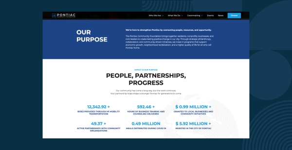
- 15. Concrete impact numbers for the last fiscal year — Three to five outcome numbers on the homepage or a dedicated Impact page: people served, meals provided, acres restored, scholarships awarded, whatever maps to your mission. Dated (2025, not “to date”) and sourced. Donors and grantmakers screenshot these.
- 16. Program pages with eligibility, services, and outcomes — One page per program. Who it serves, what it delivers, how someone accesses it, and what the measurable outcome is. This is what a journalist, a grant reviewer, or a referral partner actually needs, and most nonprofit sites bury it under a four-layer “Programs” dropdown nobody explores.
- 17. Beneficiary stories with real names, photos, and consent — Two or three stories, told with permission. Real names where appropriate, photos that show the person (not stock-image hands), and a single clear outcome for that individual or family. Stock-photo “testimonials” are worse than no stories at all.
- 18. Outcome-based results, not activity counts — “We delivered 12,000 meals” is an activity. “We reduced food-insecure households in our county by 8 percent over three years, corroborated by the regional food bank” is an outcome. Donors notice the difference, even if they cannot articulate it.
The stock-photo trap: Stock imagery of smiling, racially diverse, geographically ambiguous “beneficiaries” is one of the fastest ways to erode donor trust. We see it most often on About and Programs pages that were built in a rush. If the person in the hero photo is not actually served by your organization, replace the photo with a graphic, a typography-driven hero, or a real image of your team at work. Every photo on a nonprofit site should survive the question: who is that, and what is their connection to the mission?
“The homepages that convert for nonprofits are the ones where I can tell what the organization does, who they serve, and where they work in the first ten words. If I have to scroll past a carousel and two vague mission slogans to find a program, the donor has already tabbed away.”
— Bita Goli, Senior Designer
06 - People & Governance
Items 19–23: People and Governance, the “Who Is Behind This” Zone
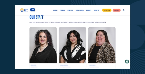
A nonprofit is its people: board, staff, volunteers, founder. Donors look for named, photographed, verifiable humans because it is the single hardest part of a nonprofit to fake.
The People zone is where “we are a legitimate organization” becomes “we are a group of specific, accountable human beings.” Every empty team page, unnamed executive director, or silhouette-for-a-bio on this zone is a small erosion of trust that compounds with the rest.
- 19. Named board of directors with roles and backgrounds — Every board member’s full name, role (chair, treasurer, secretary, member), and a sentence about their professional or community background. Photos where possible. This is non-negotiable for grantmakers, who will walk away from an application if a board page is missing or stale.
- 20. Executive director or CEO with photo and bio — Name, photo, two to four-sentence bio, and a way to reach them (at minimum an email address). The ED is the face of the organization for donors, press, and peers. Not naming them creates a trust gap even when everything else is in order.
- 21. Staff or leadership team page with real photos — At least the leadership layer, with photos, titles, and one-line bios. A full staff directory is not required for small nonprofits, but a leadership page with three to eight people and their faces is.
- 22. Volunteer and board application pathways — A clear “Get Involved” or “Volunteer” page with either open positions or a statement of when and how your organization recruits. For board recruitment, a short note about the cycle (annual nominations, rolling recruitment) signals a functioning governance process.
- 23. Founder story or year-founded statement — A short About paragraph or dedicated “Our Story” page covering when and why the nonprofit was founded, who the founder was, and how the work has evolved. For newer organizations (less than five years), this is a should-have, not a nice-to-have.
Photography is a governance tool, not a design flourish: A real photo of your board at their last retreat, your ED at a program site, or your volunteer team at a weekend event carries more weight than any stock headshot set. We recommend scheduling a half-day photo shoot once every two years to refresh the People zone. The cost is low, the trust lift is disproportionate.
“The visual difference between a trusted nonprofit and an ‘is this real’ nonprofit often comes down to whether the Team page has real photography or a grid of generic silhouettes. ”
— Shawn Xiong, Art Director
Items 24–27: Donation UX and Data Trust, the Final Thirty Seconds
By the time a donor reaches the donate button, they have already mostly decided. The last four signals either confirm that decision or undo it in seconds.
Four signals make the difference between a donor who completes the form and a donor who hesitates on the last screen. Each one is a two-hour fix on any modern CMS and a one-line fix on a platform built for nonprofits.
- 24. Donation page on your own domain, matching the rest of the site — The URL should stay on your domain. The colors, logo, typography, and tone should match the homepage. A jarring redirect to a third-party processor with unfamiliar branding creates the “am I still on the right site” moment that kills completion rates in the analytics every time.
- 25. Suggested amounts with descriptions of what each gift funds — Three to five suggested amounts, each with a short line describing what that gift funds (“$50 provides one family with a week of groceries”). Include a monthly-giving toggle. The descriptions do two jobs: they help the donor decide, and they publicly disclose how their money will be used.
- 26. Immediate, Section 6115-compliant tax receipt — An automatic email receipt that includes organization name, EIN, 501(c)(3) status, gift amount, gift date, and a “no goods or services were provided in exchange” statement when applicable. For gifts of $250 or more, this is an IRS substantiation requirement. For donor trust, it is the confirmation that their transaction actually reached you.
- 27. Privacy policy, donor data policy, and consent-aware analytics — A visible link to a real privacy policy from the footer and the donation page. A short donor-data statement that addresses list sharing, retention, and opt-out. A cookie banner with consent mode enabled on GA4, and no advertising identifiers firing on the thank-you page. The defaults should protect the donor without them having to ask.
The most common donation-page trust failure we see: A donate button on a well-designed homepage that opens a third-party processor page with the nonprofit’s name mistyped, the logo missing, and a different color palette. The donor has no way to know, in the moment, whether they clicked a phishing link or a legitimate donation form. Many close the tab. Platforms that embed the donation flow on your own domain, with your branding, eliminate this failure mode entirely.
How Morweb handles the donation-trust layer: Morweb’s built-in donation pages live on your own domain, inherit your site’s branding automatically, support suggested amounts with descriptions plus a monthly-giving toggle. The trust signals are the platform’s defaults, not an assembly job for your team.
“The donation page is where every trust signal upstream either pays off or gets wasted. If the visitor has bought into the mission and then lands on a donation form that looks like a different organization, the conversion drops in a way you can watch in real time on a heatmap.”
— Steven Calibo, Digital Strategist
The Prioritized Fix List If You Only Have One Quarter
Twenty-seven items is a lot. If your team can only ship a few this quarter, run the list below in order. Most nonprofits can clear the first six in a single afternoon without a developer.
- Add legal name, EIN, 501(c)(3) line, and mailing address to the footer, on every page.
- Confirm HTTPS and the SSL certificate are current. Run the homepage and donate page through a mixed-content check.
- Publish the latest Form 990 and most recent annual report on a Financials page linked from the main nav.
- Rewrite the homepage hero: one-sentence mission line, one concrete 2025 outcome number, one clear donate button.
- Add or refresh the Board and Leadership pages with real names, photos, and one-line bios.
- Audit the donation page: same domain, matching branding, suggested amounts with descriptions, monthly toggle, immediate receipt.
- Add or update the privacy policy and donor-data statement, and enable GA4 consent mode.
- Claim (or refresh) your Candid profile and display the seal in the footer.
Nonprofit Website Trust Signals: Common Questions Answered
What is the most important trust signal on a nonprofit website?
A clear mission statement above the fold combined with a visible 501(c)(3) status line and EIN in the footer. Those three elements together cover identity and legitimacy for nearly every first-time donor. Adding the latest Form 990 on a Financials page puts you ahead of most comparably-sized nonprofits.
Is it a trust problem if our donation page is on a different domain?
Yes, in most cases. A donation page that jumps to a third-party processor with unfamiliar branding breaks the sense of continuity and introduces the “am I still on the right site” hesitation. The fix is either to embed the donation form on your own domain using a platform that supports it, or to redesign the third-party page to match your branding as closely as the platform allows. Same-domain donation flows with consistent branding measurably outperform in our analytics.
How often should we update the trust signals on our site?
Identity information (name, address, contact, 501(c)(3) line, EIN) should be correct at all times. Financials (Form 990, annual report, program ratio) should be updated within six months of filing. Impact numbers should carry a fiscal-year label and get refreshed annually. Board and leadership pages should be reviewed at least every six months. Photography, every two years. A light quarterly audit catches almost every drift before a donor notices.
How does Morweb specifically help with nonprofit website trust?
Morweb is built for nonprofits, so most items on this checklist are platform defaults rather than custom work. Organization identity (name, EIN, 501(c)(3), address) lives in every footer and donation page. Donation pages are on your own domain with matching branding, suggested amounts, a monthly-giving toggle. If you are stitching trust signals together from five separate subscriptions, a platform designed for this is usually a better answer than another plugin.
Where should we start if our site is missing most of these signals?
Start with identity and donation UX in parallel. In one afternoon you can update the footer (name, EIN, 501(c)(3) statement, address, contact), verify HTTPS, and audit the donation page for branding continuity and an immediate receipt. Those six fixes cover the majority of the “am I being scammed” questions a first-time donor asks. Then add the Financials page the following week. Mission and People can follow over the next month.
Looking for more on building donor trust and transparency into your nonprofit website? Check out these additional resources to guide your work:
Nonprofit Website Transparency & Trust: What Donors Really Look For. The research-backed case for why transparency content is the highest-engagement content on a nonprofit site.
Nonprofit Online Fundraising Compliance: The 2026 State-by-State Guide. A practical guide to state charitable solicitation registration and the disclosures that belong on every donation page.
Donation Page Design Tips & Examples. Real donation-page teardowns and the UX patterns that consistently lift conversion for small and mid-sized nonprofits.
The Best Nonprofit CMS: 5 Essential Features to Look For. Our guide to the CMS features that matter most for mission-driven organizations.

Want a free nonprofit website trust audit?
Our team will run your site against the full 27-signal checklist and send you a prioritized report: what is working, what is missing, and what would move the needle fastest on donor trust. No pitch, no pressure, just a second set of expert eyes.
Related Articles:
30 Best Nonprofit Websites + 6 Tips For Designing Your Own