

In the modern digital age, a patient's care journey begins long before they step foot in your waiting room. Effective web design for healthcare is about more than just aesthetics; it is about building immediate trust, ensuring HIPAA compliance, and making it easy for patients to access the care they need. Whether you are searching for basic health website design principles, looking for actionable healthcare website design tips, or evaluating the best platforms for web design for health services, choosing the right digital foundation is critical. In this guide, we will explore the best health care web design practices to help your practice thrive online.
No two medical offices are the same. For example, a dentist's office might be decorated with models of the human mouth, posters explaining how to properly floss, and pictures of patients showing off their pearly whites. A sports medicine clinic, on the other hand, might display pictures of famous athletes, hang posters with inspiring sayings, and keep sports-related magazines in its waiting area. Clearly, medical offices are designed with their audience in mind.
Just as your medical office is a physical hub for your practice, your office, clinic, or hospital's website serves as the center of your online presence. And just like your office, you need to think about its design in order for it to be the best possible resource for your patients. When you have a solid design, your website can be a place where you establish your brand as a medical practice and empower patients to get important information and complete tasks. The ideal medical website design will set up new patients to learn about your services and initiate care, and help current patients pay bills, get updates on news or events, and have their questions answered — and more.
But designing your medical website may sound like a task easier said than done. After all, as a professional in the healthcare sector, it's unlikely that you're moonlighting as a webmaster or have untapped expertise in coding.
We'll let you in on a little web design secret: By doing a little homework to understand medical website design and leveraging the right tools, you can create or revamp your practice's website without having to call in a developer.
This guide is a great starting point, whether you're a complete web design beginner or looking to brush up on basics you've used before. In it, we'll cover the following:
As you get started, remember that just as no two medical practices are alike, no two medical websites are alike. With the tips provided in this guide, you'll be ready to identify and meet your specific audience's needs and foster deeper connections with the people you serve. Ready to go? Let's dive in!

Medical Website Design FAQs
In this section, we'll answer some common questions about medical website design. This information will provide a solid foundation that you can work off of to design a website that will help your practice shine.
What is a medical website?
You can think of your medical website as a virtual representation of everything your practice stands for. From your "Services" page to your blog roll, your medical website should showcase what you do as a medical professional and how you serve the patients that come to your practice for care.
For your patients, your medical website will serve as an easy-to-access resource where they can go for answers to their questions, tools to schedule appointments and order prescriptions, and important news and updates. When designing your medical website, consider how you want to present your practice and how you want that presentation to be received by your audience.
How do you create a medical website?
A well-designed website starts with the website builder or content management system (CMS) you decide to host it on. With the right CMS, you can create an aesthetically-pleasing website that hosts all of the resources and tools you want to provide to your patients. There are a lot of CMS options out there, but some are bettered geared for medical website development than others. More on this below!
What goes into a strong medical website?
The answer to this question will look different for every medical practice. However, there are three general characteristics a medical website needs to be truly useful to its audience:
- A medical website should be accessible to every visitor, regardless of ability or device used.
- A medical website should be easy to navigate.
- A medical website should provide clear information and host useful resources and tools that visitors can easily leverage.
When should we hire healthcare web design agencies?
Launching a complex medical site from scratch is often best left to the experts. You should partner with healthcare web design agencies like Morweb's in-house design team if you need custom API integrations with your patient portal, bespoke branding, or complex data migrations. We handle the technical heavy lifting so your staff can stay focused on patient care.
What makes a great healthcare website designer?
A standard web developer might build a pretty site, but a specialized healthcare web designer understands the strict regulatory environment of the medical field. Whether you need a dedicated website designer for doctors or a comprehensive hospital web design company, Morweb's expert healthcare website developers explicitly understand HIPAA compliance, secure form routing, and ADA accessibility standards, ensuring your digital presence is both beautiful and fully compliant.
Can a healthcare web developer work alongside our internal IT team?
Yes. The best healthcare website developers and healthcare web design companies act as a seamless extension of your staff. At Morweb, our agency team builds a secure, scalable foundation that your internal IT and marketing teams can then easily manage day-to-day using our intuitive Content Management System (CMS).
Now that you've learned the basics about medical website design, you're ready to jump into more specific design tips that can make your website an asset to your practice.
Showcasing the Best Healthcare Websites
Before building your own site, it helps to see what is already working in the industry. The best healthcare website designs prioritize clean navigation, mobile responsiveness, and clear patient portals.
- For Independent Practices: Take a look at these doctor website examples to see how the best website design for doctors utilizes warm imagery and easy appointment booking. You can even find a great clinic staff directory website example to see how to properly introduce your medical team.
- For Large Institutions: The best hospital website design focuses on robust search architecture, allowing patients to find specific departments, pay bills, and access emergency wait times in seconds.
Tailoring Your Digital Presence to Your Practice Size
Website Design for Doctors and Private Clinics
A solo practitioner has very different needs than a regional medical center. Effective doctor website design and medical clinic web design should focus on local SEO, patient intake forms, and streamlined telehealth integrations. When evaluating tools for website development for doctors, ensure the platform supports secure clinic web design features out of the box. Whether you need web design for clinics or a specialized medical doctor website design, the goal is to make patient onboarding as frictionless as possible.
Web Design for Hospitals and Public Health
Managing a digital campus for a large institution is a massive undertaking. Tackling a hospital website redesign requires a platform capable of handling thousands of pages and multiple user permission levels. Effective hospital websites design and website design for public health and preventative medicine must prioritize ADA accessibility, multilingual support, and secure integration with enterprise-level Electronic Health Records (EHR) systems.
Getting Started With Medical Website Design: 11 Tips
In this section, we'll take you through 11 tips that will cover the most important aspects of medical website design. As you read, consider your specific audience and what your patients will need from your website. Our tips can be applied to any medical practice's website, but it's up to you to determine your specific audience's needs.
- Choose the right CMS.
- Ensure your website is mobile-friendly.
- Make your website interactive.
- Share valuable content.
- Make your site easy to navigate.
- Include strong imagery.
- Incorporate your brand.
- Improve load speed.
- Adhere to web accessibility guidelines.
- Provide clear contact information.
- Offer secure password-protected patient resources.
1. Choose the right CMS.
As mentioned above, a CMS is a tool you use to bring your website to life. Through your CMS you can set up your website, add web pages, start a blog, connect your site to your social media profiles, employ search engine optimization (SEO) best practices, and more.
Your CMS is the foundational tool that makes medical web design possible, which means it's worth it to take your time and choose your software wisely.
You may be tempted to go with a generic CMS that you know is popular — something like WordPress, Squarespace, Wix or Drupal. While these website builders certainly have their merits, they come with major drawbacks, not the least of which is that they aren't built with medical professionals' needs in mind.
For example, say you want to add a private patient portal to your website, a place where patients can request prescription refills and send private messages to their care provider. You might be able to do something like this with a CMS like WordPress, but it will likely require more extensive technical know-how and the addition of many plugins and extensions.
Instead, we recommend you look for a CMS designed with the healthcare sector in mind, such as Morweb.
With an industry-approved website builder like Morweb, you can easily do the following:
- Leverage customizable layouts and templates that make designing easy
- Easily edit your live web pages from the front end of your website
- Edit and position photos where you want them on your web pages
- Make your website accessible to people of all abilities
- Optimize for mobile devices
- Offer healthcare-specific tools like private patient pages or career listings
The best part about Morweb is that your design experience can be intuitive. You won't need to scour the internet trying to decipher backend coding or stress about what your final product is going to look like. You can get started right away and easily make changes and adjustments that will improve the website visitor experience.
Morweb is our top pick for a CMS ready to meet your medical design needs. To get a feel for the other options on the market, we suggest you check out Morweb's roundup of the best medical website builders.
2. Ensure your website is mobile-friendly.
Part of effective medical website design is anticipating how your audience will be accessing your site. And all signs point to mobile devices as a big factor in prepping your website for your audience. According to Statista, "In 2021, the number of unique mobile internet users stood at 4.32 billion, indicating that over 90 percent of the global internet population use a mobile device to go online." These numbers speak for themselves: Medical professionals can't afford to overlook their audience members that will be visiting their websites using phones or tablets. This is why you must prioritize mobile responsiveness when designing your site.
What does it mean when a website is mobile-responsive or mobile-friendly? In short, a medical website that is mobile-friendly will adjust to fit the screen of whatever device a visitor is viewing it on — whether that's a computer, tablet, or smartphone. This allows users to interact with content on their favorite devices without having to inconveniently pinch or scroll. Just imagine how frustrating it would be for someone who's sick and struggling to reach your team without mobile responsiveness.
By making your website mobile-friendly, not only will you create a positive user experience for mobile visitors, but you may even boost your visibility on popular search engines which will ultimately help you to get in front of more prospects. In 2015, Google rolled out an update indicating that mobile-friendliness can affect how your website ranks on the Google search engine. In other words, web pages that are interactive and easily readable on mobile devices tend to rank higher in a list of search results than those that aren't.
To connect with patients who access your website via mobile devices, implement these tips for a mobile-friendly medical website design:
- Optimize your homepage. If you want to optimize your website for mobile, you'll need to think from a mobile perspective. Feature a long-scrolling homepage with quick bursts of information about your practice. This will keep your readers engaged as they learn more about the services you offer.
- Feature a hamburger navigation menu. As readers tap through your medical website, you'll want to make sure they can easily access the content most relevant to them. A hamburger menu is a collapsed version of your navigation menu located in the top corner of your site on mobile devices. This type of menu allows mobile users to see all menu items in a dropdown format.
- Allow visitors to click and call. When a prospective patient decides to set up an appointment, they'll want to call in as soon as possible. Make it easy with a strategically-placed button in your navigation that allows them to instantly call your business from the mobile device that they're using.
Developing multiple versions of your website can be a pain. Simplify this process with a CMS like Morweb that offers automatic mobile responsiveness. This way, your content will automatically adjust without you needing to make custom changes, saving you time that can be better spent focusing on your practice and boosting patient satisfaction.
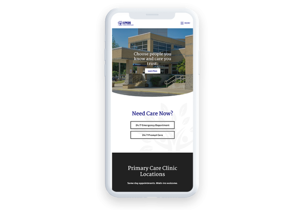
Mobile-Friendly Healthcare Website Design Example: Iroquois Memorial Hospital
Iroquois Memorial Hospital makes its medical website design feel like the same business across all devices. Thanks to the mobile-responsive design, the content on their site automatically resizes based on the user's screen size and provides all key information that users need so that it's both readable and interactive. This way, anyone can learn about the hospital's services, providers, and locations no matter what device they're using.
3. Make your website interactive.
If you're still in the early stages of development of your medical web design, you might be wondering, "Why do I need an interactive healthcare website?" The answer is simple: even if you don't have one, your competition does.
In a world where your patients can schedule appointments from the comfort of their couches, it's crucial that you prioritize interactivity to match up to your competition. Otherwise, you may lose business to a competing hospital or healthcare specialist with a more engaging design. In fact, 75% of consumers admit to judging a business's credibility by its website design.
Keep in mind that all medical websites are designed with certain goals in mind, whether that goal is increasing inquiries or encouraging patients to schedule appointments. By making your healthcare web design interactive, you'll increase patient engagement and ultimately reach your conversion goals.
Let's walk through three key ways you can funnel visitors toward completing your desired goals:
- Create interactive forms. Enable patients to fill out important medical information with online forms, whether it's dealing with health conditions or insurance details. Keep in mind that mobile users will be accessing these too, so ensure your CMS offers responsive forms.
- Feature call-to-action buttons. Well-placed call-to-action buttons will let your patients take action the moment they decide to. Consider including interactive buttons for scheduling appointments, requesting referrals, or filling prescriptions for quick access and a seamless experience.
- Offer a patient portal. Instead of having to contact your office's receptionist, allow patients to edit personal details within a patient portal. This will make changing contact information, updating medical insurance details, and monitoring their health (with data such as blood pressure and weight) a breeze.
When you use these interactive features in your medical website design, you're bound to improve the user experience, which will directly impact a variety of metrics, such as time spent on the page, bounce rate, and click-through rate.
Note that resources you offer that record sensitive patient information will need to be compliant with the Health Insurance Portability and Accountability Act of 1996 (HIPAA). Keeping personal information secure will help you build a rapport with your patients and will encourage them to use your interactive resources again and again!
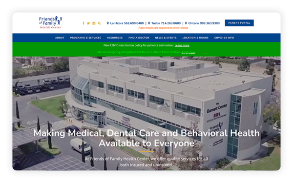
Interactive Healthcare Website Design Example: Friends of Family Health Center
Friends of Family Health Center offers an extremely interactive healthcare website design. From the first glance at their homepage, you know about the type of care they offer and can see interactive videos that showcase their top-tier facility. Using helpful buttons, they encourage users to learn more about the services they specialize in, as well as locate providers within the network near them. Plus, they offer a patient portal that empowers patients to take a more active role in managing their care.
4. Share valuable content.
Providing content that's interesting and valuable to your patient base can take your medical web design to the next level. While this will encourage existing patients to regularly visit your website, it will also inspire first-time visitors to click through to other content on your website. If they find their medical needs match your expertise, they're much more likely to schedule an appointment or reach out to learn more.
According to Demand Metric, content marketing costs 62% less than traditional marketing and generates about three times as many leads. In other words, creating and sharing valuable content is a cost-effective opportunity for any practitioner looking to get ahead of the competition.
As you map out your medical website design, consider sharing valuable content such as the following:
- Blog posts. It can be helpful to discuss topics that are relevant to your patient base, such as tips for improving quality of life through healthy practices or recent news in your medical field. Pairing intriguing news with an injection of professional expertise can strengthen your brand and position you as an authoritative, knowledgeable professional.
- A Q&A section. Consider featuring a Q&A page where you discuss common health-related questions that patients frequently ask you. This is a great opportunity to show off your expertise.
- Patient reviews.Testimonials are a powerful resource and therefore offer a great opportunity to improve your medical web design. Encourage your current patients to say a few words about their experiences receiving care at your practice. Testimonials may be of special interest to potential patients with related problems, putting you at the top of their potential list of healthcare specialists.
As you spend time developing valuable content for your visitors, you'll continue to increase brand awareness, generate more leads, and grow customer retention. Blogging, Q&As, and reviews will serve as a solid foundation for your content marketing strategy, so starting there is your best option.
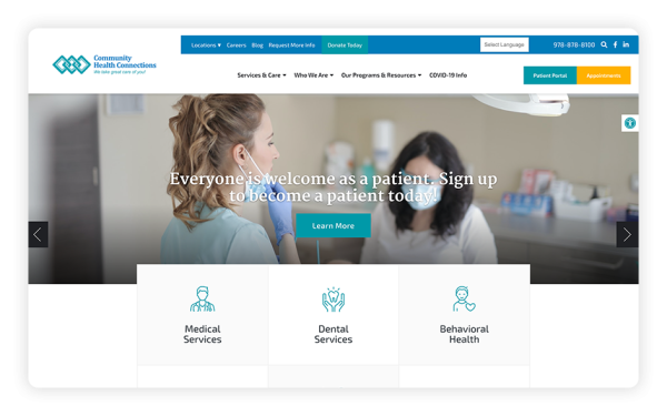
Healthcare Website Design Enriched With Valuable Content Example: Community Health Connections
Community Health Connections has worked for 20 years to serve the low-income, underinsured, uninsured, publicly-housed, and homeless populations of North Central Massachusetts. Through their healthcare web design, they provide insightful descriptions of their services and helpful information about their programs and resources.
Further, they use their blog to provide thought leadership on various health-related topics. Through this powerful content, they connect with prospective patients who may otherwise turn to another healthcare professional for treatment.
5. Make your site easy to navigate.
A major part of an intuitive medical web design is its navigation structure. If your visitors can't find their way around your website, they may grow frustrated and ultimately take their business elsewhere. As we mentioned earlier, someone who's sick and looking for medical assistance doesn't have time to struggle with an unintuitive website.
According to a recent study, 94% of consumers indicate that easy navigation is the most important website feature, meaning navigation strongly influences the effectiveness and perception of your medical web design. Maneuvering through content shouldn't be challenging, and if it is, you'll likely steer some individuals away.
When creating your website, keep these key navigation tools in mind to create the best possible healthcare web design:
- A well-designed menu.The easier it is to find relevant information, the better the user experience will be for patients. Feature a well-designed menu that displays your most important pages and uses a hierarchical structure to indicate which pages take precedence. While each medical website will house different pages, common ones you'll want to include are your "Services" page and your "Contact Us" page. Just be sure to create clear titles that concisely indicate the content of the landing page.
- Clear calls-to-action. A large part of moving a client from considering your services to walking into your office is providing clear direction within your content. Strategically place call-to-action buttons throughout your web pages, leading users directly to high-priority pages. These valuable pages may include your online booking system, your patient portal, or your donation form if your medical practice uses one.
Prioritizing a navigable medical web design increases the likelihood of prospective patients booking appointments. In no time, you'll push more visitors down the conversion funnel.
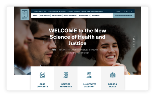
Easily-Navigable Healthcare Website Design Example: The Center for Collaborative Study of Trauma, Health Equity, and Neurobiology (THEN Center)
THEN Center researches and demonstrates the direct connection between trauma, chronic disease, and health disparity. Their website serves as an educational resource for the public to learn about their findings.
In their medical web design, they prioritize smooth navigation by first featuring a well-structured static navigation bar. Across their website, you'll see they've strategically placed CTAs that guide users to subscribe to their newsletter.
6. Include strong imagery.
Effective imagery can take your medical website design from mundane to engaging. Content with appealing imagery consistently outperforms text-heavy pages in terms of views and shares. In fact, posts that include images produce 650% higher engagement rates than text-only posts. What this means is that any website with visual content will perform better than one without it.
In terms of medical website development, high-quality photos allow you to showcase the quality of products and services you provide, so prospective patients can determine if your offerings align with their needs. Remember to also share pictures of your doctors, so new patients know who they're booking an appointment with. Further, videos and photo slideshows add life to your website and humanize your healthcare web design that's likely to stick with prospects.
Let's walk through three key tips for making your visual content stand out to patients and other visitors:
- Feature original images and videos. Stock images won't resonate with visitors, especially if they're recognizable and have been used dozens of times across multiple doctors' websites. Instead, use your medical web design as an opportunity to show off your practice. Feature high-quality images and videos of staff hard at work to connect with patients.
- Strategically place visual elements. While images and videos can connect with visitors, too many will distract readers from the core content. Not to mention, it will slow down your page speed, which we'll discuss more in-depth below. When you'd like to share multiple photos, consider using an image carousel. This will clean up your design and declutter your pages.
- Enrich your educational content. If you've incorporated a blog into your medical web design, images can make your content much more engaging and informative. When possible, feature original graphics, but at the very least, receive permission for sharing other medical professionals' diagrams and illustrations. In any case, you'll want to steer clear of sharing graphic photos or patient photos without written permission.
Remember, all of the traffic you receive won't help your practice if you fail to deliver visually-engaging content that resonates with site visitors. As part of your medical website design, ensure your images are up-to-par, serve your overall goals, and convert visitors into patients.
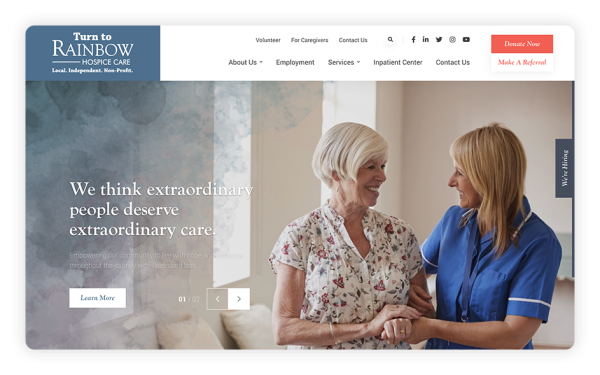
Image-Rich Healthcare Website Design Example: Rainbow Hospice Care
Rainbow Hospice Care features captivating imagery at the forefront of its design strategy. Throughout this healthcare website, original photos paired with impactful text resonate with visitors and connect with the right audience. Through these visual strategies, this organization is able to effectively convey their authenticity as well as the level of care they provide to those facing terminal illnesses.
7. Incorporate your brand.
When selecting a healthcare provider, patients have numerous options, so don't leave any room for interpretation in terms of your practice. Your medical web design must clearly convey your services and define what differentiates your practice from competitors.
Start by making it immediately apparent the kind of healthcare provider you are, the services you provide, and the patients you treat. Your medical website visitors are often busy, which means they may not have time to conduct an in-depth search or may give up quickly if the information they need isn't immediately available.
Then, you'll need to take it a step further. Think of it as a way to tell your story and convey what you stand for. Let's walk through a few key elements for accomplishing clear brand messaging in your medical web design:
- Color scheme. Consistency is key. Make sure to use the same color scheme across all your web pages. In particular, you'll want to choose two to three colors that will connect with your target audience. For instance, doctors who serve a wide variety of age groups should stick with professional, neutral colors. On the other hand, doctors who work with children may opt to use more playful and bright (yet still readable) colors.
- Font. Similar to the color scheme, you'll want to remain consistent in your choice of fonts. Limit the number of fonts to one or two, using a consistent type for headers and another for paragraph text. Further, your fonts should connect with your audience. For instance, if you work with a senior population or patients with disabilities, complicated designs with numerous fonts and thin lettering can be difficult to read.
- Images. Remember, your images are an important element in medical web design. As such, you'll want to choose ones that actively convey who you are and the services you provide. For instance, you'll often notice that websites include their logos in an upper corner or the top-center of the navigation menu so that it appears across every page on their website. As you begin selecting images, refer to the tips we covered above. Remember, you'll want to take original photos and use them in conjunction with high-impact text.
Being straightforward about your practice will help you clearly define your brand and position you as a respectable, trustworthy option for patients. When incorporated effectively into your healthcare web design, these branded elements will tie together to accurately communicate what your practice stands for and who you serve.
Branded Healthcare Website Design Example: THEN Center
THEN Center has a distinct visual brand that guides the entire design of this medical website. At every turn on this website, the look is inspired by THEN Center's distinctive logo, built off of their acronym. The dark blues and light blues in the design match the logo perfectly and guide the coloring for the text and icons on every page.
THEN Center also relies on carefully-curated stock photos to illustrate their work and target audience on every page, establishing connections with website visitors right off the bat.

8. Improve load speed.
In the early days of the internet, everyone had slow websites. However, today is a different story. Users expect your content to load quickly, and if it doesn't, they might jump to a competitor's site instead.
To quicken your load time, let's explore a few options that can be easily incorporated into your medical website design:
- Compress images. Luckily, it's easy to identify the major culprit of slow pages: large image files. Simply compressing images can save you up to 1MB of load time. While it may be tempting to upload tons of high-resolution images, refrain from doing so. As we discussed earlier, it's best to place visuals strategically instead of overloading your pages. For those images that you do include, make sure to resize them appropriately for your page then compress them to reduce the file size using free online tools such as tinypng.com or compressjpeg.com.
- Reduce the number of redirects. 301 redirects can be useful when cleaning up your website, but if you create too many redirect chains, your page speed can be heavily impacted. This is because each time a page redirects to another page, visitors must wait for the HTTP request-response cycle to complete. The more cycles, the slower the load time. Check any redirects and simplify them as much as possible so the browser doesn't have to work through several pages to get to the newest content.
- Minify the code. Accomplish this by cleaning up extra spaces, commas, and other unnecessary characters in addition to any code comments, formatting, and unused code. This will decrease the number of elements that need to load on the page. While this may seem like a small change, it will directly impact your page speed as the elements add up.
When mapping out your medical website design, measure with Google's free page speed insight tool. Diagnose any potential loading issues and adjust your web pages to minimize load time. By taking these extra steps to improve load speed, you'll convey to patients that you care about their experience and will set high expectations for interactions with your practice from the start.
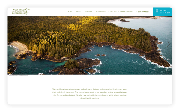
Speed-Optimized Healthcare Website Design Example: West Coast Endodontics and Sedation Centre
West Coast Endodontics and Sedation Centre works to treat all of their patients with individualized care and to keep patients fully involved in their dental health. When developing their site, they opted to feature a minimalist healthcare website design without sacrificing quality. They offer a few captivating photos that tell their story and limit the text to only the essentials while still informing their audience and persuading them to get more involved. Further, they've limited the number of pages on their website to display everything a prospective patient would like to know without providing extra, unnecessary information that clutters up the pages.
9. Adhere to web accessibility guidelines.
An accessible medical website design is paramount to getting in front of more potential patients, especially if you serve individuals with disabilities. While many of these guidelines require the help of a professional medical web developer, there are a few steps your healthcare organization can take toward better accessibility on its own.
Start with CMS that offers a web accessibility widget, like Morweb. Tools like this allow your medical website's visitors to adjust the text size, change the font type to non-serif, highlight links, and change the web pages to greyscale. These options enable people with disabilities to customize their user experience and will also help you meet several important Web Content Accessibility Guidelines (WCAG) guidelines.
Let's dive into a few of the key requirements set forth by accessibility guidelines:
- High-contrast colors. WCAG 3.0 guidelines require a contrast ratio of at least 4.5:1 for all text and graphics. For context, black text on a white background has the highest contrast at 21:1.
- Large text. Text that's larger and has wider character strokes is easier to read at a lower contrast. Therefore, the contrast requirement for larger text is lower. WCAG 3.0 guidelines call for large-scale text and images to have a contrast ratio of at least 3:1. The guidelines define large text as text that is 18pt and larger, or 14pt and larger if it's bold.
- Alternative (alt) text for links and images. Alt text is a descriptive sentence added to the HTML code of a website under images, graphics, and other non-text elements. For an image, alt text should describe its appearance and purpose in relation to the information on the page. For links, it should describe the content of the landing page. This helps visually-impaired visitors who are using screen reader technology to better understand your page's content. Plus, alt text is another one of Google's ranking signals and tells the search engine what your page is about.
Not only will implementing these tips allow individuals with hearing and visual impairments to interact with your content, but it will also enhance your medical website's overall design. Taking these steps as you go will prevent you from having to conduct a complete accessibility overhaul in the future, so do everything you can now to optimize your medical website for accessibility.
Accessible Healthcare Website Design Example: AlivioCare
The AlivioCare medical website design exemplifies the characteristics of good accessibility. When taking a look at this healthcare website, you'll notice they make use of high-contrast colors and large text to make content easy to view. They also add descriptive alt-text to help those with screen reader technology understand what the images are and what purpose they serve.
They take it one step further and implement Morweb's web accessibility widget, allowing those with impairments to take control of their own user experience and adjust the content to suit their needs.

10. Provide clear contact information.
The ultimate action you want your website's visitors to take is to initiate care in some way, whether they're returning patients or prospective patients. And the only way they can do so is if you provide them with clear contact information.
Burying your contact information on your website, or worse, leaving it off altogether, can be frustrating for individuals who are sick or in pain and want to make an appointment quickly. Instead, you'll want to prominently display your contact information and provide clear instructions for how to schedule an appointment.
Here are some specific pieces of contact information you'll want to include:
- Phone number and email.Nothing can be more frustrating to a website visitor than looking through your services and providers, deciding to initiate care, and then not being able to contact anyone who can answer questions or schedule an appointment. Feature your phone number and email in multiple places on your website, and encourage people to reach out with questions or requests to schedule. This will go a long way in establishing a professional, friendly brand with patients new and old.
- Directions to your practice's facility. Setting up an appointment will only get your patients so far. Next, they'll need clear directions for getting to your facility. Post your physical address on your website, and, to enhance the user experience, try adding an interactive map so users can see where your facility is in relation to their home.
- Your online scheduling tool (if you schedule appointments online). Some practices have moved to all-online scheduling, and this convenience can be great for your patients if you explain how to use your online scheduler. Consider using a brightly-colored CTA button that says "Click Here to Schedule" and links to your scheduling tool. This will quickly catch your visitors' attention and get them moving toward care faster. Also, provide clear instructions on how to use your tool so that patients don't get frustrated and abandon their attempt to make an appointment.
Another important aspect of providing clear contact information on your medical website is regularly updating it. If your phone number, email, or physical location changes, you could be leaving your patients to be confused as to where to go for their appointments or how to schedule appointments. Maintain accurate information at all times to continue building rapport with your website visitors.
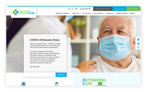
Healthcare Website Design With Clear Contact Information Example: Ohio County Healthcare
The Ohio County Healthcare website excels in anticipating its visitors' needs. Not only does this organization display its phone number clearly at the top of its static menu, but it also includes a dedicated "Contact" page. On this page, Ohio County Healthcare displays its address, an interactive map, and instructions for reaching its main switchboard and patient rooms. It also includes a contact form that visitors can fill out and submit in order to get in touch with this practice.
11. Offer secure, password-protected patient resources.
In the healthcare world, there is a great need for security and privacy due to the sensitive nature of medical records and information. This means that security should be a top priority for any medical practice that provides tools where patients or practitioners enter sensitive medical, financial, or contact information.
This is where password-protected patient resources come in. With the right CMS, you can leverage secure tools while allowing your patients greater flexibility in how they access care. For example, a patient might be able to request a prescription refill or to send a private message to their doctor without having to call your office or schedule an appointment.
To offer resources like these, you'll need to use your CMS to set up a secure intranet network. This will allow you to grant certain users access to secure tools once they've made a username and password, and to keep bots and malicious hackers out of the picture.
To maintain the security of your password-protected patient resources, make sure to do the following:
- Encourage users to change their passwords often.
- If your online tools allow your patients to pay bills, make sure you're using a secure, PCI-compliant payment processor.
- Educate your staff about HIPAA and the importance of maintaining patient privacy and keeping patient data secure.
Tools like a patient portal or online bill-paying platform can be great assets for your practice, but you'll need to do the work beforehand to ensure they're adding to the patient experience, not causing more stress to those you serve.
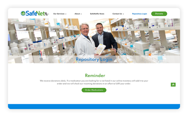
Healthcare Website Design With Password-Protected Patient Resource Example: SafeNetRx
SafeNetRx is a nonprofit that provides vulnerable populations with donated medicines. Due to the nature of their work, a patient portal is a crucial tool for their website. Their patient portal, called the Repository, allows individuals with a username and password to log on to order medications they need. Their secure password-protected page is a great example of the types of secure resources you can offer by using the right CMS.
The Gist
It doesn't matter whether you're a pediatric dentist or an emergency room receptionist — with the right tools and these tips backing you up, you have everything you need to create a healthcare website design as unique as every individual who walks through your door seeking care.
As you embark on your healthcare website development journey, remember to prioritize creating content and tools that are accessible, easy-to-use, and useful.
Now that you know the basics, you're likely eager to keep learning. Check out this additional reading:
- Morweb's Healthcare Websites Showcase. Sometimes all you need to get started with effective website design is some inspiration. Check out Morweb's showcase.
- 5 Effective Donation Page Design Tips (Plus Examples!). If you need to include a donation form on your website, you'll need to review form-specific design tips. This article can get you started.
- 15 of the Best College Websites (And Why They're So Great). You can gain inspiration from websites outside of your specific sector, too. Check out this roundup of well-designed college websites.