5 Effective Donation Page Design Tips (Plus Examples!)


Want an engaging website?
Don't just throw together your nonprofit's online giving page. With 54% of donors preferring to give online and the custom-branded donation pages nested inside a nonprofit’s website raise 6X more money, it’s more important than ever to put some extra thought and effort into your nonprofit's donation page design.
When donors find a donation page to be untrustworthy, lengthy, or difficult to use, they’re more likely to abandon their gift before their transaction is complete.
During the donation page design process, be sure to keep the following tips in mind:
- Brand your donation page design to match your website.
- Optimize your donation page design for mobile.
- Design your donation page with multiple giving options.
- Map out a minimalist donation page design.
- Create your donation page through your CMS platform.
Read through these design tips and check out our examples to make sure your nonprofit’s donation page is up-to-par. Let’s get started!

1. Brand your donation page design to match your website.
Make sure your nonprofit maintains brand consistency from one website page to another, especially on your donation page.
Visual consistency maintains the element of trust for your donors as they navigate on your website. Creating a seamless transition using effective brand-oriented visuals is key to keeping this trust.
Maintain your organization’s brand consistency by:
- Customizing templates. Starting with a nonprofit website template will kickstart your donation page design. However, make sure these templates are completely customizable so that you can set the font and colors to match your brand guidelines.
- Clearly display your logo. Your organization’s logo is the most recognizable element of your brand for donors. Your logo should be featured on every page of your site, including, of course, your donation page. Generally, logos are featured in the upper left-hand corner of your site and link back to the home page, however, any spot will do as long as it's a good size and clearly visible. Make sure that your logo appears properly across different devices by testing it manually. It’s the best way!
- Style the donation option buttons. Use bright colors for your donation option buttons and your ‘Submit’ button to draw attention to these elements. Style them to match your organization’s brand colors to maintain consistency. Additionally, research has shown that changing the button label from ‘Submit’ to ‘Donate Today’ or ‘Send Your Gift’ provides a better donor experience. Be sure to use a different color for this button to make it stand out.
- SSL Certificate. A Secure Sockets Layer (SSL) certificate authenticates the identity of the website allowing the webserver to initiate a secure session with a browser. The presence of an SSL certificate is indicated in the website’s URL as ‘https’. A site that has a properly installed SSL certificate will have a lock icon in the top left of the browser address bar. When a donor sees that on a nonprofit’s website, they feel assured that it is secure to enter their payment information.
Maintaining brand consistency in the small visual elements throughout your site makes a big difference in your fundraising efforts. Branded donation pages on a nonprofit’s website have been found to raise 6X more money.
Check out the donation page design example below of New York Pet Rescue who customized a Morweb template to match their brand:
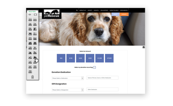
Customization is key to creating a consistent visual appeal across your nonprofit’s website. The more customization options you have, the more brand-specific you can make your content.

2. Optimize your donation page design for mobile.
According to Nonprofit Source, 25% of donors complete their donations on mobile devices. If your page isn’t mobile-optimized, you could be losing that 25% of online donations!
Be sure to design your donation page on a platform with mobile-responsive automation. Responsive websites adjust to fit various screen sizes to make them easy to view on different devices.
Not only should your information be easy to view on different screen sizes, but it should also be easy to interact with from a smartphone, tablet, or desktop computer. A mobile-responsive design will offer tap-friendly menus that make your website easy to navigate on a smartphone.
Your ‘Donate’ button should be clearly displayed at all times without having to dig through the menu or scroll. On all Morweb website themes, the donate button is optimized to display on the top right on every screen resolution.
More tips for designing a mobile-friendly donation page include:
- Designing for speed. Mobile site visitors will likely have little patience to wait for your donation page to load. Make sure your images and elements are mobile-friendly and won’t slow down the page speed. If you want to test this speed, try using tools like Lighthouse Audits or Pagespeed Insights to learn about more opportunities for improvement.
- Mobile preview. It’s important to keep in mind how your donation page will look on mobile as you design it. Choosing a CMS with mobile previews will help during the design process.
Use mobile optimization tools within your CMS platform to make sure your donors can view and interact with your donation page no matter what device they are viewing from. Check out how this donation page looks on mobile for example:
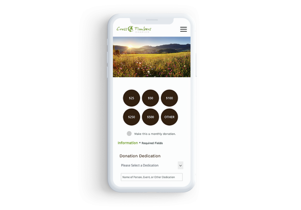
Mobile optimization is one of the easiest ways that your nonprofit can expand the reach of your website and appeal to a wider donor base.

3. Design your donation page with multiple giving options.
Once you have an effective general design for your nonprofit’s donation page, there are some additional steps you can take to boost your donations.
First, provide easy donation options for your donors to choose from, such as a recurring donation option. Give donors the option to set the duration to months or years, and Morweb will auto-calculate the total funds over the selected duration. You can also provide suggested giving amounts to create a frame of reference for donors to use when deciding how much to give.
The Bronx Charter School for Children’s donation page provides an excellent example of how you can make these donation page options stand out: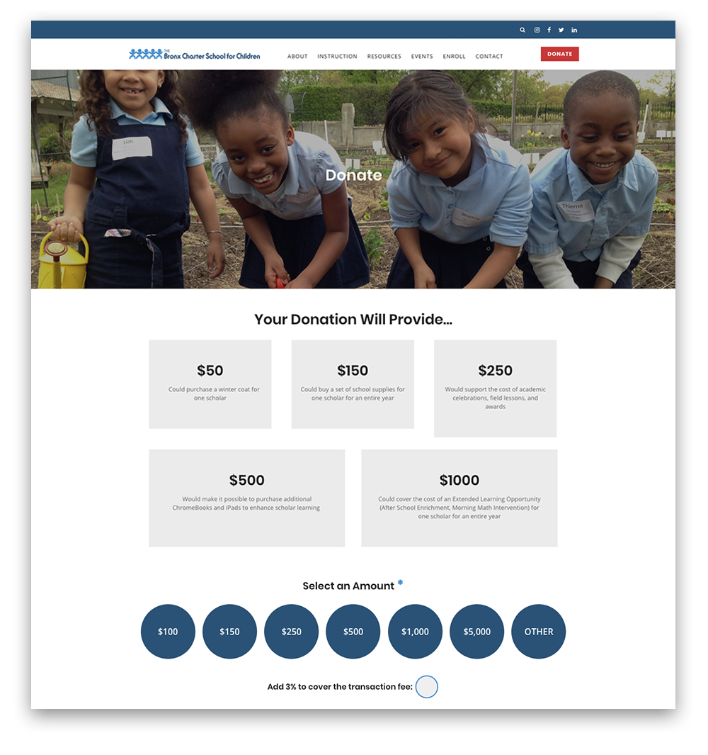
Aside from easy donation options, donors also prefer to give using different online methods. For instance, some like to get something in return for their gift while others may prefer to attend an event. Provide other ways to give in addition to your donation page, such as:
- Adding an online store to your site. Pick a CMS platform with eCommerce functionality to create a digital storefront for merchandise fundraising. Plus, selling branded merchandise is a great way to promote your nonprofit's brand image.
- Throwing fundraising events. Organize fundraising events for people to attend such as golf tournaments, bake sales, galas, workshops, etc. Events are a fun and interactive way to connect with your donors. Make sure your CMS platform enables them to easily register and/or purchase tickets for upcoming events on your website. Events are also proven to give your social media presence a boost!
- Providing information on corporate giving programs. Embed a matching gift and volunteer grant database into your donation form, and as supporters are perusing your donation options, they can quickly search whether their employer is eligible for any of these programs. According to Double the Donation, using corporate giving tools like matching gift auto-submission eliminates several roadblocks that often result in eligible matches going unclaimed.
From matching gift programs (where employers match their employee's donations to nonprofits and effectively double the gift) to corporate volunteer grants (where employers give grants to nonprofits where their employees volunteer), your nonprofit can use variety to drastically increase fundraising. However, donors will only know these programs exist if you promote them!
While you can effectively design your donation page without these elements, adding some giving options will spread the word about important giving opportunities and ultimately help your nonprofit maximize its fundraising potential.

4. Map out a minimalist donation page design.
One of the most common flaws of nonprofits’ donation pages is clutter. Nonprofit professionals often try to include every possible angle to appeal to their audience on their donation page. However, the old saying, “less is more” truly applies to donation page design.
Map out a minimalist design for your donation page to keep the donor’s eye focused on the pertinent details and guide them through the donation process.
Make sure to limit the number of fields you include in your donation page to those that are absolutely necessary for the giving process. One way to do this is to make sure that everything fits on a single page. Including “next” buttons on your donation page creates more steps for your donors and more opportunities for them to leave the page.
When you ask for too much information or have too many steps, your nonprofit will see a higher rate of shopping cart abandonment or those who get partway through the donation process, but later bail for one reason or another. Clean up your donation page by:
- Condensing your donation appeal. The donation appeal on your donation page is your last opportunity to tug at your donors’ heartstrings. Make sure to make efficient use of your space. This is easy to do when you edit from the front end of your site rather than working back and forth from back-end to preview views.
- Using a banner image. Adding too many images to a donation page creates too much content for your donors to process. It’s more effective to include a single compelling image at the top of the page to resonate with donors.
- Creating white space in between fields. White space is naturally appealing to people. Therefore, make sure your donation form fields have a little extra line spacing and the size of the font is a touch larger than normal, making it easier to read.
- Optimize for accessibility. In addition to making your donation page visually appealing, be sure to maintain compliance with ADA standards for web accessibility. Morweb’s accessibility widget helps make your donation page more accessible to a wider audience, encouraging more donations.
Check out this minimalist page design used to create this example for the American Friends of Covent Garden:
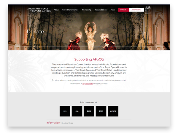
Morweb’s CMS platform, equipped with premade nonprofit-specific templates, makes it easy to organize attractive, minimalist donation pages.

5. Create your donation page through your CMS platform.
When designing your nonprofit’s donation page, the last thing you want is for donors to leave your website to access the donation form. Many fundraising software providers require that you create the donation page through their online platform, forcing donors to switch domains to give.
Think about it, if you’re a donor who’s ready to provide your financial information and you get a popup window or a new tab with a domain name and look and feel that is different than the website you were just on, you may become suspicious and abandon your donation. Switching domains without warning causes confusion and can make donors feel like the site is untrustworthy or even worse, a phishing attempt to steal their information!
The ideal setup and design of your donation page should enable donors to give right as they feel inspired and safe.
The best way to streamline the giving experience from your home page to your donation page is to create your donation form within your website by using a secure CMS platform that has ideal solutions for nonprofits. To facilitate this process, your nonprofit CMS should offer the following functionality:
- Nonprofit-specific design. Website builders created specifically for nonprofits take into consideration that nonprofit professionals are rarely fluent in coding languages. A nonprofit-specific website builder will limit or eliminate the need for coding literacy to build and edit web pages and donation forms.
- Donation form editing options. Having the ability to quickly change the initial donation amounts, change recurring options (monthly, 1 year, 2 years, etc.), designate funds, dedicate donations, and even edit form fields will help you make the most of your donation page.
- Live page editing. Choose a CMS platform with live site editing so that your team doesn’t need to make changes on the back end of your website. Drag-and-drop functionality allows you to add content to your page and immediately see how it looks on your live site.
- Customized user permissions. Not everyone at your organization needs access to editing capabilities on your donation page or the donor information collected there. Choosing a CMS with built-in user permissions will help your nonprofit safeguard donor data.
Below are a handful of nonprofit websites with donation pages built on Morweb’s CMS platform:
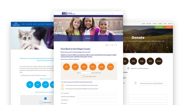
When you use a nonprofit CMS with built-in donation pages, you’ll find it easy to create an attractive donation page on a user-friendly interface. You’ll also provide a better giving experience for your donors by allowing them to give directly through your site, leaving them with a confident giving experience!
Designing an effective donation page requires comprehensive knowledge of required content and visual appeals. Your nonprofit shouldn't need to worry about coding literacy in addition to these skills.
Leveraging a non-technical and feature-rich CMS platform to create your website will help your nonprofit create an effective donation page design that will draw donors in.
For more information about how you can use your CMS platform to grow your nonprofit’s online presence, check out these additional resources:
- The Best Nonprofit CMS | 5 Essential Features to Look For. When you're choosing the CMS platform to build your nonprofit's website, look for a provider that is built for nonprofits. Make sure your final choice has the 5 features outlined in this article.
- Online Fundraising Compliance: 9 FAQs. Online fundraising requires your nonprofit to follow certain regulations to be compliant. Get your questions answered with this guide written by the Harbor Compliance team.
