10 Best Association Website Designs + 5 Tips to Build Your Own


Want an engaging website?
Introduction
A strong digital presence is the lifeblood of any growing member-driven group. Whether you manage a local neighborhood group and need to see top community association websites, or you run a national professional network, analyzing successful membership website examples is the best way to spark inspiration for your own redesign. The right digital foundation keeps your members connected, streamlines dues, and highlights your mission. In this guide, we have curated some of the best membership organization examples and general association examples on the web today to show you exactly what is possible when great design meets powerful functionality.
What Makes a Great Association Website Design?
A great association website design blends functionality, accessibility, and aesthetics. Here are key features to look for in an exceptional design:

- Mobile-First Approach: With around 60% of global web traffic now coming from mobile devices, responsive design is essential for reaching your audience on any device.
- Intuitive Navigation: Help members quickly find resources, directories, and tools with clear menus and site structure.
- Visually Engaging Branding: Reflect your mission with cohesive colors, fonts, and imagery. Consistent branding builds recognition and trust – in fact, 75% of consumers admit to making credibility judgments based on a website's design.
- Member-Focused Features: Include password-protected content, member directories, online communities, and interactive tools tailored to your membership.
By focusing on these elements, you can create a site that serves your members effectively and even ranks well in search results. Remember, first impressions form in just 50 milliseconds – a polished, user-friendly design ensures that snap judgment is a positive one.
10 Best Association Website Designs for Inspiration
Below are 10 examples of outstanding association websites. These sites showcase exceptional design, usability, and features that make them stand out.
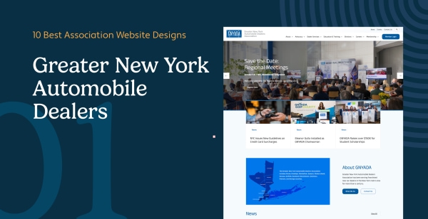
1. Greater New York Automobile Dealers Association (GNYADA) – GNYADA represents over 450 franchised new car dealerships in the New York metropolitan area. Its website supports members with services such as legislative advocacy, training programs, and compliance assistance.
Top 3 Features of the GNYADA Website:
- Education and Training Programs: Extensive resources (e.g., webinars and guides) for dealership personnel to stay competitive in areas like sales, service, and finance.
- Member Directory: A searchable directory helps users connect with member dealerships by name, location, or brand.
- Member Services and Benefits: Compliance tools, industry updates, and exclusive discounts empower dealerships to effectively address industry challenges.
These features make the GNYADA website a vital resource for members and a hub for community engagement.
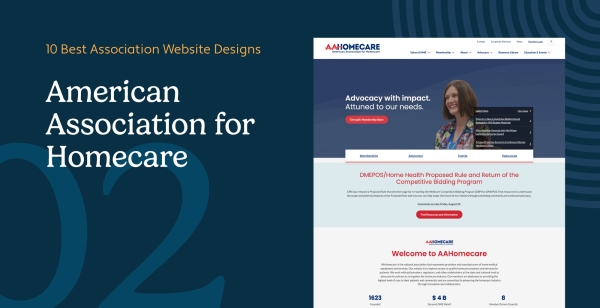
2. American Association for Homecare (AAHomecare) – AAHomecare advocates for policies supporting access to home medical equipment (HME), working closely with stakeholders to ensure sustainability in the homecare industry.
Top 3 Features of the AAHomecare Website:
- Membership Directory: A detailed directory of HME providers and manufacturers that fosters networking and collaboration across the industry.
- Advocacy and Policy Resources: Comprehensive materials to assist members in engaging with policymakers, including updates on federal legislation and payer relations initiatives.
- Searchable Resource Library: A centralized hub for documents on compliance, reimbursement policies, and industry standards.
AAHomecare's website is a valuable platform, providing essential resources to its members and the broader homecare community.
Studies show that associations with robust membership directories can boost collaboration by as much as 30%, enabling members to form strategic partnerships and share critical resources. A great example is AAHomecare's directory, which strengthens connections and fosters innovation across the homecare industry.
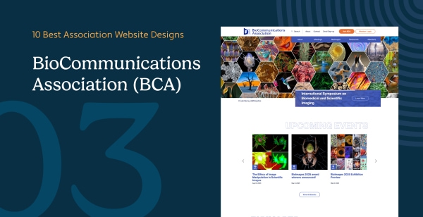
3. BioCommunications Association (BCA) – BCA's website serves as a central hub for professionals in biological communications, including medical photographers, videographers, illustrators, and graphic designers.
Top 3 Features of the BCA Website:
- Educational Resources: Easy access to journals, job postings, and professional development materials keeps members informed and growing in their field.
- Showcase of Excellence: The site highlights award-winning visual media through BCA's annual BioImages competition, celebrating members' best work.
- Networking Opportunities: Events like the BIOCOMM conference are prominently featured, encouraging collaboration and knowledge exchange among members.
The BCA website is a benchmark for supporting its members' professional needs while celebrating excellence in the field.
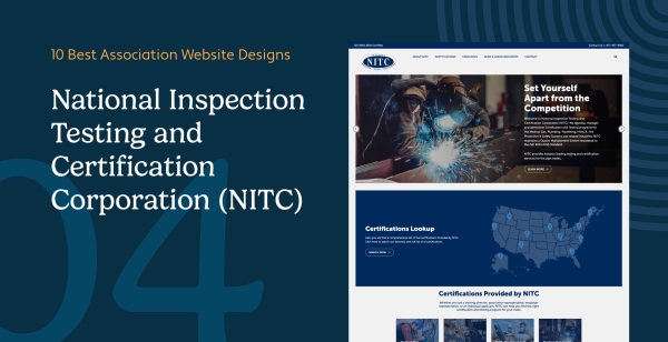
4. National Inspection Testing and Certification Corporation (NITC) – NITC provides a user-friendly website for certification services in industries like medical gas, plumbing, HVACR, and fire protection.
Top 3 Features of the NITC Website:
- Detailed Certification Information: Comprehensive resources on exam eligibility requirements, online applications, and study materials for various certifications.
- Accessible Resources: A robust library of forms, bulletins, and guides helps streamline certification and recertification processes for professionals.
- Timely News Updates: A regularly updated news section keeps members informed about changes in industry standards, safety regulations, and upcoming training events.
The NITC website serves as a central hub for advancing professional certifications, with an intuitive design that caters to both seasoned professionals and newcomers seeking credentials.
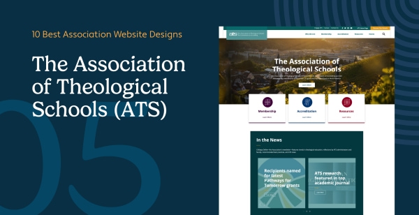
5. The Association of Theological Schools (ATS) – ATS supports over 270 graduate theological institutions across the U.S. and Canada, advancing academic and institutional excellence in theological education.
Top 3 Features of the ATS Website:
- Accreditation Support: Tools and resources guide member schools through accreditation and assessment processes, including self-study materials and best practices.
- Educational Tools: A rich selection of webinars, workshops, and guides helps institutional leaders and faculty enhance leadership and pedagogy in theological education.
- Member Directory: An easy-to-navigate directory connects users with member institutions, facilitating networking and collaboration among schools.
ATS exemplifies how an association website can blend academic resources with community collaboration tools to serve a specialized membership.
Associations that offer comprehensive member directories can boost collaboration by up to 30%, according to recent research. These directories help facilitate partnerships, promote knowledge-sharing, and strengthen member networks. For example, AAHomecare's detailed directory empowers homecare businesses to connect, share resources, and grow together within the industry
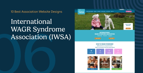
6. International WAGR Syndrome Association (IWSA) – The IWSA website supports individuals and families affected by WAGR syndrome, offering information, community, and advocacy.
Top 3 Features of the IWSA Website:
- Rich Informational Resources: Tailored content for families, researchers, and educators includes FAQs, medical literature, and guidance for newly diagnosed individuals.
- Accessibility Features: The site adheres to WCAG 2.1 standards, with tools like text-size adjustments, high-contrast modes, and screen-reader compatibility to ensure content is accessible to all.
- Community Stories: Inspiring personal stories and testimonials from families impacted by WAGR syndrome help build a supportive community and encourage engagement.
The IWSA website demonstrates how accessible, empathetic design can empower a community and provide comfort and knowledge to those who need it most.
Websites that follow WCAG 2.1 accessibility standards can reach up to 35% more users, including individuals with disabilities. By prioritizing accessibility, organizations like IWSA ensure their digital experiences are inclusive, user-friendly, and compliant with global best practices.
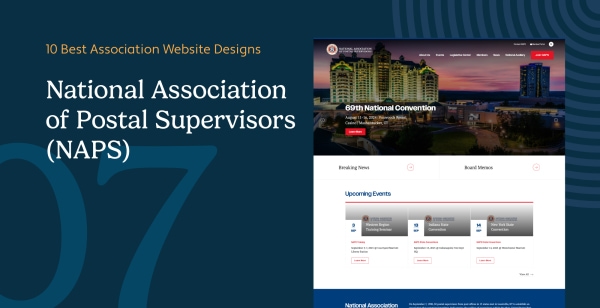
7. National Association of Postal Supervisors (NAPS) – NAPS supports U.S. postal supervisors through a comprehensive website that prioritizes communication and engagement.
Top 3 Features of the NAPS Website:
- Rich Content and News: Regular news updates, industry bulletins, and external resource links keep members informed about postal service developments and organizational initiatives.
- Interactive Tools: Features like the "Find Your Branch" lookup tool make it easy for members to find local chapters and contacts, enhancing regional engagement.
- Community Engagement: A live social media feed (e.g., Facebook) on the homepage and an events calendar foster interaction, community discussions, and up-to-date communication with members.
The NAPS platform is an excellent example of how practical tools and interactive features can enhance member support and keep an association's community connected.
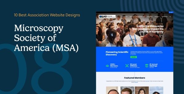
8. Microscopy Society of America (MSA) – MSA advances the field of microscopy and microanalysis through an interactive, content-rich website.
Top 3 Features of the MSA Website:
- Educational Resources: Members can access journals, recorded webinars, and training programs directly through the site, supporting continuous learning.
- Community Building: The site features information on annual meetings, competitions (like micrograph contests), and collaborative forums to strengthen the professional community.
- Cutting-Edge Content: News feeds and blog updates highlight scientific advancements and industry news in microscopy, positioning the site as a go-to resource for current information.
MSA's platform excels at blending professional resources with community-focused tools. The design balances technical content with easy navigation, ensuring both new and experienced microscopists find value.
Annual meetings and professional competitions can boost collaboration by up to 50%, helping drive innovation and shared learning. Organizations like MSA leverage these events to strengthen industry relationships and accelerate advancements in their field.
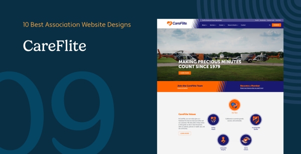
9. CareFlite – CareFlite, a nonprofit medical transportation service, uses its website to promote its lifesaving mission and connect with the community.
Top 3 Features of the CareFlite Website:
- Service Information: Clear, detailed descriptions of emergency and non-emergency transportation services help users understand options (e.g. ambulance, helicopter transport) and how to request help.
- Community Engagement: The site highlights charitable initiatives, fundraising events, and donation opportunities, inviting the community to support CareFlite's mission.
- Online Tools: Visitors can easily register for membership programs, access patient resources, and even donate directly through the website's secure online forms.
The CareFlite website successfully combines an accessible design with a community focus to support its lifesaving mission and encourage public involvement.
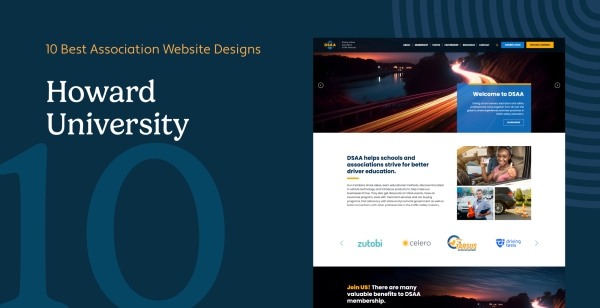
10. Driving School Association of the Americas (DSAA) – DSAA's website supports driving schools with resources, advocacy, and a professional network to promote safer roadways.
Top 3 Features of the DSAA Website:
- Educational Resources: Training programs, certification information, and instructional tools help driving instructors and schools improve their services.
- Advocacy Focus: The site provides updates on laws, regulations, and public policy initiatives impacting the driver training industry, helping members stay compliant and influential in policymaking.
- Event Management: An events calendar and online registration for conferences, webinars, and workshops keep members engaged and facilitate professional development opportunities.
The DSAA website equips driving school professionals with tools to foster safer roadways. Its clean design and organized content make it easy for members to find what they need, from legislative updates to upcoming training events.
Member directories and online forums can increase professional collaboration by up to 35%. Platforms like DSAA's foster strong peer connections among driving school professionals—promoting innovation, best practices, and long-term industry growth.
Inspired by these outstanding association websites? Seeing what's possible is the first step. Next, we'll explore how you can apply these ideas to redesign or build your own association website. The following expert tips will guide your strategy. (And if you're feeling overwhelmed or need additional support, don't hesitate to reach out to professional web design partners who specialize in association websites — the right expertise can make all the difference.)
5 Expert Tips for Creating a High-Performing Association Website
A high-performing website is crucial for any association. Whether you're building a new site or considering a redesign, these tips will help you create a platform that serves your members effectively.

1. Assess the Need for a Redesign
Before jumping into a website overhaul, evaluate whether your current site is truly meeting member expectations. Signs you might need to recreate or redesign your association website include:
- Outdated Design: If the site looks dated compared to competitors or modern web standards, it's time to refresh the look and feel.
- Poor Mobile Experience: Over half of web traffic comes from mobile devices and if your site isn't fully responsive and mobile-friendly, you're likely losing visitors. (A poor mobile experience can also hurt your reputation; 57% of users won't recommend a business with a badly designed mobile site.)
- Declining Engagement Metrics: Low event participation, fewer member logins or sign-ups, and reduced resource downloads all signal that your website is not engaging members as it should.
By addressing these gaps, you can determine if it's time for a complete redesign or just targeted updates. And remember, 52% of association executives say lack of engagement is the primary reason members do not renew their membership. If your website isn't helping members engage with your organization, a redesign can directly improve member retention.
2. Focus on Branding Consistency
A cohesive brand across your website builds trust and recognition. Ensure that your site's design reflects your association's mission and identity by:
- Using Consistent Visuals: Maintain the same colors, logos, and fonts across all pages. Every element—from the homepage banner to the footer—should align with your established brand guidelines.
- Unified Messaging: Align imagery and messaging with your organizational goals and tone. Your content and graphics should immediately convey who you are and what you stand for.
Inconsistent branding can confuse visitors and weaken your association's credibility. On the other hand, a website that's visually aligned with your mission reinforces professionalism and trust. Visitors form opinions about your credibility within seconds of landing on your site, so a modern and unified design is critical. (In fact, 94% of first impressions are influenced by design elements, not content.)
3. Optimize for Mobile and Accessibility
Your website must be user-friendly for everyone, which means optimizing for mobile devices and ensuring accessibility for people of all abilities:
- Mobile Optimization: Ensure pages look great and function well on all screen sizes, from desktops to smartphones. Given the dominance of mobile browsing, Google now uses mobile-first indexing (if your site isn't mobile-friendly, it may not rank well in search results). Plus, a seamless mobile experience is expected by your audience.
- Accessibility Compliance: Follow WCAG 2.1 guidelines to make your site usable for people with disabilities. Key steps include:
- Adding alt text for all images (so screen readers can describe them).
- Ensuring keyboard navigability for those who can't use a mouse.
- Using high-contrast color schemes and readable fonts for those with visual impairments.
- Providing captions or transcripts for video/audio content.

Prioritizing inclusivity broadens your reach and ensures equal access for all members and visitors. An accessible, mobile-friendly site not only improves user experience but also demonstrates your association's commitment to serving every member. It's worth noting that catering to mobile and accessibility isn't just a nice-to-have: it's often required to meet legal standards and member expectations (for example, 85% of adults believe a mobile site should be as good as or better than the desktop site).
4. Provide Robust Member Resources
Exclusive, member-only content adds significant value to association memberships and keeps members coming back to your website. Consider implementing features such as:
- Members-Only Portals: Password-protected directories, forums, or resource libraries that offer content exclusively to members (e.g., an online community or knowledge base).
- Job Boards and Career Centers: Create an industry-specific job board where members can post or find opportunities. This not only helps members professionally but also drives regular traffic to your site.
- Downloadable Toolkits and Publications: Offer white papers, toolkits, research reports, or e-books that address your industry's pain points. These resources position your association as an authority and give members tangible benefits for their dues.
A strong resource hub demonstrates value to members and can improve both retention and engagement. When members frequently use your website for valuable information or networking, they'll be more likely to renew and recommend your association to peers. In one industry study, 25% of associations reported that creating targeted member communications (a form of specialized content) boosted member engagement. The lesson: providing relevant, high-quality content through your website keeps members involved. Make your association website a go-to destination for knowledge and connections, and you'll reinforce the value of membership every day.
5. Enhance Security and Stability
Association websites often handle sensitive member data (personal information, payment details for dues or event registrations, etc.), so your site must protect that data and maintain reliable uptime. Essential security practices include:
- Use SSL Encryption: Install SSL certificates to enable HTTPS on your site, encrypting data transfer. Visitors should see the padlock icon in their browser, signaling that your website is secure. (This is a basic trust factor as modern browsers may even flag non-HTTPS sites as "Not Secure.")
- Implement Two-Factor Authentication (2FA): For admin logins or member portals, enable 2FA to add an extra layer of security beyond just passwords.
- Ongoing Software Updates: Keep your content management system (CMS), plugins, and any third-party integrations up to date. Regular updates patch security vulnerabilities. Consider scheduling routine maintenance checks or using managed hosting that handles updates for you.
- Backups and Uptime Monitoring: Maintain automated backups of your website and have uptime monitoring in place. This ensures you can quickly recover from any crashes or outages, minimizing disruption for your members.
Investing in security not only protects sensitive information but also builds trust with your members and visitors. For instance, 75% of consumers say they will not purchase from (or engage with) an organization they don't trust with their personal data. The same principle applies to your association wherein members need to trust that their data (and transactions on your site) are safe. By visibly prioritizing security (displaying badges, using secure payment gateways, etc.), you reassure members that your association values their privacy and safety. In the long run, a secure and stable website protects your reputation and helps sustain member confidence in your organization.
Frequently Asked Questions (FAQ)
How do we find the right web solutions for associations?
Finding the right web solutions for associations means looking beyond basic website builders. You need a platform that seamlessly integrates your front-facing public website with your backend member database, allowing for secure login portals, automated dues renewals, and members-only event registration.
Should we partner with a specialized web design association or agency?
Absolutely. Partnering with a specialized web design association or a dedicated web developers association ensures your site is built specifically for complex member hierarchies. Experts understand how to properly gate content, set up robust directories, and ensure your site is fully ADA compliant, which saves your internal team hundreds of hours of frustration.
Takeaway
Your association's website is more than just an online brochure, it's a powerful tool for connection, engagement, and growth. By drawing inspiration from these best-in-class association websites and applying our expert tips, you'll be well-equipped to build a platform that meets and exceeds member expectations.
Ready to redesign or launch your association's website? Now is the time to apply these best practices and create a site that truly serves your mission. A modern website with engaging design, fresh content, and robust functionality will not only attract and retain members but also elevate your organization's credibility in the industry. If you're unsure where to start, consider reaching out to professional web designers or service providers who specialize in association website development as their expertise can guide you through a successful project.
Ultimately, a great website can drive member engagement to new heights, strengthen your community, and support your association's goals. Start with the strategies outlined above, and you'll be on your way to creating one of the best association website designs in your field.
Looking for more resources? Check out:
- Member Engagement: The Actionable Guide to Boost Retention. (Looking to better engage and retain your association's members? This guide offers proven strategies to strengthen your member engagement approach.)
- Association Website Best Practices: Designing for Success. (Now that you know the basics of association website design, dive into these eight best practices for creating the website of your dreams!)
- 5 Effective Donation Page Design Tips (Plus Examples!). (If your organization depends on donations, you can't neglect your online donation page. Learn five design tips that are critical for donation page success.)
By continuously learning and iterating, you'll ensure your association's online presence remains impactful and valuable for your members. Good luck with your website project, and here's to higher engagement and a thriving membership community.