10 Nonprofit Web Design Best Practices To Maximize Support


Want an engaging website?
Your website is the foundation of your nonprofit’s digital presence. With a well-designed website, your nonprofit can maximize its reach, boost donor acquisition and retention rates, and raise more revenue. As a result, your nonprofit will be in a better position to engage donors and pull in more support.
While web design may seem daunting—especially if you don’t have previous web development experience—it can be accomplished with the right tools and strategies. In this article, we’ll walk you through the best practices to strengthen your digital presence and streamline the nonprofit web design process.
When a visitor lands on your site, you only have a few moments to make a great first impression. So, your website design needs to be both visually appealing and informative to grow your reach. Let’s dive into how you can make a beautiful nonprofit website from scratch or revamp your current website.

1. Choose a nonprofit CMS.
A content management system (CMS), or website builder, is a system that streamlines the entire website development process.
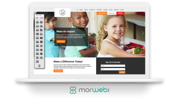
With a CMS, users can easily upload and manage digital content on a user-friendly interface. Instead of working with code on the technical backend of websites (which is time-consuming, difficult, and headache-inducing), a CMS does the heavy lifting for you. This way, your only job is uploading and arranging great content.
While there are many generic CMS platforms, choosing a nonprofit-specific CMS is essential to the success of your website. CMS platforms designed for nonprofits come with important functionality for facilitating events, fundraisers, and so much more that can simplify your nonprofits operations.
When it comes to picking a nonprofit-specific CMS, you’ll want a website builder with the following features:
- Customization. In order to stand out from the crowd, your nonprofit website should be unique to your organization. Use your CMS to add custom elements like font, color scheme, page layout and theme, and your nonprofit’s logo. Branding your nonprofit’s website boosts your organization’s credibility and expands your reach.
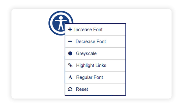
- Widgets. Premium widgets built into your nonprofit CMS make it easier to arrange and display content. The right widgets help optimize the user’s experience, encouraging site visitors to stay on your website for a longer period of time. For example, Morweb’s accessibility widget allows users to customize their experience on your site. To cut costs, choose a CMS that already offers widgets instead of having to pay additional fees.
- Support. As you familiarize yourself with your CMS, it’s likely that you’ll run into some questions. An ideal CMS should have experienced web developers readily available to provide customer support when you need it.
- Live-Editing Features. Make uploading and managing content as easy as possible by using live-editing features. With live-editing, you can click and type or drag and drop to edit elements on a page—no coding required.
- Mobile-Responsive. A mobile-friendly website can significantly increase your website’s traffic and promote a positive user experience. Your CMS should automatically optimize your website to fit any size device without too much pinching or scrolling. This is especially important when it comes to your nonprofit’s donation page. In fact, according to 360MatchPro, mobile users made up 33% of website donation transactions last year.
- Security. Your website will likely process donors’ personal records, like contact and billing information. In order to establish trust with your donors and keep your records safe, you’ll need a secure CMS that protects your website’s data from hacks or leaks.
You’ll also want to consider your nonprofit’s budget when choosing a CMS. However, don’t fall into the trap of picking a “free” CMS! Although popular open source platforms (think WordPress or Drupal) are free upfront, they can end up costing you a fortune because of additional plug-ins and integrations you’ll have to purchase.
And, because these platforms don’t offer traditional customer support, there’s the added cost of hiring an external web developer for support. It is worthwhile to invest in a platform with a monthly subscription that provides an all-in-one solution, like Morweb.

2. Brand your nonprofit website.
Instead of using a cookie-cutter website template that looks like a thousand other sites, your website should be customized to your nonprofit. This way, visitors know your website belongs to your organization.
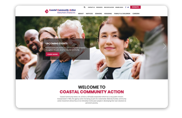
There are many benefits to branding your website, including:
- Increased brand awareness. Brand visibility is an important part of expanding your reach. As people become familiar with your organization, they’ll be more likely to trust your nonprofit and become a supporter.
- Boost in credibility. A branded website looks more clean and professional. This helps convert casual site visitors into donors, which can be a huge boost in revenue.
- Stronger connection with supporters. Your supporters will emotionally connect with your cause and foster a stronger relationship with your nonprofit. As a result, you’ll have access to a robust support network, from volunteers to recurring donors.
To get started on branding your website, you’ll need to design a beautiful logo. Your logo should include bright, easily recognizable colors, and a blend of simplicity and sophistication. Stick it in prominent places on your website so supporters can easily attribute your various web pages, including your donation page, to your organization.
Next, brand your whole website to your organization’s color scheme. This creates a cohesive and unified design and adds to the feeling of security for your visitors as well as your professional appearance.
Finally, add some high-quality pictures and videos. Embed these into your pages so that your visitors know what your organization does in the real world. These graphics can include:
- Participants at your latest fundraising event
- Your staff hard at work behind the scenes
- The beneficiaries of your nonprofit, whether that be underserved communities or homeless animals
These images and videos create visual interest in your website and allow your organization to tell its story. A picture is worth a thousand words, so by including pictures and videos, you tell your story and mission more effectively than a whole novel ever could.

3. Add accessibility features.
In order for your nonprofit to grow, it needs to be accessible by everyone. You’ve already put the hard work into creating your nonprofit and developing inspiring content. Now, you just need it to reach as many people as possible.
Expand your audience and create a positive user experience by using the following accessibility features:
- Accessibility widget. An accessibility widget lets the user easily adjust the content to their needs. With Morweb’s accessibility widget, users can conveniently increase or decrease the font size, convert colors to greyscale, highlight links, and change font type to regular non-serif.
- Alt text and transcripts. All users should have the opportunity to engage with your amazing visuals. Accompany your photos with written descriptions so viewers that can’t see the images can still understand what they’re conveying. For videos, provide a transcript or captioning.
- Legible font. Your text should be easy to read so users can enjoy the content. If your text is too large or small, or uses a complex font, your site visitors will get easily distracted and are likely to click away. Choose a font size that will show up clearly on the user's screen and a plain and simple style to facilitate a positive reading experience. Sans serif fonts are best for readability.
- Contrast between text and background. If your page background color is too dark, it can be difficult to read your content. Opt for a combination with a high contrast ratio. For example, black text on a white background has the highest contrast ratio. But in general, lean toward having dark text on a light-colored background.
- Appropriately sized images. Your images are an important part of telling your organization’s story, but if they’re too small or too big, visitors will have a hard time viewing them, and they may even slow down your site’s load speed. Make sure your images are formatted at a reasonable size in relation to your text.
Accessibility not only boosts user’s experience, but can also help your website rank higher in Google’s search engine results. As a result, you’ll be able to reach more people, which can lead to an increase in support and revenue.

4. Optimize it for mobile devices.
Modern nonprofit websites must be fully functional on every device, whether that’s on a mobile phone, tablet, or desktop computer. Mobile-optimizing your nonprofit website is good for both the user experience and search engine optimization (SEO) of your site.
Search engines like Google prefer websites that provide a great user experience on mobile devices and will therefore rank your website higher than a site that is not mobile-friendly.
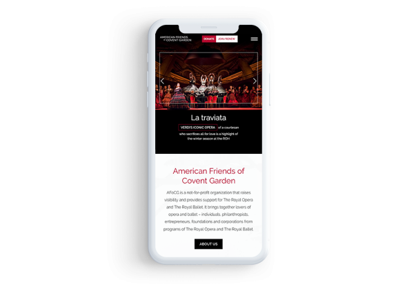
Your mobile users should be able to easily fill out all forms, including your donation page. All prompts should be appropriately sized and simple to fill out. Make sure to avoid frustrating your users with too many prompts. Limit your forms to only the most essential information so mobile users can complete forms in just a few moments. You’ll also want to minimize pop-ups, which can be impossible to close out on a mobile screen if they’re not set up right, driving traffic away.
The right website builder will automatically optimize your website for mobile devices. This way, you won’t have to worry about coding or changing the technical backend of your website for a streamlined mobile experience. With a mobile-friendly website, more people will be able to engage with your content and your donation page, increasing your revenue.

5. Create a well-designed donation page.
Your donation page is one of the most important—and most searched-for—components of your nonprofit’s website. Many site visitors will arrive on your website for the specific purpose of making gifts to your organization.
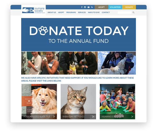
In order to convert site visitors into loyal donors, use the following donation page design tips:
- Brand your donation page to your organization. Your donation page should feature the same font, color scheme, page layout, and theme as the rest of your website and marketing materials. This will help boost your nonprofit’s credibility, establish trust with donors, and create a professional look. Plus, an engaging donation page is much more satisfying to complete than a generic one; this will help keep donors’ attention and encourage them to submit a donation.
- Provide multiple giving options. Your supporters will be more inspired to give when you provide them with several ways to do so. Using your nonprofit-specific CMS, you can create a donation page that allows site visitors to set recurring gifts or choose from predetermined amounts that help them decide how much to give. You can also provide flexible giving methods beyond credit or debit cards, such as Venmo, PayPal, and Zelle.
- Incorporate a matching gifts tool. With a matching gifts tool right on your donation page, donors can easily look up whether their employer will match donations to your organization. Many times employers will double (or even triple!) their employees’ contributions, increasing your revenue. As a result, donors will feel more inclined to give more since they can make their impact even greater. This is an easy way to generate more funds for your nonprofit and help donors feel more connected to your organization.
- Use ample white space. Avoid a donation page that looks too cluttered or disorganized. Go for a minimalistic feel so site visitors can focus on filling out the prompts and reading your content without feeling distracted. To do this, provide an appropriate amount of space between each element.
Throughout your website, make sure to use buttons to direct site visitors to your donation page. A brightly colored button in your navigation menu (or at the top of the page on the mobile version of your site) can draw site visitors’ attention to your donation page. Even as they explore all of the components of your website, they’ll be able to reach the donation page in just one click.

6. Implement security features.
Website security should be a high priority for nonprofits, especially if you collect online payments or user data through your site.
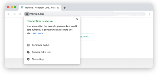
The first step to securing your nonprofit website is to install a Secure Socket Layer (SSL) Certificate onto your web server. When your SSL Certificate is successfully installed, your application protocol (HTTP) will change to HTTPS to indicate that it is secure. This way, it’s less susceptible to data leaks or hackers, protecting your donors’ information and your nonprofit’s reputation.
Nonprofit websites with self-hosted donation forms must be Payment Card Industry Data Security Standard (PCI-DSS) compliant. PCI compliance involves how a donor’s credit card and personal information is stored. Any information collected through your website must be protected and stored safely. Choose a nonprofit CMS like Morweb that will automatically make your website PCI-DSS compliant.
A good website hosting platform will take care of any security updates for you. While platforms like Morweb will automatically roll out updates for your website, open source CMS platforms like WordPress and Drupal rely on the user to run the updates, leaving your site vulnerable if you don’t keep to it.

7. Use storytelling.
Your website is a powerful tool in telling your organization’s story. Effective storytelling helps your nonprofit connect emotionally with current and potential supporters. This can turn casual site visitors into dedicated volunteers and donors, growing your nonprofit’s reach.
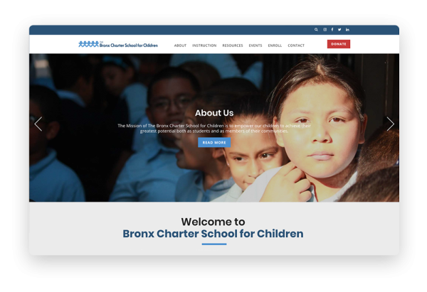
To bring your nonprofit’s story to life, use the following strategies:
Create an “About” page.
This page will be especially valuable for site visitors who are unfamiliar with your organization and want to learn more. Create a designated page that gives a complete overview of your organization, including its mission statement, the year it was founded, the work it's done to date, and any other information relevant to your audience. This is a great opportunity to make a memorable first impression, so be sure to highlight the problem your nonprofit has been working to solve and how supporters can be a part of the solution by contributing to your organization.
Add powerful visuals.
A picture is worth a thousand words, so make it count! Feature images that show your organization in action across your website, such as photos of volunteers at work or past events or programs your organization has organized. You can even highlight people that have directly benefited from your nonprofit’s work. This helps site visitors better understand the impact your nonprofit has and why it's a worthy cause to support.
Spotlight impact stories.
Everyone loves a story with a hero who comes out on top. Showcase stories of people (or animals!) your organization has helped with accompanying images. Make sure to take the reader through a complete story arc, showing the person before they received your organization’s services and their new and improved life afterwards. For example, if you’re an animal welfare organization, you can feature a story of a dog that your nonprofit rescued from inhumane conditions, and is now happy and healthy with its new family. Be sure to accompany your story with images that appeal to people’s emotions and make them connect with your cause.
Create a “Testimonials” page.
To add to your organization’s credibility and help build trust, you can create a “Testimonials” page that features quotes from people your organization has served. This will help supplement your organization’s mission statement; after all, every good story needs supporting evidence. This builds supporters’ confidence in your nonprofit and encourages them to support your efforts.
As you create impact stories, make sure to be descriptive, but avoid long blocks of text. You want your audience to read through your entire story, so try to stick to the main points that will compel people to support your organization.

8. Make it easy to use and navigate.
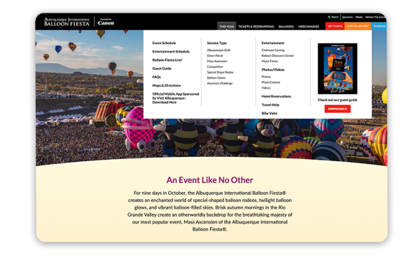
Encourage site visitors to engage with your organization by designing a website that’s easy for them to navigate. When visitors can easily find exactly what they’re looking for, they’ll have a positive experience that will lead them to think more highly of your organization.
Here are some of the ways you can shape more positive experiences with your website:
- Maintain clean designs. Keep your website’s layout and design style simple and uncluttered. While you don’t have to use a minimalist style that limits you to neutral colors and few images, prioritize writing concise copy, selecting a tight color palette, and limiting the content featured on each page to what will have the biggest impact.
- Leverage menus. The primary way that most people navigate a website is through the main menu, usually included in a header at the top of the website. Further improve your site navigation by adding important links in your footer and creating a sitemap with a list of all of your important web pages. If your website has a very large navigation menu, consider using a mega menu (a large dropdown list that allows you to organize your links into sections).
- Limit reasons to leave the site. This may seem obvious, but there may be times when supporters are forced to leave your website to complete certain tasks. For example, perhaps they have to use a different software or website to submit a matching gift request. As a remedy, invest in the software you need to limit these trips off your website.
When your nonprofit’s website is easy and enjoyable to use, your supporters are likely to use it for longer periods. This boosts the chance that they will find blog content, testimonials, and ways to get involved that motivate them to continue supporting and sharing your mission.

9. Display upcoming events.
Events are a great way to connect with supporters in person and deepen relationships with your existing donors and volunteers. Your nonprofit website offers the perfect opportunity to promote these events as it is often the first place people go to get updates about your organization.
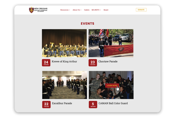
Help direct new site visitors to your organization’s event page by displaying upcoming events on your homepage. By including dated content on your website, new visitors will be able to see that your website is frequently updated and will feel encouraged to check back for more engagement opportunities.
With Morweb’s events module, you can create and manage beautifully designed event landing pages. Morweb offers built-in event templates so you can easily add in your content and will automatically generate a dedicated event page URL once you’re ready to go live. Plus, you can easily create custom registration forms and track signups for a smoother planning process.

10. Provide additional engagement opportunities.
Now that you’ve grabbed your audience’s attention with your content, you need to offer ways for supporters to stay actively engaged.
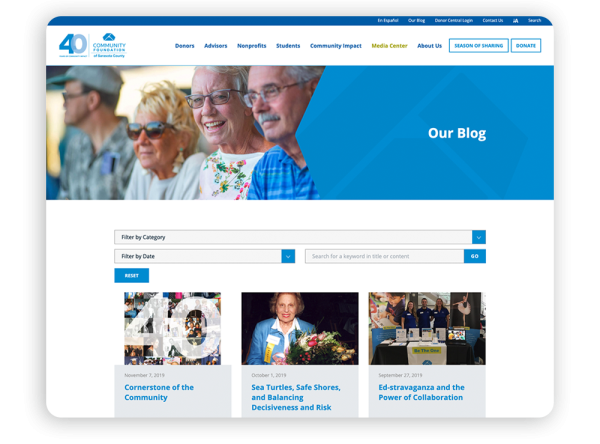
Supporters who choose to stay connected with your organization value your work and want to stay up-to-date on your latest progress. Share your achievements and encourage their engagement in helping you reach your next goals by incorporating website elements such as:
- An email list sign-up. Keep supporters in the loop about your progress and upcoming opportunities by including an email newsletter sign-up that visitors can complete quickly and easily.
- A volunteer form. Want to encourage supporters to participate in other ways beyond donating? Use your CMS to create a form that volunteers can use to sign up and gain hands-on experience in your nonprofit’s work.
- Social media widgets and links. Many, if not most, of your supporters are already spending time on Twitter, Facebook, Instagram, and other popular platforms. Stay connected to them on their favorite social media sites by including live feeds or links to your accounts on your website and encouraging visitors to like and follow your nonprofit.
- An active blog. A blog is a great way to provide supporters with educational materials related to your nonprofit’s mission, news updates, or even spotlight volunteers or beneficiaries of your organization. Morweb’s blog module can help your nonprofit easily upload rich content with scheduled published dates, social media integration, instant image optimization, and more.
When visitors are captivated by your nonprofit’s web design and motivated to explore its various resources, your organization will have no trouble encouraging them to become supporters and stay involved with your important work.
The Gist
Designing an engaging and user-friendly nonprofit website doesn’t have to be out of reach. With the right CMS and nonprofit-specific website features, you can put into play nonprofit web design best practices, empowering your organization to forge meaningful connections with supporters and advance your mission online.
Looking for more web design strategies for your nonprofit? Check out these additional resources to guide your research:
- 30+ Best Nonprofit Websites + 3 Tips for Designing Your Own. Explore nonprofits that have created inspiring websites and how you can emulate their best practices for your own digital success.
- Top 10 Nonprofit Payment Processors: Accept Donations Online. To optimize your online donation page, you’ll need a payment processor that will safely transfer donated funds to your nonprofit. Check out the 10 best nonprofit payment processors to facilitate a secure and trustworthy donation process.
- Graphic Design for Nonprofits: What To Know & 9 Free Tools. A surefire way to make your website more engaging is by adding beautiful graphics. Learn more about nonprofit graphic design and how you can use it to optimize your site.
