Nonprofit Web Design: 5 Best Practices for a Beautiful Site

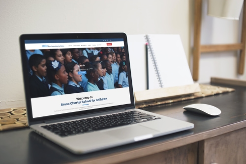
Want an engaging website?
Whether they’ve recently learned about your nonprofit and want to do more research or are already familiar and ready to give to your cause, your supporters expect to be able to find your organization online. A well-designed nonprofit website is central to staying connected with your supporters and encouraging future donations.
Potential supporters will be most eager to give to your nonprofit organization online when you’ve created a beautiful site for them to interact with. The best designed nonprofit websites are those that:
- Engage visitors with their visual elements
- Incorporate plenty of content without being overwhelming
- Are easy to navigate and use
- Simplify the donation process
Ready to transform your nonprofit’s website into a beautiful one? Whether you’re creating a new website for your nonprofit or giving your current site a makeover, we’ve compiled a list of the most valuable best practices for nonprofit web design. As you work to improve your organization’s online presence, we’ll show you some of the ways that you can.
From the moment a visitor arrives on your site, you want them to have a good idea of your nonprofit’s mission and an understanding of the important work that you do each day. Introduce or reinforce these aspects of your organization with a beautiful website that tells your story right from the homepage.

1. Tell your organization’s story with captivating nonprofit web design.
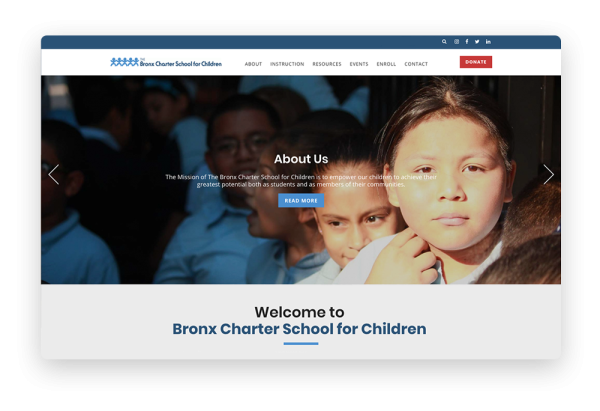
Your website is a primary location for new visitors to be introduced to your nonprofit organization and your work as well as for familiar supporters to stay updated on your latest projects. Visitors to your website should be able to grasp your nonprofit’s overall mission as well as your most urgent goals quickly and easily.
A beautiful website begins with a clean and modern layout that’s easy for your site’s visitors to navigate and for your nonprofit’s team to update. If you're like most nonprofits, it’s unlikely that your team members are experienced web developers. In this case, you’ll benefit from choosing to host your site on a content management system (CMS) designed specifically for nonprofits.
A nonprofit CMS makes it easy for your organization to convey your story to visitors and direct them to the most important pages on your site. Some of the features to look for as you choose a nonprofit CMS include:
- A highly customizable layout. Your nonprofit’s mission and story are unique, so your website should be, too! Choose a CMS that offers drag-and-drop templates, which allow your team to customize your site’s layout and refresh it as often as you want without having to code each element yourselves.
- Multimedia capabilities. Captivate your site’s visitors from the moment they arrive on your homepage with eye-catching images that showcase your nonprofit’s most recent projects and the incredible work you’ve already done. Videos—including testimonials from volunteers or footage of your team working to make a positive difference in your community—can also be highly engaging.
- Easy-to-use editing features. You want a website that’s easy to keep updated with content related to your latest projects. Look for a CMS that offers live editing tools so that your team can regularly refresh your content and know exactly what the page looks like on the front end of your website in real-time.
Looking for another place on your site to share your nonprofit’s goals, latest achievements, and other key aspects of your story in more detail? Choose a CMS that features robust and easy-to-use blogging tools so that your team can share even more valuable information with supporters and other visitors to your site.
When your nonprofit web design is both beautiful and easy to navigate, your supporters will be encouraged to explore your site further and use it to make their gifts. Keep them engaged and demonstrate your trustworthiness with a site that’s branded to your organization on every page.

2. Customize your web design to your organization’s brand.
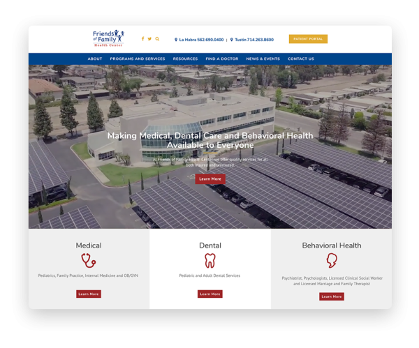
Your website is an excellent location to build brand recognition for your nonprofit. No matter the size of your organization, supporters will be more enthusiastic about giving to your nonprofit when they’re able to associate your name, logo, and other branding elements with all of the good work you’ve demonstrated.
Branding is also essential to making your site trustworthy so that supporters know exactly where their contributions are going. The presence of your branding elements on all of your website’s pages—and especially your donation page—assure supporters that their gifts are going straight to the cause they care about.
Some of the most important branding elements to incorporate into your nonprofit web design include:
- Page templates customized to your brand. When choosing a CMS, you’ll want to ensure that the layout templates are not only easy to use but also easy to customize to meet your organization's brand standards.
- Your logo, font, and color scheme. Increase your brand recognition and ensure the trustworthiness of your website by including these elements on every page of your website. Look for a CMS that allows you to pick the styling of the layout so that you can set the font and color scheme to match your logo.
- Branded add-on modules. Supporters who are visiting your site may want to make donations, buy branded merchandise from your online store, or register for events. Choose a CMS with built-in modules so that you don't have to send them to an external linking platform with a different look and feel. Built-in pages will automatically be styled to match the rest of your website so you can maintain that element of trust as your supporters navigate through your content.
Beautiful nonprofit website design makes your site visitors feel confident about supporting your organization because they associate your branding with quality work.
As you create or refresh your nonprofit website, remember that many of your online supporters will be visiting your site and your donation page on their mobile devices. Your branding elements should appear just as prominently on mobile as on desktop displays of your site.
Whether your supporters are visiting your website to catch up on your organization’s most recent progress, make a gift, or register to join you at your next event, you’ll want to make sure that your nonprofit web design facilitates their journey through your site and takes them exactly where they want to go.

3. Design a nonprofit website that is easy for visitors to navigate.
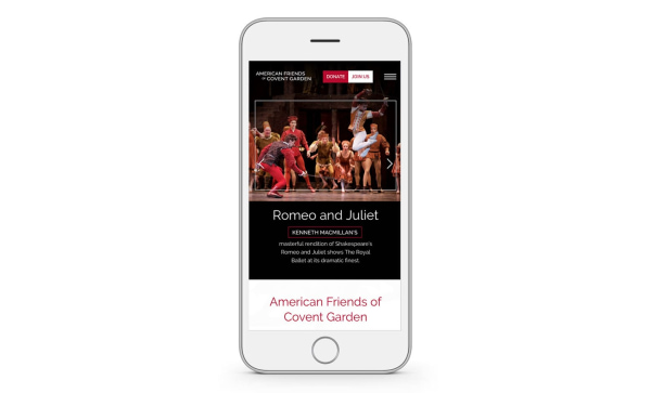
Your nonprofit’s team works hard each day to better your community and the wider world. You have so much to share with your site visitors and plenty of opportunities to offer them when they want to get involved! Encourage your site visitors to engage with your organization by designing a nonprofit website that’s easy for them to navigate.
When visitors can find exactly what they’re looking for as soon as they land on your website, they’ll have a positive experience that will lead them to think more highly of your organization. Because they have found what they need so quickly, many of them will be motivated to explore more of the components of your site, increasing the likelihood that they’ll find new ways to get involved.
Ready to design a website that will connect supporters with the information they need and boost engagement with your organization? Make sure that your nonprofit website design is:
- Mobile-responsive. Just as your branding elements should appear as prominently on the mobile version of your website as on the desktop version, each page or component of the site should look and function just as beautifully on mobile as on desktop. This is especially true of your donation page, as many supporters will want to give on-the-go.
- Optimized for page speed. No one likes visiting a slow website, and a frustrating experience can lead visitors to leave your page without exploring your organization’s work or completing their gifts. Follow Double the Donation's nonprofit web design tips by resizing and compressing images to minimize page load time.
- Using updated navigation. Like your organization, your website changes over time. Create and update content to reflect your organization’s new goals and work. Choosing a non-technical CMS designed for nonprofits ensures that members of your team will be able to update your site’s navigation menu whenever necessary. This way, site visitors will always know where they can find the pages they’re looking for.
Your supporters visit your website to learn more about your organization and explore the ways in which they can get involved in contributing to your good cause. For many of them, this means donating to your organization.
Make your donation page prominent within your site’s navigation and ensure that you engage in nonprofit web design best practices when it comes to this essential component of your website.

4. Choose a web design that directs visitors to your donation page.
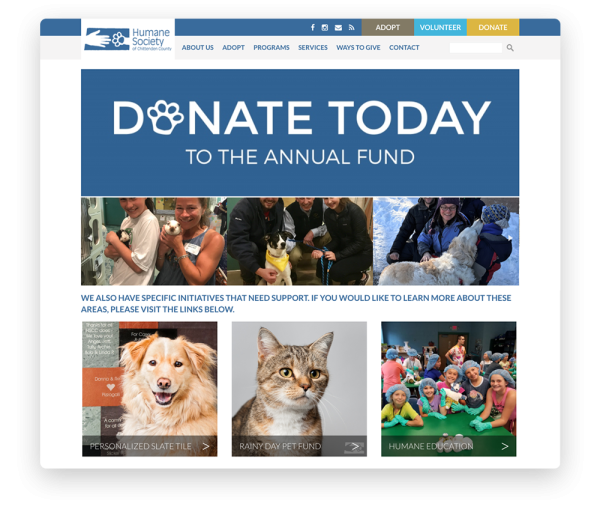
Your donation page is one of the most important—and most searched-for—components of your nonprofit’s website. Many site visitors will arrive on your website for the specific purpose of making gifts to your organization! Design your nonprofit website so that visitors can access your donation page from any location on your site.
An effective donation page is one that is as easy for your nonprofit’s team to create as it is for your site’s visitors to access and use. By building an on-site donation page using your CMS designed for nonprofits, you’ll be able to:
- Use buttons to direct site visitors to your donation page. A brightly colored button in your navigation menu (or at the top of the page on the mobile version of your site) draws site visitors’ attention to your donation page. Even as they explore all of the components of your website, they’ll be able to reach the donation page in just one click.
- Brand your donation page to your organization. Recent statistics indicate that custom-branded donation pages on a nonprofit’s website bring in 6x more donations than external linking pages! This is why it’s important to create your donation page using your nonprofit CMS to ensure that it automatically matches your website's branding.
- Provide multiple giving options. Your supporters will be more inspired to give when you provide them with several ways to do so. Using your nonprofit-specific CMS, you can create a donation page that allows site visitors to set recurring gifts or choose from predetermined amounts that help them decide how much to give.
When it comes to online giving, supporters value convenience. You can simplify the process by offering a quick donation option on your homepage like that of the Humane Society of the Treasure Coast. A simplified donation form will allow donors to give to your cause as soon as they arrive on your website.
The most beautiful and effective nonprofit website designs encourage visitors to return to your site again and again. Provide your site’s visitors with several convenient ways to stay connected so that they can stay updated on your progress and support you whenever they’re inspired!

5. Offer site visitors multiple ways to stay involved and updated.
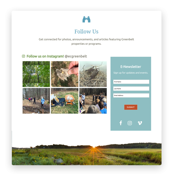
Engaging nonprofit web design does more than simplify the donation process. A beautiful website can transform one-time donors into recurring givers and motivate supporters to seek out additional forms of involvement in your organization. Look for a CMS that allows your nonprofit to incorporate forms, widgets, and other tools that keep you connected to your supporters.
Supporters who choose to stay connected with your organization value your work and want to stay up-to-date on your latest progress. Share your achievements and encourage their engagement in helping you reach your next goals by incorporating website elements such as:
- An email list sign-up. Keep supporters in the loop about your progress and upcoming opportunities by including an email newsletter sign-up that visitors can complete quickly and easily.
- A volunteer form. Want to encourage supporters to participate in other ways beyond donating? Use your CMS to create a form that volunteers can use to sign up and gain hands-on experience in your nonprofit’s work.
- Social media widgets and links. Many if not most of your supporters are already spending time on Twitter, Facebook, Instagram, and other popular platforms. Stay connected to them on their favorite social media sites by including live feeds or links to your accounts on your website and encouraging visitors to like and follow your nonprofit.
You can use social media elements on your site to keep visitors updated on your upcoming events and follow your organization’s work in real time. These elements work especially well when combined or placed near each other on your site.
When visitors are captivated by your nonprofit’s web design and motivated to explore the site through easy navigation, your organization will have no trouble encouraging them to become supporters and stay involved with your good work.
A beautifully designed nonprofit website is central to keeping your supporters engaged and giving. Below, you’ll find a few more valuable resources that you can use to create or refresh your site in ways that are sure to inspire your visitors:
- 5 Easy Ways to Use Your Website to Help Grow Your Online Presence. Check out this guide for tips on building an online following and strengthening your organization’s brand recognition.
- Top 9 Nonprofit Website Templates for All Organizations. Whether you’re creating an entirely new website or revising your current site, find guidance and inspiration by having a look at these effective templates.