How to Build a Membership Website: The Ultimate Guide


Want an engaging website?
For member-based organizations such as professional associations, nonprofits, or clubs, effective member engagement can lead to a stronger community, long-term member retention, and overall organizational growth.
Though there are a number of strategies and tools your organization can use to engage its members, a well-designed, compelling membership website is one of the most important. The trouble for most organizations is knowing where to start, as most member-based organizational leaders aren't moonlighting as expert web designers and developers. In addition, tight budgets may hold you back from seeking expert help.
The good news about building a membership website is that, with the right tools and some basic know-how, you can build a site that you and your team are proud of without the hassle of integrating plugins, creating codes, or seeking third-party advice.
That's where this guide comes in. In it, we'll teach you how to build a membership website that helps you engage your members and demonstrate the value of belonging to your community. Specifically, we'll cover:
- What is a membership website?
- Step 1. Design or revisit your membership model.
- Step 2. Choose a website builder created for member-based organizations.
- Step 3. Add valuable content to your membership website.
- Bonus: Membership Websites We Love
If you're ready to enhance your organization's membership experience by working to create a tight-knit online community, this is the guide for you. Let's jump in.

What is a membership site?
A membership website is primarily used by nonprofits, associations, and some businesses to engage both prospective and current members. The most successful membership organizations use their websites to acquire, engage, and retain members by offering exclusive resources such as industry insights, member directories, job boards, online courses, and online opportunities to interact with other members.
Membership websites that are both well-designed and easy-to-use provide the most value. When membership websites feature functional tools, your organization's team can save substantial time on administrative tasks, such as:
- Registering new members
- Processing dues
- Updating personal member profiles
- Distributing members-only content
- Promoting members-only events
- Communicating with members
To build a membership website that can benefit both your members and your team in these ways, you'll need to follow three critical steps. We'll take a look at these steps in the following sections.

1. Design or revisit your membership model.
Before building your membership website, you'll need to define your membership model. Or, if your organization already has a membership model, it may be worth revisiting and revamping that model to explore ways you can encourage prospects to become members or how to provide more value to current members.
What is a membership model?
Your association’s membership model defines why individuals pay a recurring fee in exchange for membership to your organization. A thoroughly-defined membership model not only justifies why someone should join your organization and continually renew their membership, but it can also guide the structure of the membership website you want to build as you determine the best way to present information about your membership program on your website. On the other hand, an unclear model will lead to dissatisfied members and a disorganized website.
As you create or rework your membership model, answer the following questions:

- What benefits do members receive for joining? This depends on what type of organization you’re running. For associations, members typically receive access to resources such as continuing education opportunities, networking opportunities, certification, events, and more. Determine the specific benefits and prominently communicate that value.
- What are the different membership levels and dues required for each? The approach taken for membership levels and dues varies across organizations. According to Association TRENDS, most employ a tiered structure in which lower-level members receive basic benefits, while higher-level members receive more perks and flexibility.
- How do prospective members join your organization? Once you've successfully outlined the benefits and membership levels, interested prospects will want to know what step to take next. Ensure you have a thorough process for welcoming new members to your organization. For example, after a prospect fills out an application, your team might need a certain amount of time to review the application, after which your new member may need to complete orientation and create an online profile.
Defining your membership model is a key first step in building an effective membership website, as it will allow you to provide useful tools and relevant content for your target audience. From there, you’ll be able to be completely transparent regarding your membership program, building a trustworthy brand for your organization online.

2. Choose a website builder created for member-based organizations.
After you’ve sufficiently defined your membership model, you'll need to select the right website builder, also known as a content management system (CMS), to help bring your vision to life. Specifically for organizations with smaller budgets, it’s important to have an intuitive CMS that empowers you to build your membership website without help from a professional web developer.
Open-source CMS platforms, such as WordPress, Ghost, or Drupal, are popular options that many organizations choose to go with. But these platforms often require more technical know-how and don't always offer the specific features you need for a membership website. A platform designed specifically for membership organizations will provide the functionality and features that will make building your website a piece of cake.
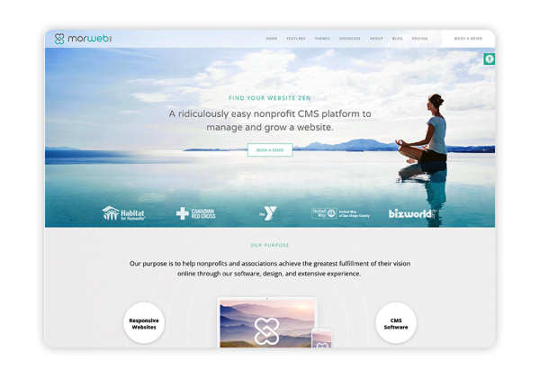
For example, Morweb offers an easy-to-use platform that you can leverage to create a useful and aesthetically-pleasing membership website.

To start shopping for a website builder that is right for your organization, we recommend taking a look at roundup-style lists of different providers, such as Morweb's list of the top membership website builders for associations. Resources like these give you the chance to get familiar with your options and to explore the different features each platform offers.
But what features will be the most important for building a truly effective membership website? Here's what we recommend you look for:
- Live editing tools. Many website builders have back-end editors that must be used to update pages. However, most of these editors in no way resemble the front-end of the page, making them tricky to use. The best platform for your organization will empower you to bring your visions to life and make changes directly to web pages with live editing and drag-and-drop functionality.
- Mobile-responsive forms. From membership applications to event registration pages, your membership website will likely house numerous forms. The right website builder will enable you to fully customize and embed forms directly onto your website. Plus, the top website builders will take care of mobile responsiveness for you, meaning the page elements will automatically adjust to fit users’ devices without compromising functionality.
- Member directory. A member directory is a critical resource to offer your members. Choose a website builder that will let you easily add, edit, and categorize members in a directory. Some platforms even offer interactive mapping capabilities, which your members can use to conveniently search and connect with others. This tool will help foster a strong sense of community within your organization as they bond over their mutual passion for your cause or field.
- Intranet portal. Member-based organizations need the flexibility to create password-protected pages for their members. Make sure your chosen website builder can grant access to members so that they can share internal information, participate in exclusive forums, and register for private events.
- Image optimization. Whether you have a blog where you post pictures from recent events or you want to share headshots of your organization's leaders on your "About Us" page, be sure the images you're putting on your website are high-quality. The best website builders out there allow you to convert your images to web-friendly versions, resize them, and easily alter the focus so they fit perfectly on your web pages.
Though every organization will have different needs, these are the essential features your team will need to build a useful and beautiful membership website. These intuitive design tools, paired with useful member-based tools, will prove invaluable when engaging your supporters. Conduct thorough research as you select your website builder!

3. Add valuable content to your membership website.
Offering the right type of content that reflects members’ goals and values is an essential part of membership website design. Otherwise, you’ll leave users frustrated when they can’t find sufficient information that answers their questions and allows them to accomplish tasks.
To determine what type of content to provide on your membership site, first think through why users visit your site. Overall, most prospective members have three primary expectations for your membership website:
- They want to understand your organization’s purpose and values. Oftentimes, prospects (and existing members who are considering renewing their membership) visit your membership website to determine if their personal values and needs align with what your organization offers.
- They want to join a thriving and engaging community. One of the primary reasons individuals join organizations is to connect with like-minded people who share the same values and passions. Creating and promoting a tight-knit community on your membership website is essential.
- They want access to specialized information and resources. Your membership website is an optimal tool for showcasing what value your organization brings to the industry that can’t be found anywhere else, whether you offer a mentoring program or virtual members-only networking events.
To meet (and even exceed!) these three expectations for your prospects and members, you’ll need to feature high-value pages and tools. Let's walk through the eight resources to include when creating your membership website.
Homepage
In most cases, your homepage will be the first page your membership website visitors will land on. Web experts have known for a while now that it only takes about 50 milliseconds for visitors to form an initial opinion of a site, so you’ll need to instantly showcase value in a visually compelling way.
Specifically, this means taking the area "above the fold" into account. The phrase “above the fold” refers to the content that’s visible above the bottom border when the page initially loads. According to a 2015 finding that still rings true today, there is an 84% difference between how website visitors view the "above the fold" portion of a page versus the "below the fold" portion, with the majority of their time spent above the fold. In other words, this is prime real estate on your membership website, especially on the homepage.
Use this as an opportunity to feature your main calls to action, such as "Become a Member Today!" or "Make a Donation Now." You may also choose to include recent industry news, organizational updates, featured members, upcoming events, or captivating imagery to showcase your recent work.
About Us
For associations and other member organizations, an About Us page is critical for displaying their work and purpose. This page can be instrumental in encouraging prospects to apply for a membership.
The About Us page should tell your organization’s story and showcase the individuals who drive your mission forward. Include the following key elements:
- The history of your organization
- Your mission
- Your vision and core values
- Staff and board member profiles
Your About Us page should be comprehensive enough to give prospects a solid understanding of what your organization stands for and what it offers. However, avoid including too much information. For example, you don't want to bog website visitors down in a long-winded version of your organization's history when they just want a quick overview.
New Member Information
The primary goal of your membership website is to provide ongoing value to existing members and encourage prospects to make the commitment to join. Featuring member information will provide a compelling case for prospects to join. Create a webpage that houses anything a new member might need to know, such as:
- Benefits
- Membership levels and required dues
- A link to your online form
Not sure where to start with this page? Use the membership model you worked on in Step 1 to guide the design!
Events
Conferences, conventions, and fundraisers are excellent ways to connect and interact with members, whether you’re hosting them in person or in the virtual space. Condense all available opportunities into a singular events page.
When building this page on your membership site, keep these best practices in mind:
-
Include a page summarizing upcoming events. Include the date and location of each event so that it’s easy for potential attendees to find. As soon as your event dates are finalized, add them to your event pages to get the word out and build momentum.
-
Feature easy-to-complete event registration forms. Create and share well-designed forms that capture key information, such as names, contact details, and payment information. This way, you can accurately predict attendance and prepare accordingly.
-
Privatize members-only events. With privatized pages, you’ll be able to manage user permissions and offer exclusive events to your members.
A well-designed events page can help you boost attendance at your conferences, conventions, and fundraisers, and can be a great place to direct members or prospective members to when they have questions about upcoming opportunities.
Members-Only Area
Member engagement should be at the forefront of your membership website design strategy. Offering a members-only area is a great place to start. Not only does a members-only area provide ongoing value for current members, but it also incentivizes prospects to join and gain exclusive access to content.
You might use this area of your membership website to protect members’ confidential information or to house exclusive resources like a job board or member directory and map. You may also consider creating a forum where members can discuss your work, industry trends, and members-only events. Remember, a CMS with an intranet portal and private pages will make this possible.
Blog
Whether it's housed in your members-only area or on display for all to see, a blog is a great asset to your membership website. Since blogging requires ongoing content creation, it can also lead to regular traffic from both current members and prospects. Plus, a blog is a great place to announce upcoming events and learning opportunities, promote fundraisers, and start conversations about topics within your field or that relate to your cause.
To create blog posts that your audience will want to read on a regular basis, you'll need to master the art of storytelling. Getting Attention's guide to nonprofit storytelling is a great place to start, as it offers the following tips:
- Share stories of compelling characters — real people that your audience can relate to.
- Introduce conflict in each story, as well as a proposed solution that your audience can be a part of by taking action.
- Activate emotion in your audience by sharing emotional narratives and describing sensory details.
- Support your storytelling with data.
- Use compelling visuals to enhance the stories you're telling.
For your blog to be truly effective, consistently update it. We recommend creating a content calendar to help you stick to a regular schedule. You can take this accountability to the next level by arranging email alerts for your members each time a new post is published.
Contact Us
Web development studies have found that 44% of website visitors will leave a website if there is no contact information available. Further, 54% of respondents indicated that a lack of thorough contact information directly impacts the organization’s credibility. In other words, a lack of contact information may deter prospects from joining your membership program.
Avoid this altogether with a Contact Us page that includes basic information such as a phone number, email address, and a physical address, if available. This provides a level of transparency and gives members a way to reach out to inquire about joining your organization. You may also choose to include an email newsletter signup on this page that discloses the benefits of receiving a monthly membership newsletter.
Donate
While membership dues make up the majority of your revenue, donations provide a source of additional income. Give prospective donors and members the ability to act on their generosity by featuring a conversion-optimized donation page on your membership website.
According to Morweb's guide to donation page design, this page should be visually consistent with the rest of your membership website to create a seamless, trustworthy experience that feels closely tied to the rest of your organization's operations and your overall values.
Remember, a website builder created for member-based organizations will allow you to fully customize your donation form with your organization’s colors, logo, and imagery. You'll also be able to customize the questions on the form, ensuring that the experience is fast, easy, and convenient. Don't forget to add multiple giving options, like the chance to opt-in to your monthly giving program or to check for matching gift accountability with a matching gift tool.
From there, you can embed this form directly into your membership website. Then, drive traffic to this page by featuring it as a CTA button in your navigation bar. This way, it’ll automatically appear on each page of your membership site.

Bonus: Membership Websites That We Love
While learning the ins and outs of how to create a membership website is certainly beneficial, it’s also helpful to see these methods in practice. Let’s walk through a handful of well-designed membership websites that may very well inspire your own design!
1. International Association of Fairs & Expositions
Springfield, Missouri, USA

The International Association of Fairs & Expositions uses eye-catching shapes, colors, and page animations to engage site visitors and capture the essence of the events it represents. Through this membership site, the association strikes the perfect balance between beautiful design and useful functionality.
Taking a look at the image above, you’ll find that it provides sufficient information regarding the purpose and the benefits of joining. This membership website uses brightly-colored buttons in the navigation menu to make it crystal clear how to join the association, attend an upcoming event, or log in to the members portal. Plus, the creative design establishes a strong brand identity with unique fonts and stunning image banners that match the association’s branding.
2. Poultry Science Association
Champaign, Illinois, USA

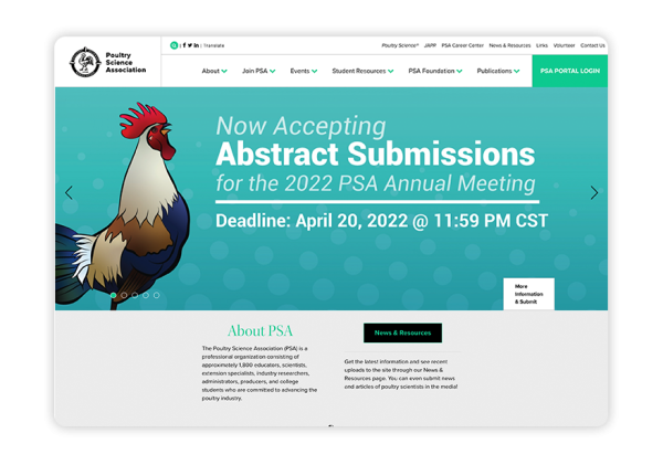
On this membership website, the Poultry Science Association features a minimalistic design with a pop of color. It captures visitors’ attention the second they land on the homepage with recent news and resources to download. Plus, it features custom icons that walk through the benefits of becoming a member, as well as information on the various membership types.
Further, the unique navigation menu features a combination of drop-down menus and links for quickly accessing specific resources. This way, users can quickly locate information and tools needed to complete tasks.
3. National Council for History Education
University Heights, Ohio, USA

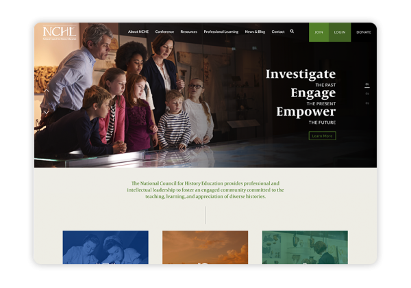
The National Council for History Education captivates prospects with beautiful imagery and a variety of resources. Its commitment to teaching and appreciating diverse histories is evident through the use of rotating banner images that put a human face to its work.
The NCHE is fully transparent with involvement opportunities by featuring links to events, resources, membership information, and blog posts on its homepage. It has an easy-to-use navigation menu and clear buttons that encourage website visitors to "Join," "Login" or "Donate."
4. National Association of Postal Supervisors
Alexandria, Virginia, USA

The National Association of Postal Supervisors' membership website offers a professional and simple design. Its minimalistic look and ease-of-use is cohesive throughout the whole site. It features a wealth of useful information for prospective and current members, especially on its Legislative Center page.
A great addition to this website is the search bar and social media icons featured at the top of each page. These tools give members the power to find the resources they need and to connect with each other (and prospective members) on social media platforms, setting this association up for a strong online presence.
5. Driving School Association of the Americas
Pasco, Washington, USA

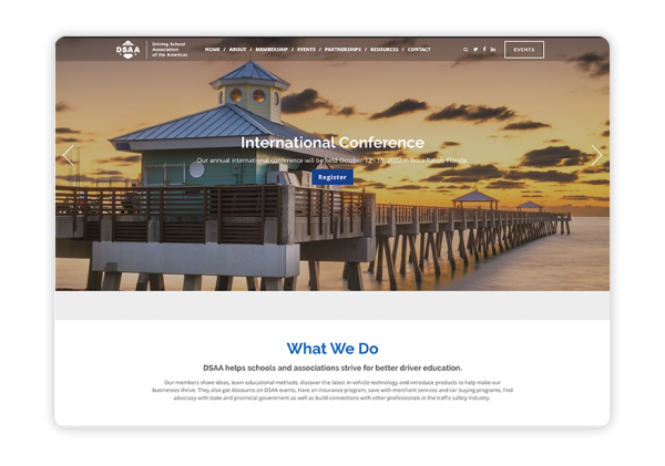
This membership website stands out in particular for its stunning homepage, which features high-quality rotating banner images, an introduction to what DSAA does, and the benefits that members can access by joining. DSAA also makes it easy for members to register, log in, and view event information.
Another feature that stands out on this website is clearly-displayed contact information, which can be accessed in the website's footer or the navigation bar at the top.
The Gist
Creating a membership website doesn't have to be difficult. With an easy-to-use membership website builder, a knowledge of the best practices outlined in this guide, and inspiration from top membership websites, you can easily create a website that your organization will be proud of and that will provide ongoing value to your members.
Want to delve deeper into membership website design? Check out these helpful resources crafted specifically for associations and other member-based organizations:
- Member Engagement: The Actionable Guide to Boost Retention. Once you have dedicated members in your organization, you want to do everything you can to retain them. With a thorough explanation of engagement and five proven ideas for carrying out effective engagement, this guide is a great place to start.
-
21 of the Best College Websites (And Why They're So Great). When looking for inspiration to guide your membership website design, don't limit yourself to studying association or nonprofit websites! You can find inspiration everywhere, including this roundup of the best college websites.
- Take Your Nonprofit Branding Strategy to the Next Level - Getting Attention. Branding is critical to creating a great membership website. Learn about the ins and out of branding — from your mission statement to your fonts — with this article from Getting Attention.


