
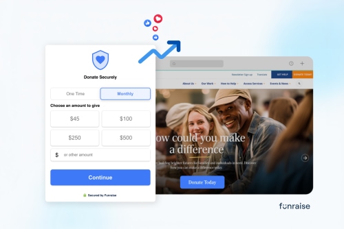
Fundraisers, it's your lucky day. Today, we're talking with Funraise about easy ways to make the easiest part of getting a donation even easier.
Getting someone to your nonprofit website is the hard part. They saw an email, clicked a post, or searched your name. They're here, and they care. And after all that hard work, are you going to let a clunky form, a slow page, or a surprise redirect talk them out of giving? Not after you read this article, fundraising friend.
That gap between "I want to give" and "I gave" is called donor conversion, and it's the easiest way to grow your nonprofit's website donations. Here's what the data (ours and other people's) says moves the number, plus a free way to see how your own site stacks up.
Tired of reading already? To raise donor conversion on your nonprofit website, (1) let donors give from the page that moved them instead of sending them somewhere else, (2) use a multi-step donation form, (3) design the giving experience for a phone first, (4) offer a monthly option and suggested amounts, and (5) test your own donation path the way a first-time donor would.
What is donor conversion on a nonprofit website (and what's a good rate)?
Donor conversion is the share of people who complete a gift out of everyone who had the chance to. Your donor conversion rate is completed donations divided by visitors, times 100. Measure it in two places, because they tell you different things:
- Donation page conversion rate: of everyone who lands on your nonprofit donation page, how many give? This tells you whether that page truly tells your story.
- Donation form conversion rate: of everyone who opens or starts the form, how many finish paying? This tells you whether the checkout gets in the way.
So what's good? M+R Benchmarks puts the typical nonprofit donation page at 8% of visitors. Across Funraise's 2025 customer data, the picture looks very different:
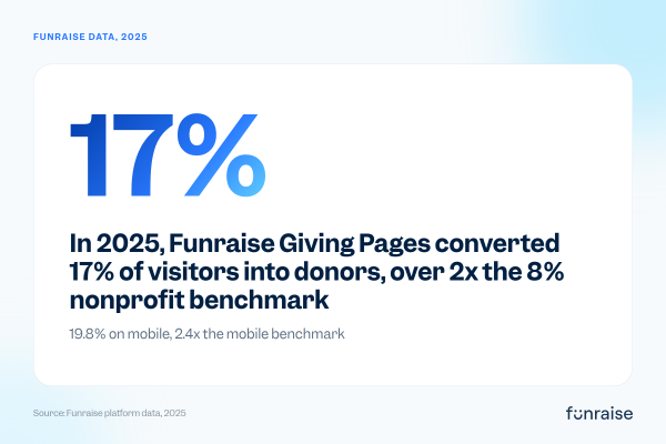
On the form itself, Funraise popup forms converted 38% of clicks into completed payments in 2025, and forms placed directly on a page converted 31%. All told, organizations using Funraise grew online revenue by an average of 26% in 2025. And guess what? None of that came from asking donors to give more. It came from making it easier for donors to do what they already wanted to do.
As Funraise CEO and Co-founder Justin Wheeler puts it: "Every percentage point represents real people choosing to support causes they care about. Our job is to help nonprofits remove the barriers between generosity and action."
Here are five ways to remove those barriers on your own site.
- Let donors give from the page that moved them
- Use a multi-step donation form
- Design the giving experience for mobile first
- Offer a monthly option and suggested amounts
- Test your site the way a first-time donor would
1. Let donors give from the page that moved them
Most nonprofit websites work like this: a visitor reads a story that gets them right in the heart, they click Donate, and are whisked away to a separate donation page (or worse, a different website). The story is gone. The feeling fades. Some of them don't make it.
Justin Wheeler has a rule for this: "every page is a donation page." Your stories, your program pages, and your homepage are where the urge to give happens, so that's where the form should open.
Action Against Hunger put the idea to the test. When the team updated its website in early 2020, it swapped the click-through-to-a-donation-page flow for Funraise pop-up forms that open on top of whatever page the donor is reading, then measured the difference.
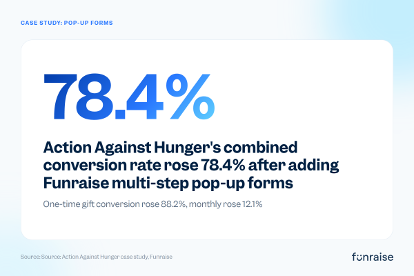
Count conversion rate and average gift together, and the total value of their one-time gift rose 23.3%, while monthly gifts rose 65.8%. Andrew Chappell, Action Against Hunger's Digital Lead, summed it up on the Nonstop Nonprofit podcast:
"It was really a game changer for us. It contributed, I think, to tens, if not hundreds of thousands of additional revenue during the year just because we were losing donors clicking to a traditional donate page."
Read the full Action Against Hunger case study for the details. The takeaway for your site is the same: keep donors on your domain, on the page they're already on, all the way through payment. (Need more convincing? Take a look at a Morweb case study from the website perspective in Donation Page Mistakes Costing Nonprofits Thousands.)
2. Use a multi-step donation form
A single long form shows a donor every question at once: amount, frequency, name, address, card number, the works. It looks like homework. A multi-step donation form asks for one small thing at a time, starting with the easy, feel-good choice (how much and how often), and saves the typing for when the donor has already said yes.
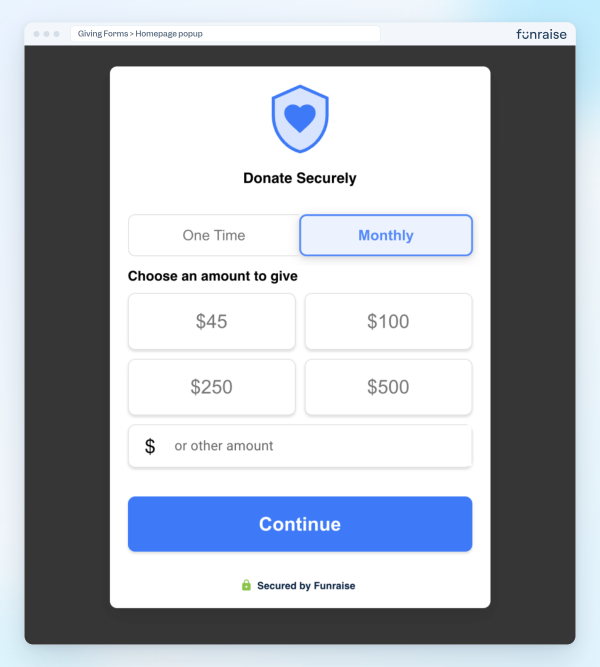
Step one of a Funraise pop-up form: frequency and amount, nothing else. Contact and payment details wait for the next steps.
The evidence is consistent. In a Blackbaud A/B test of a single-page form against a multi-step one, the multi-step version produced 33% more total conversions, a 75% higher form conversion rate, and a 54% higher average donation. And btw, those really successful Action Against Hunger forms above were multi-step.
A few donation page best practices to borrow when you build yours:
- Lead with amount and frequency. Contact and payment details come after the donor has committed.
- Cut every field you can. If you don't use the answer, don't ask the question.
- Keep it short. Steps make a form feel lighter, but every extra click still costs you a few donors.
3. Optimize the giving experience for the mobile-first donor
According to M+R, 50% of nonprofit website visitors arrive on a mobile device. If your form was designed on a laptop and also works on a phone, half your visitors are getting the worse version. Good nonprofit website design starts with the small screen.
Mobile-first giving means big tap targets, a form that fits the screen without pinching or zooming, and digital wallets like Apple Pay so nobody has to dig a card out of a bag on the bus. Get it right, and you've got to find a new weak spot to fix! In 2025, Funraise Giving Pages converted 19.8% of mobile visitors, 2.4x the mobile benchmark.
4. Offer a monthly option and suggested amounts
Two small choices on the first step of your form change what donors give, not just whether they give.
- Suggested amounts take the guesswork out of "what's a normal gift?" Tie each amount to something real when you can.
- A visible monthly option turns a nice one-time gift into reliable revenue. In 2025, monthly donors drove 27% of online revenue for Funraise customers.
Neither of these options adds friction; they replace a blank box with an easy decision. Funraise Chief Product Officer Tony Sasso calls the donation experience "a make-it-or-break-it technology that too many organizations take for granted. The most critical part of a donor's journey should not be an afterthought."
5. Audit your donation path like a first-time visitor
You know where your Donate button is, which is exactly why you can't tell whether a stranger would find it.
That's why Funraise built a free, conversion-focused website audit. Enter your URL at funraise.org/audit, and it'll visit your site like your first-time donors: it reads your first screen, finds and clicks your donate button, walks through your donation form up to the payment step, tests your speed on a phone, and checks whether Google and AI assistants like ChatGPT can find you.
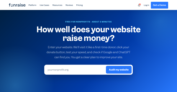
The free audit starts with one field: your website address.
In about 5 minutes, you get a score out of 100, the first three fixes to make, and a prioritized action plan you can share with your team or your board.
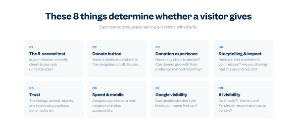
The eight areas the audit scores, each explained in plain words with the fix.
Run it before you change anything, so you have a baseline. Then run it again after.
How a Morweb website levels up your donation form conversion rate
While Funraise perfects the checkout experience, Morweb ensures the donor's journey to that form is flawless. A high-converting form won't reach its full potential if the website it lives on is slow, hard to navigate, or inaccessible.
Pairing Funraise with a Morweb CMS boosts your conversion strategy in three key ways:
- Native Integration: You don't need a developer to embed a high-converting multi-step form. Morweb features a native Funraise integration, meaning you can drag and drop Funraise widgets directly onto any campaign page using the Live Editor.
- Zero-Friction Accessibility: Morweb websites are built with WCAG 2.1 AA accessibility support. This ensures that donors using screen readers or assistive technologies can navigate your compelling stories and seamlessly interact with your Funraise pop-up forms without hitting technical roadblocks.
- Data-Driven Adjustments: Morweb's built-in Mission Intelligence™ dashboard brings your Google Analytics and performance data into one place. When you combine this with Funraise's free audit tool, you can see exactly which pages are driving traffic to your forms and continuously refine your layout to maximize giving.
Frequently asked questions
What is a good donor conversion rate for a nonprofit website?
It depends on where you measure. M+R Benchmarks puts the typical nonprofit donation page at 8% of visitors. In Funraise's 2025 data, Giving Pages converted 17% of visitors, and pop-up donation forms converted 38% of the people who clicked to open them.
Do multi-step donation forms convert better than single-page forms?
Yes, in most tests. A Blackbaud A/B test found a multi-step donation form produced a 75% higher form conversion rate and a 54% higher average donation than a single-page form. Action Against Hunger saw its combined conversion rate rise 78.4% after adding Funraise multi-step pop-up forms across its site.
How do I find out why visitors aren't donating on my website?
Walk your own donation path on a phone, from the homepage to the payment step, and note every moment of doubt or delay. Or let a tool do it. Funraise's free website audit clicks through your site like a first-time donor and returns a score, the top three fixes, and an action plan.
The bottom line
Donor conversion isn't about persuading people harder. Your visitors already care, or they wouldn't be on your site. The job is to get out of their way: open the form where the feeling happens, ask one easy thing at a time, make it lovely on a phone, offer monthly, and check your work like a stranger would.
Start with the free website audit to see where your site stands today. Then see how Funraise donation forms turn more of the visitors you already have into donors. Pair a form built to convert with a Morweb website built to earn the click, and your donors get what they wanted all along: an easy way to do some good.