4 Tips for Incorporating Waivers into Your Volunteer Website (2026 Update)
Read more about 4 Tips for Incorporating Waivers into Your Volunteer Website (2026 Update)


Humane societies depend on the generosity of adopters, donors, and volunteers to save the lives of animals in their c…

When creating or redesigning your nonprofit website, one of the first decisions you’ll make is which content ma…

If you’re new to the world of nonprofit web design, finding a web design agency for your website project can fe…

Back in 2018, Morweb partnered with Harbor Compliance to publish a guide helping nonprofits navigate online fundraisi…

Volunteers are the heart of every nonprofit. They power your programs, help run events, and bring your mission to lif…

Why Nonprofit Website Transparency Matter More Than Ever for Nonprofits Lately, there’s been increased attenti…

Your online donation page is one of the most critical parts of your nonprofit’s website. It’s where inter…

Data privacy has become one of the defining issues of the digital era — and for nonprofits, trust is everything…

Building your nonprofit’s online presence doesn’t happen overnight — it’s an ongoing effort t…

Your nonprofit’s website is often the first impression donors, volunteers, and partners get of your organizatio…

Your nonprofit’s website isn’t just a digital brochure — it’s your most powerful storytelling…

As someone who has worked with hundreds of nonprofits on their website design, SEO strategy, and digital growth, I&rs…

People form the initial perception of your school on your website and not so much at the school entrance. In today&rs…

At Morweb, we understand that creating consistent, high-quality blog content can be a challenge—especially for…
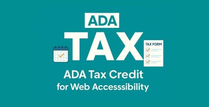
If your organization recently made website updates to improve accessibility — or plans to — there’s…

Morweb provides the right mix of strategy, design, non-technical software, and customer support to manage and grow not just a website, but an engaging online presence.