Nonprofit Web Accessibility: Make Your Site User-Friendly


Want an engaging website?
Web accessibility is a growing initiative to make the internet inclusive for everyone. This means that people of all abilities should be able to access and engage with digital content—including your nonprofit’s website.
Making your website accessible is not just an ideal standard; it’s also important for legal compliance. More and more, courts are finding that nonprofit websites fall under the “public accommodations” classification defined by Title III of the Americans with Disabilities Act (ADA). By understanding the different facets of accessibility, your nonprofit can optimize its website and put inclusivity at the forefront of its online strategy.
In order to comply with the ADA, you'll need to make sure your site is up to the standards of the Web Accessibility Initiative's Web Content Accessibility Guidelines (WCAG). Armed with a content management system (CMS) that allows you to make edits yourself, you can meet many of these standards and significantly improve the accessibility of your website—no coding required!
In this guide, we’ll walk through the basics of web accessibility and standards your organization should follow. Then, we’ll go over concrete steps your nonprofit can take to become more user-friendly for everyone.
By making your website more accessible, you’ll boost your nonprofit’s reputation, expand your reach to a broader audience, and increase your revenue. Let’s dive into what web accessibility is and how you can open up your site to everyone, all over the world!

Common FAQs about Nonprofit Web Accessibility
If web accessibility is a new topic for you, don’t panic! In this section, we’ll discuss the ins and outs of accessibility standards and why your nonprofit needs to adopt user-friendly website features.
What is nonprofit website accessibility?
Website accessibility means enabling everyone to navigate, understand, and engage with your content, regardless of ability. Your website design should not only support the user experience by reducing page load speed and using legible fonts; it also needs to accommodate people with visual, hearing, neurological, cognitive, and motor disabilities.
Currently, 97.4% of the world's top one million websites don't offer full accessibility, making it difficult or impossible for many people to access the web. In order to open up your nonprofit’s reach to more diverse audiences, your website needs to remove barriers so site visitors with disabilities and limitations can enjoy your content just like anyone else.
What are the benefits of accessibility?
An accessible website is more likely to keep visitors’ attention and motivate them to take action. This next step could be keeping up with your organization’s blog, signing up to receive your nonprofit’s newsletter, applying to volunteer, or even donating to your nonprofit.
With an accessible donation page, for example, more people will be able to give to your organization, allowing you to advance your mission and provide necessary services to the community.
Accessibility compliance also has these benefits:
- Boosts your nonprofit’s reputation.
- Creates an inclusive community and culture.
- Gives site visitors a positive user experience.
- Increases your website’s conversion rate of site visitors to donors.
- Improves your website’s search engine ranking so you can reach more people.
With these benefits in mind, it’s well worth it to optimize your website so it prioritizes accessibility. Many of these changes can be made easily, without needing to rework the technical backend of your website. Later in this article, we’ll discuss these quick fixes to meet accessibility standards.
What is the Americans with Disabilities Act (ADA)?
The Americans with Disabilities Act (ADA) is a civil rights law that protects individuals with disabilities from facing discrimination in all areas of public life. Title III of the ADA, which covers public accommodations, has been interpreted more and more to include websites. This means that making your website accessible is not only beneficial, but a legal requirement.
To comply with the ADA, your website needs to follow the Web Content Accessibility Guidelines (WCAG) created by The World Wide Web Consortium (W3C). In the next section, we’ll explore what this means so your nonprofit can meet the necessary accessibility standards.
What is the World Wide Web Consortium and how does it apply to accessibility?
The World Wide Web Consortium (W3C) is an international community that develops protocols and guidelines to spur the web’s growth. To address web accessibility and encourage websites to improve their design, the Web Accessibility Initiative (WAI) was implemented by W3C.
The WAI was created in 1997 to make the web accessible to people with disabilities. This initiative is led by individuals and organizations around the world, including disability advocacy organizations, governments, accessibility research organizations, and more. The W3C writes the standards for web accessibility, known as the Web Content Accessibility Guidelines (WCAG).
WCAG provides 13 detailed guidelines on how websites can improve their accessibility. These guidelines are organized under four principles. Each guideline has success criteria, which are measured in three levels: A, AA, and AAA. A means that you have completed the minimum requirements to be compliant with WCAG 2.0, and AAA means that you have completed all of the requirements.
Most government websites have adopted WCAG 2.0 or 2.1 at level AA as their standard. To be legally compliant with the ADA, your nonprofit website should be at least AA compliant. If you’re not sure whether your website is AA compliant, use these free web accessibility evaluation tools recommended by the W3C.
What are the 4 Web Content Accessibility Guidelines (WCAG) Principles?

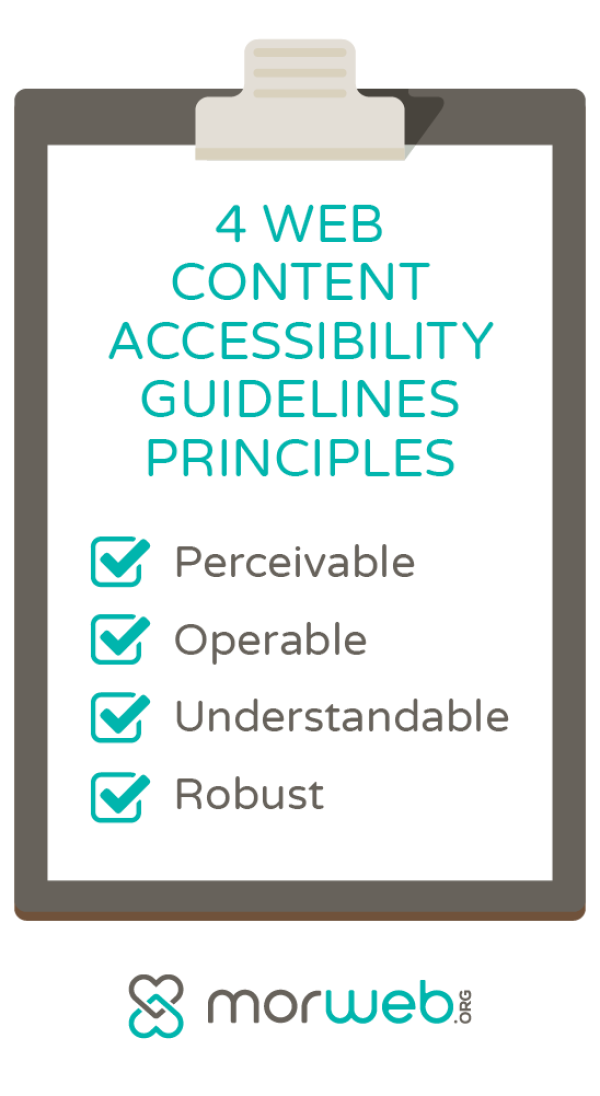
The Web Content Accessibility Guidelines (WCAG) are recognized as the international standard for web accessibility. There are four main principles that make up the foundation of these standards:
-
Perceivable. This means that all site visitors should be able to identify your content through the senses. For users without visual impairments, they should be able to easily see and read your content. For users with visual impairments, they should be able to identify your content by other means, such as audio descriptions. This means that all visual elements should have alt text.
- Operable. When content is operable, any user can interact with elements on the page, such as buttons and a navigation menu. This means that your website should have keyboard functionality to accommodate users who do not use a mouse. In addition, your site should offer users enough time to engage with the content, avoid flashing or moving content (or provide alternatives if this type of content is necessary), and be easy to navigate.
- Understandable. Understandable content is predictable in its design, consistently formatted, and provides assistance to help users avoid and correct mistakes. Your content needs to be readable in order for people to digest its message and be able to take next steps. For example, you can aid with readability by using the simplest language possible, offering a navigation bar that is visible on every webpage, and including error messages and suggestions for correction on forms or any other place where users input information.
- Robust. This means that your content should be accessible to users on a variety of technologies, including different browsers, assistive devices, and other user agents. For example, if your content is only accessible on Google Chrome, users who only have access to Internet Explorer are immediately blocked from engaging with your site. Ensure your content is compatible with current and future user tools.
Within each of these principles, the WCAG lays out specific guidelines on how you can meet their standards. In the next section, we’ll go over these accessibility requirements so you can convert these principles into actionable steps for your nonprofit.

Nonprofit Web Accessibility Guidelines
The WCAG has laid out the following accessibility standards to achieve each principle. While some of these will require the help of a developer, most can be done quickly by anyone, no web design experience required! Let’s dive into the specifics of these standards so you can take action to make your website more accessible.
Perceivable
- Create text alternatives. Text alternatives, also known as alt-text, are brief descriptions that describe what a non-text element is conveying. This way, people with visual impairments can still engage with your content and connect emotionally with your nonprofit’s mission. A screen reader will read the alt-text aloud to the user, giving them the necessary context to understand how this image relates to the rest of the page. All non-text elements on your page—including images, videos, and audio content—should have a text alternative.
- Provide captions and other alternatives for multimedia. With videos and other audio-based content, provide full transcripts. You can also create captions that are synced with the content’s audio. This allows people with hearing impairments to understand your content.
- Make your content adaptable. Users should be able to change the presentation of your content to fit their unique needs. This means that your headings, lists, input fields, and content structures should be correctly marked-up so that the content can be adapted but still retain its original messaging.
- Develop content that can be seen and heard. There are several ways to make your content easily distinguishable so users can access it. For example, use sufficient color contrast between the background and foreground so your text stands out. Additionally, if you have background audio, give users the ability to adjust the volume.
Operable
- Make functionality available from a keyboard. Users with motor disabilities may only use a keyboard to interact with the web. If your content is only accessible using a mouse, you’re excluding several people from engaging with your content. Keyboards should have the same functionality as a mouse. For example, users should be able to use the “tab” key to navigate and jump to different sections on a page, and the “enter” key to click on elements.
- Provide users with sufficient time to engage with the content. If an element on your website has a time limit, allow users to extend the time as needed. Users should also be able to pause scrolling content, such as an image carousel, to look through the content at their own pace.
- Avoid using flashing content. Flashing content can distract users and even cause photosensitive reactions, including seizures. If possible, avoid including flashing or strobing content on your website. If you do include this type of content, warn users before the flash is presented or offer alternatives. You can also enable users to hide or switch off flashing content or animations.
- Streamline navigation on your website. Simple navigation contributes to a positive user experience. Include a navigation bar at the top of your website that includes all of your important tabs, such as your about page, donation page, contact page, and more. This way, users can easily find sections they’re looking for. Include meaningful links and organize your content with clear titles and section headings.
- Allow different input modalities beyond keyboard. Different input modalities, like speech input and touch activation, allow people with various abilities and a wide range of devices to interact with your content. This is a more complex accessible feature to add to your website and will require external support. For more information, explore WCAG’s guidelines on input modalities.
Understandable
- Make your written content understandable. Your content should be understandable to a wide audience, so use the simplest language possible. Avoid using unusual words, or provide definitions to aid users’ understanding. This also helps assistive technology process your content correctly.
- Give your content a predictable structure. Structure your content in a way that users can easily follow. For example, include a navigation bar above the fold with text content below it. Make each page follow the same structure so there’s consistency across your website.
- Create useful error messages. Users might run into errors, such as when filling out a form and mistakenly inputting letters into a prompt that requires numbers. Make sure to alert users to the mistake and how to rectify it to avoid frustration and keep them on your website.
Robust
- Make your content compatible with user tools. Many users with disabilities will use assistive technologies to access the web. Your website should be compatible with these tools, such as screen reading software and text-to-speech devices. This compatibility will depend on your HTML code, which determines how well your content can be formatted to another device. For more information, read WCAG’s guidelines on compatibility.
For an extensive breakdown of each guideline, explore the WCAG’s success criteria and techniques.
As you looked through these web accessibility guidelines, you likely noticed that there are some steps that will require more work than simple on-site edits. Don’t worry! The right CMS can help you comply with WCAG standards and legally adhere to the ADA’s public accommodation requirements. In the next section, we’ll explore how a nonprofit-specific CMS can help you boost your website’s accessibility with little effort needed on your end.

Choosing a CMS that Prioritizes Nonprofit Web Accessibility
After looking at the WCAG guidelines, you might be feeling overwhelmed by the amount of optimizations you’ll have to make to your website. A content management system, or CMS, can be instrumental in streamlining this process and making your site more user-friendly and inclusive.
With so many CMS platforms available, you’ll want to choose one with nonprofit-specific features that can easily boost your website’s accessibility and get it up to WCAG standards.
Choose a CMS that has the following features:
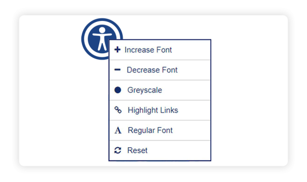
- Accessibility widget. An accessibility widget allows users to easily adjust the content to their specific needs. For example, users should be able to increase the font size, change colors to greyscale, highlight links, and change font type to regular non-serif.

- Front-end editing. A good CMS will take care of all the difficult and time-consuming coding on your behalf, allowing you to easily edit your content to meet accessibility standards. For example, with front-end editing, you can assign header tags for better on-page organization in just a few seconds, giving your users a better reading and viewing experience. You can also quickly add in alt-text to all non-text elements without having to go into the technical backend of your website.
- Built-in templates. With ready-to-go templates that can be easily customized to your needs, your web design team can create a well-organized website with navigation tools. For instance, your CMS should enable you to create and edit navigation menus that can be seen on every page of your site. This makes your content across your website consistent, predictable, and simple to scan through.
- Instant mobile optimization. A mobile-friendly website is guaranteed to attract more site visitors and facilitate a positive user-experience. This is especially important when it comes to your online donation page. In fact, according to 360MatchPro, donation pages that are mobile-friendly yield 34% more donations. A great CMS will automatically make your website accessible and user-friendly for mobile users.
Although there are many free CMS platforms like WordPress and Drupal, these require external plug-ins which are less secure and will likely require the support of an outside web developer to install. Instead, you’ll want to choose a CMS platform, like Morweb, with accessibility features built-in and 24/7 customer support.

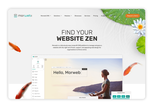
Morweb is a nonprofit-specific CMS that offers all of these listed features and more to streamline the website development process and create user-friendly designs. Morweb offers web development packages to meet Level A or AA WCAG compliance, instantly allowing you to create a beautiful website that prioritizes inclusivity.
The Gist
In order for your nonprofit to grow and reach diverse audiences, you’ll need to meet as many WCAG requirements as possible.
This will benefit people of all abilities and make navigating your website a fun, engaging, and illuminating experience. Plus, with a well-designed website, users will be more likely to take next steps, such as signing up to volunteer or donating to your cause.
Work with a nonprofit-specific CMS like Morweb to streamline the web development process and make your website user-friendly for everyone. Be sure to keep up with any WCAG updates and do your research to comply with their standards. As a result, you’ll boost supporter relationships, amp up your fundraising, and bring your nonprofit closer to reaching its goals!
Interested in learning more about nonprofit web design and accessibility compliance? Explore these additional resources:
- 10 Nonprofit Web Design Best Practices To Maximize Support. Learn more about accessibility and other best practices for a beautiful website design.
- Nonprofit CMS: Choosing the Right Tool for Your Organization. A nonprofit-specific CMS can make it easier to meet accessibility standards and create a user-friendly experience. Read about popular CMS platforms and how to choose the best one for your organization.
- 30+ Best Nonprofit Websites + 3 Tips For Designing Your Own. Want to see what an accessible and well-designed website should look like? Check out the top nonprofit websites and how they’ve incorporated accessibility into their design.


