6 Common Website Mistakes That Nonprofits Make


Want an engaging website?
With many social distancing measures still in effect, many nonprofits are turning to their websites to conduct their day-to-day activities virtually. For many organizations in 2020 and beyond, having a strong online presence will become a top priority.
Few nonprofits have the resources to hire a web developer full-time so more and more organizations are relying on user-friendly CMS platforms that enable users to make updates on the front end of their website. This eliminates the need for coding and takes out the guesswork from trying to edit in the backend of your site without knowing how it will look on your live site.
Having the power to make all edits yourself can be a blessing and a curse for many nonprofits who’s admin staff are not trained in web design or SEO best practices. Morweb has the benefit of providing post-launch support to our users so we’ve seen our fair share of mistakes over the years. If you’re new to managing a nonprofit website, we’ve compiled a list of common mistakes to look out for.
Read through this guide and see how you can apply these tips to your nonprofit’s website today!

#1: Incorrectly adding links
Links - these are by far the most common mistakes we see. Fortunately, they’re easy to fix. The method for adding links differs for internal and external links. Internal links are links within your site, such as your ‘About’ page or blog posts. External links are any URLs outside of your website.
For SEO purposes, internal links should use a “relative” link to your site. For example, rather than copying and pasting the entire URL of your website, you can copy the section after the domain name eg) /about-us. Most CMS platforms allow you to select internal links from a dropdown list. This is preferable than trying to type the URL yourself because it helps to avoid typos.

External links MUST open in a new tab. That’s because external URLs send users away from your site making it difficult for them to return to their original page if they want to go back. Opening external URLs in a new tab will keep them on your site longer and improve session duration and pages/session in your analytics reports. Additionally, linked files such as PDFs and Word Documents should also open in a new tab.

#2: Inconsistent tone of voice
When you have many contributors to your website such as staff members and volunteers, your organization’s tone of voice can get a bit confused. Maintaining a consistent tone is important for the credibility of your organization and accurately conveying your mission.
The best way to ensure that your tone of voice remains consistent throughout your entire website is to limit the number of admins who can edit your content and having a clear set of brand guidelines for writing as your organization. Research shows that focusing on second-person pronouns such as “you” rather than "we" can help drive more donations. Additionally, writing for a lower reading level can improve understanding for both experts and the general public.
Typos and grammatical errors are other common mistakes that many nonprofits make when adding content to their website. While typos may seem like small potatoes, they can hurt the credibility of your nonprofit, especially larger organizations that are targeted by hackers with spoof websites to collect donations in your good name. Luckily, there are tons of free tools you can use online to identify and correct grammatical mistakes. Grammarly offers a free browser extension and the Hemingway Editor is a powerful resource for improving your writing.
Take advantage of features offered through your CMS. Morweb offers a spell-check feature within the text editor and allows users to create draft pages that can be reviewed by a team member before being pushed live.

#3: Overcrowding images
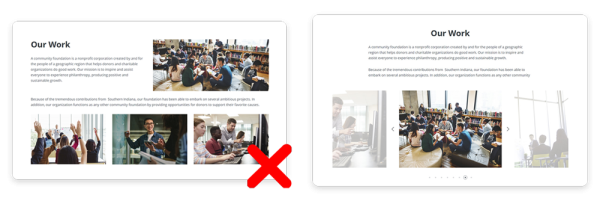
Visuals are a powerful tool for conveying your mission and connecting emotionally with visitors. However, the overuse of images can lead to a poor user experience and distract away from your core message. It will also slow down your page load speed, especially if the file sizes are very large which can hurt the SEO of your site.

Rather than trying to fit all of your images on the page, consider using image carousels. Carousels take up a fraction of the space and offer an interactive component for users to click through.
Another great alternative to displaying multiple images is a video. Videos are highly effective visuals for communicating your nonprofit’s story and showing the impact you’re making. With a user-friendly CMS, embedding your video from Youtube or Vimeo should be very straightforward.

#4: Forgetting to add meta tags
Meta tags are a core component of your nonprofit website’s SEO strategy. Many nonprofits fail to fill out meta titles and descriptions for their web pages because they are unaware of the benefits or simply don’t know-how.
Taking the time to fill out these fields can do wonders for improving your page’s visibility in search engines. Meta titles and descriptions are short snippets describing the contents of your page so that search engines can rank it accordingly. You’ll want to optimize these text snippets to incorporate your top keywords and entice users to click on your page.
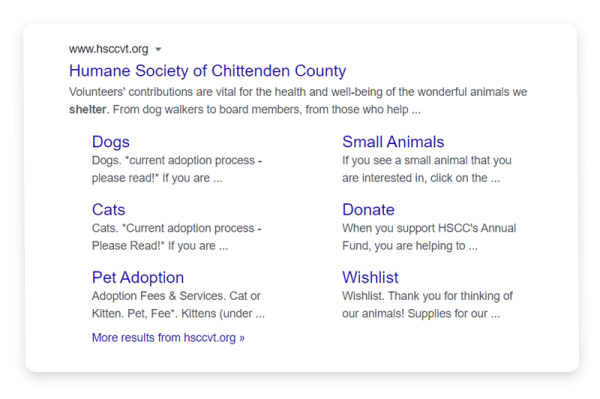
Take for example the Humane Society of Chittenden County's website. Their staff has done an excellent job of writing short and succinct meta titles and descriptions for their pages which becomes clear in a Google search.

Most reputable CMS platforms come with SEO options for editing your meta tags. You should be able to fill out the meta title and description in the backend of your site for each page and blog post. When writing your meta tags, follow these rules of thumb:
Meta Tags
Meta title: Describes the title of your page. The recommended length for SEO is 10-60 characters.
Meta description: Describes the contents of your page. The recommended length for SEO is 100-160 characters.

#5: Missing favicon
A favicon is the little icon in your browser’s window next to the title of your page. It might seem like a small detail but it can go a long way for your site’s credibility.
Some website plans such as WordPress' free plan or Weebly's starter plan don’t allow you to add a favicon and will show the CMS platform’s logo or a generic gray icon. Make sure your platform of choice gives you the option to add a custom favicon to match the branding of your site.

The recommended size for your site’s favicon is 32 X 32px in a PNG format. Most organizations will use a simplified version of their logo so that it’s easy to recognize in its small size. As an example, take a look at the United Way of Greater Texarkana's favicon in comparison to a missing favicon. UW of Texarkana's site appears more secure and trustworthy.

#6: Forgetting to unpublish old events
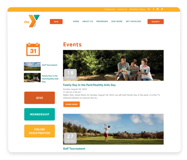
Having outdated content on your nonprofit’s website is a big no-no. You want supporters and visitors to return to your website frequently to see recent posts and upcoming events. Showing past events on your site gives the impression that you don’t update it often giving them little reason to check back.

Post scheduling is a quick and easy way to make sure your content is always current. Assuming your CMS offers this feature, make sure to schedule an unpublish date so that your event will automatically be hidden from your site after it has passed.
If you’re hesitant to delete old events because you want to show them off, consider posting an image gallery to commemorate the event or a follow-up blog post.
The Gist
Nonprofits are becoming more and more reliant on their websites for communicating with current and prospective supporters. By equipping your team with a user-friendly CMS and keeping in mind common website mistakes to look out for, your staff will be able to manage the bulk of your website’s content.