

Your nonprofit’s website is often the first impression donors, volunteers, and partners get of your organization. But if that first impression happens on a mobile device — and your site doesn’t load well — you’ve already lost half your audience.
In 2026, with more than 60% of nonprofit website traffic coming from mobile and tablet devices, responsive web design (RWD) isn’t optional — it’s essential.
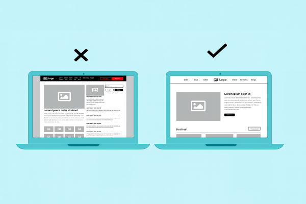
Responsive web design ensures your website adapts seamlessly to any screen size — whether someone’s visiting from a laptop, smartphone, or tablet. Every element — menus, images, text, buttons, forms — should automatically adjust for optimal readability and usability.
When done right, responsive design delivers a fast, intuitive, and accessible experience that builds trust and encourages engagement. When done poorly (or not at all), it creates friction, confusion, and missed opportunities for donations and support.
At Morweb, we’ve been exclusively designing responsive websites for nonprofits since 2004 — long before it was the standard. Over the years, we’ve found that responsive nonprofit websites today fall into three clear categories: the Non, the Bad, and the Great.
Let’s see where yours stands.

1. The NON (Non-Responsive Website)
Description:
Your website likely hasn’t been updated in 5+ years. It was built before mobile-first design became the norm — and it shows.
Symptoms of a Non-Responsive Website:
- The site looks tiny or distorted on smartphones
- Visitors must pinch and zoom to read text
- Menus don’t function well on mobile
- Images or text overlap
- Buttons and forms are nearly impossible to tap
The Problem:
A non-responsive website alienates mobile users — a group that now represents over 60% of all nonprofit web traffic. You’re essentially cutting your audience (and potential donations) in half.
The Fix:
Modernize with a responsive nonprofit CMS that ensures every page automatically adjusts for all devices. Platforms like Morweb’s website builder make it easy to launch a mobile-optimized design without coding.

2. The BAD (Poorly Responsive Website)
Description:
Your site might be between 1–5 years old. A developer promised you “responsive design,” but in reality, only some parts scale properly. The more content you add, the more problems appear.
Symptoms of a Badly Responsive Website:
- Elements overlap or break on smaller screens
- Menu bars or buttons disappear on mobile
- Load times are slow due to unoptimized images
- Some forms or pop-ups don’t resize correctly
- You constantly need a developer to “fix” formatting issues
Why It’s a Problem:
A half-responsive site is often worse than a non-responsive one. It frustrates visitors who expect a seamless experience — especially on mobile. Research shows that 53% of users abandon a site if it takes more than 3 seconds to load, and 70% say they won’t donate again if the online experience is poor.
The Fix:
Use a website platform built for nonprofits with built-in responsive templates, mobile preview tools, and drag-and-drop editing. Morweb’s CMS, for example, ensures every page element — from images to donation forms — stays consistent across devices automatically.

3. The GREAT (Truly Responsive Website)
Description:
A great responsive website isn’t just about resizing elements — it’s about creating an intentional, seamless user experience that supports your mission. Every pixel, button, and interaction feels natural on every device.
Signs of a Great Responsive Website:
- Layouts adapt beautifully across all screen sizes
- Navigation is simple, sticky, and always visible
- Donation and volunteer forms are mobile-optimized
- Pages load quickly (under 2 seconds)
- Text, buttons, and images scale perfectly
- Accessibility (WCAG 2.2) and security (SSL) are built in
Beyond Design: Communication and Experience
A great responsive website doesn’t just look good — it works strategically to communicate your nonprofit’s story and drive action.
- User Experience (UX): Visitors can easily donate, volunteer, or learn about your mission. Navigation and calls-to-action are consistent across devices.
- Communication: Your design and content work together to convey your nonprofit’s vision, values, and impact clearly.
Why It Matters:
Your website is often the deciding factor between a one-time visitor and a lifelong supporter. A “great” responsive website builds confidence, increases conversion rates, and amplifies your nonprofit’s credibility online.
The Gist: Why Responsive Design Is Non-Negotiable in 2026
- Mobile traffic now makes up more than 60% of all nonprofit website visits.
- 94% of users judge a brand’s credibility based on web design.
- Online giving continues to grow, now accounting for about 13% of total donations.
- Nonprofits with mobile-optimized donation pages see 34% more conversions than those without.

If your website falls into the Non or Bad category, you’re likely losing visibility, engagement, and donations. A modern, responsive site built on a nonprofit-specific CMS ensures your supporters have a fast, accessible, and inspiring experience — every time they visit.
How do you build a high-performing, responsive nonprofit website in 2026?
A truly responsive nonprofit website does more than resize — it inspires action, builds trust, and supports giving across every device. In 2026, your website’s mobile experience directly influences donor behavior, making responsiveness a key factor in your organization’s success.
Why Mobile Experience Matters
- First impressions count: Visitors form an opinion of your nonprofit in under 15 seconds. A fast, visually clean site encourages them to stay, explore, and donate.
- Mobile users dominate: Over 60% of nonprofit website traffic comes from mobile or tablet devices — meaning your mobile experience often decides whether a visitor becomes a supporter.
- Better experience, higher giving: Nonprofits with mobile-optimized donation pages see up to 34% more conversions and stronger repeat giving rates.
Core Features of a Great Responsive Nonprofit Website
- Lightning-Fast Performance – Aim for under two-second load times. Faster pages improve trust and search visibility.
- Accessibility by Design – Meet WCAG 2.2 standards to ensure everyone can engage with your content, forms, and media.
- Optimized Donation Flows – Mobile-friendly, secure forms with concise steps make giving simple and stress-free.
- Sticky Navigation & Clear CTAs – Keep “Donate,” “Volunteer,” and “Contact” buttons visible at all times for effortless engagement.
- Story-Driven Visuals – Feature authentic photos, impact numbers, and real success stories that connect emotionally with visitors.
- Integrated Analytics – Track engagement, donations, and conversions to understand what resonates with your audience.
- Scalable CMS Platform – Choose a nonprofit-specific website builder like Morweb that evolves with your organization — allowing you to add programs, events, and campaigns without rebuilding your entire site.
When design and storytelling come together, your responsive website becomes more than a communication tool — it becomes a fundraising engine and mission amplifier. Every click, scroll, and tap should remind visitors why your cause matters and make it effortless for them to take action.
The 2026 Takeaway
In today’s digital landscape, a responsive website isn’t a luxury — it’s the foundation of your nonprofit’s online success.
Whether you’re raising funds, recruiting volunteers, or promoting your programs, your audience expects a fast, easy, and mobile-friendly experience.
If your site falls into the Non or Bad category, it’s time to upgrade. A responsive nonprofit website platform like Morweb helps you build a Great site — one that’s visually engaging, easy to update, optimized for search engines, and built to grow with your organization.
Ready to See Where Your Website Stands?
If your nonprofit’s website still struggles on mobile, it’s time for a change.
Book a free website consultation with Morweb and discover how a responsive nonprofit CMS can transform your online presence.
