Creating a Donation Page: 5 Smart Strategies to Follow
The last stepping stone of the giving process is the online donation form. You may assume that a visitor who has made it all the way to the donation page is sure to donate, but that’s not always the case!
Until your website’s visitors have completed this form, they’re still prospective donors instead of dedicated stewards of your cause. A functional and attractive donation page might be the difference between a completed gift and a missed opportunity.
While fundraising used to focus primarily on making face-to-face connections with prospects, the truth is that most of your supporters will primarily (or only) interact with your cause online.
For this reason, it’s crucial to ensure your online donation page is optimized.
To help encourage potential donors to convert, here are 5 important strategies for making your online donation form as streamlined, effective, and inspiring as possible:
- Include visual elements.
- Steer your donors toward giving upgrades.
- Ensure a smooth giving experience for smartphone users.
- Create an opportunity to learn about your supporters.
- Offer varied donation page experiences to donors.
Are you ready to take your online donation form to the next level? Follow these 5 strategies to optimize your online giving experience for potential donors.
1. Include visual elements.
Have you ever visited a website that was poorly designed and felt your opinion of the company immediately sour? You don’t want that to happen with your donors!
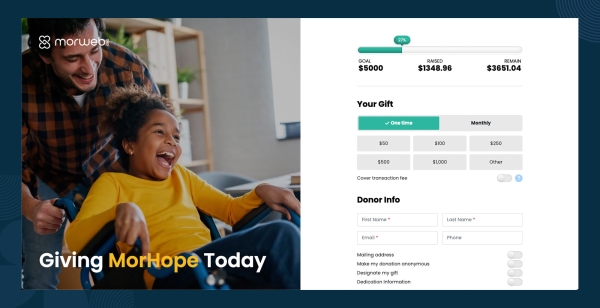
Some important concepts to keep in mind when designing your online donation page are harmony, professionalism, and excitement.
You can easily create harmony by maintaining a branded color scheme throughout your website, including on your online donation form. This color scheme will create a sense of cohesion and professionalism throughout your entire web presence.
The presence of your logo on your donation form will also add to the professionalism of your website by uniting all the important pages; from general information to board membership, under the single banner of your nonprofit.
The combination of your logo and a branded color scheme throughout your website will allow the online donation form to meld seamlessly into the rest of your site. Aside from providing a better user experience on your page, it also helps establish trust between you and your donor. That trust results in higher donor conversion rates and bigger gifts!
Add excitement to your donation form by using fun gamification tools like a fundraising thermometer. By allowing visitors to see how close you are to your goal, you can encourage them to become part of the team by donating to the cause.
2. Steer your donors toward giving upgrades.
If a potential donor is looking at your online donation form, the fundraising battle is halfway won.
Now, your page has to inspire donors to give as much as they can. There are multiple ways to do this, including:
- Incorporating a recurring gifts opt-in field.
- Offering gift suggestion buttons.
- Suggesting matching gifts.
Recurring gifts are popular among donors (and nonprofits!) because they allow the donors to pre-arrange their support for your cause. They get to contribute on a regular basis without having to worry about remembering to do it!
Gift suggestion buttons are useful to have on your donation form because it eliminates the guesswork of an appropriate donation size. They also subtly encourage a potential donor to increase their donation to the next suggested size.
78% of donors are unaware if their employer offers a matching gift program or not, so your donation form is a great place to promote this opportunity. Since most companies match their employees' contributions at a 1:1 ratio, effectively promoting matching gifts can essentially double your donation revenue. Check out these statistics that demonstrate the true power of matching gifts:
- Over 26 million people work for matching gift-eligible companies.
- Those companies donate about $2-$3 billion in matching gift funds each year.
- An additional $4-$7 billion in matching gift funds is left on the table since employees are not aware of these opportunities.
- 65% of Fortune 500 companies offer matching gift programs.
- 84% of donors say they'd be more likely to donate if they knew their gift was being matched.
- 1 in 3 donors says they'd be willing to give a larger gift if they knew their gift was being matched.
To take full advantage of matching gifts, consider leveraging a resource like Double the Donation’s matching gift database, which keeps track of different companies’ policies regarding charitable donations. By integrating matching gift software into your nonprofit's donation page, you can make it easy for donors to determine their matching gift eligibility. Some platforms even offer autosubmission capabilities that will submit matching gift requests to companies on behalf of donors.
Including a matching gifts resource on your donation page encourages donors to increase the impact of their gift without having to dig any deeper into their wallets. That’s a win-win for you and your supporters!
3. Ensure a smooth giving experience for smartphone users.
Mobile donation is rapidly becoming a more and more important part of the online donation landscape.You need to be ready to reach potential donors who spend more time on their phones than on their computers.
What are two quick ways to optimize your web design so that your donation form is accessible to the widest possible audience?
- Design a mobile responsive giving page. If your website is illegible or difficult to navigate from a smartphone or tablet, a potential donor will be less willing to take the time to struggle through the website to complete a donation.
- Make sure to preview your website in both mobile and tablet views! Test-driving your website on all devices before releasing it to the public will save a lot of trouble for everyone involved.
Nothing will turn off a potential mobile donor more than a website that is difficult to navigate or a form that cannot be completed easily from their smartphone or tablet. However, with a little effort, your giving page can be accessible from any device.
One more way to engage mobile users is to incorporate a text-to-give option in your fundraising campaign.
This option creates a no-stress way for donors with very little time on their hands to still contribute to your cause.
If you want to include text-to-give fundraising in your next campaign but don’t know where to start, check out this article about text-giving fundraisers from the industry experts at Qgiv.
4. Create an opportunity to learn about your supporters.
While you want your donation page to be as easy to navigate and minimalist as possible, you also don’t want to give up this valuable opportunity to collect information about your donors.
To reap the benefits of collecting donor information while also keeping the donation process streamlined, try adding a link to a survey on either the confirmation page, donation receipt, or in a thank-you email.
Creating a survey is a great way to flex your statistician muscles! There are so many things that you can learn about your donors by gathering some very simple pieces of information. By asking a few non-intrusive questions, you can improve your fundraising skills across the board.
Some important things to learn about your supporters are:
- Biographical data (name, gender, date of birth, etc.)
- Contact information
- Demographic information (education, family life-cycle, etc.)
- Networking information (employer, alma mater, etc.)
If you want, you can even create comment fields for your donors to discuss their thoughts on your campaign and gain valuable insights to improve your fundraising efforts.
By collecting biographical data and contact information, you can begin to build a database of constituents who are proven supporters of your cause. This database can turn into anything from a distribution list for a newsletter to an army of volunteers!
Demographic and networking information is important for honing your fundraising strategies.
Do a lot of your donors work for the same company? Reach out to that company for a partnership, or check out their matching gift policies to get more bang for a donor’s buck.
Networking information can also lead you to new potential donors by connecting you and your nonprofit to your donors’ social and professional circles.
Collecting data from individual fundraising campaigns also allows you to track metrics from campaign to campaign.
This information allows you to track which outreach strategies are most effective, which events generate the most online buzz, or even which social media presence has the most influence on potential donors.
By comparing the most successful strategies from different fundraisers and learning about your donors’ online experiences, you will be able to increase your overall fundraising efficacy.
5. Offer varied donation page experiences to donors.
The work on your online donation page doesn’t end once you have a satisfactory end product! If your page becomes stagnant, donors won’t enjoy repeat donations. Part of the fun of donating is the novelty of the campaign.
Therefore, a great way to keep donors engaged is to revamp your donation page or create separate forms for each fundraiser
The logo and color scheme can remain season after season, but keep your donation form fresh and inviting by updating the page with pictures of your volunteers at different events. You can also try adding pictures of your staff or constituents at various programs and projects hosted by your nonprofit.
Putting a face to your nonprofit on your donation page is also a great way to keep your donors invested in the cause! By adding a touch of personality and human interest to your forms, you allow your donors to see the soul of your organization.
Try including a photo of someone who has benefitted from your nonprofit’s work! The best pictures include a single person (or very small group of people) who are making eye contact with the camera. Showing donors exactly who they are helping with their gift encourages donations.
Another great way to keep donors interested and invested is to engage your volunteers in a peer-to-peer fundraising campaign.
This approach gives donors a personal stake in raising money for the cause while also capitalizing on the similar values of their friends and family. If your circle of volunteers and existing donors use their own social circles to raise money, your nonprofit’s sphere of influence grows!
One more great way to diversify the donation experience is to make use of donation kiosks. Instead of waiting for donors to find your online donation page, bring the donation page to them!
This is a particularly useful method if you’re running a fundraising event or an on-site event. Making it easy for donors to give is the key to a successful fundraiser; offering both mobile options and on-site options makes giving convenient.
Make the most of your organization’s events by allowing newcomers or repeat donors to give conveniently and securely by providing them with a tablet and card reader.
These kiosks are great ways to interact with people who aren’t familiar with your cause—think family and friends who come to cheer on a volunteer at a ‘fun run’.
By having an easily accessible way to donate, you can strike while the iron is hot and your organization is still on the mind of someone who has just been introduced to your cause.
As tablets and smartphones become more ubiquitous, the world of fundraising and donating is increasingly more Internet-based.
By ensuring that your organization’s website and online donation form are attractive, easy to use, and versatile, you’ll be ahead of the game and ready to make the most of this growing opportunity.
Author Bio
Abby Jarvis is a blogger, marketer, and communications coordinator for Qgiv, an online fundraising service provider. Qgiv offers industry-leading online giving and peer to peer fundraising tools for nonprofit, faith-based, and political organizations of all sizes. When she’s not working at Qgiv, Abby can usually be found writing for local magazines, catching up on her favorite blogs, or binge-watching sci-fi shows on Netflix.