

For nonprofits, it’s important now more than ever to connect virtually. That’s why it’s vital for your organization to leave a positive mark with your website. Even better, for your website to inspire action among donors and members.
Think about it — this is your chance to land a HUGE donation. It’s the place that could entice your most dedicated volunteer that you haven’t even met yet. And while it may be a small world, after all, I guarantee your organization hasn’t tapped into every potential lead out there. This could be your chance for them to fall totally and completely in love with your organization.
In short, your website could be the deciding factor between somebody joining your community as a member or donor, and somebody clicking away to find a different organization to give their support. That’s why it’s vital for you to avoid these common website mistakes and ensure your members and donors fall in love at first ‘site’.
Check out the nine most common mistakes below.
- Unfriendly Design
- Not Mobile/Tablet Friendly
- Hard to Navigate
- No Clear Call to Action
- Unclear Messaging
- No Case for Support
- No ‘About Us’ Page
- Hard to Use Forms
- No Call to Stay in Touch
Mistake #1: Unfriendly Design
You shouldn’t judge a book by its cover, but many donors WILL judge a website with an unfriendly design at first sight. Don’t fall for some of the basic design pitfalls that could scare donors and members away.
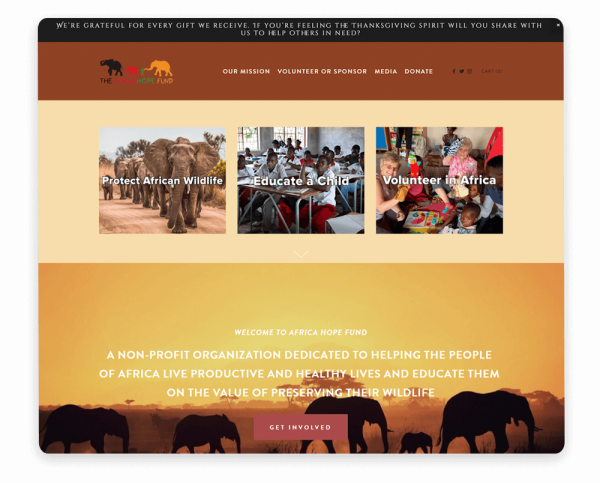
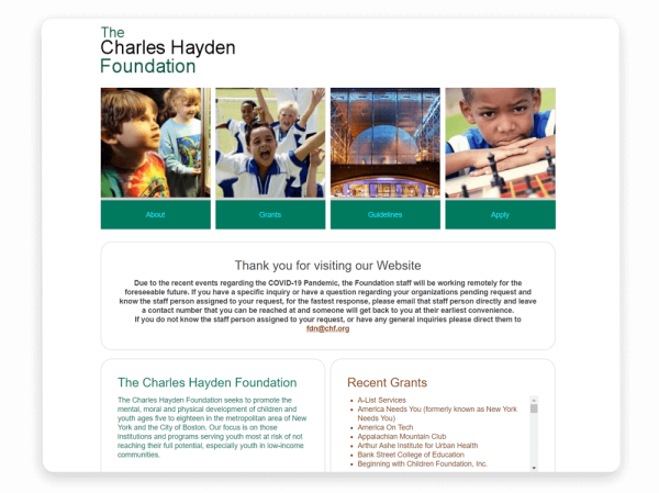
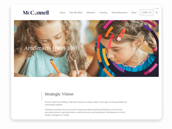
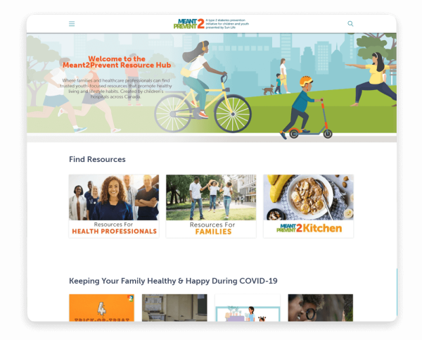
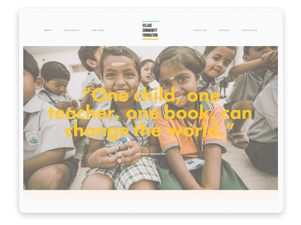
For starters, there should be a hierarchy of imagery and media drawing your website visitor’s eye down the site. Clashing colors, inconsistent branding, and various fonts and sizes are all major signs of an unappealing site and design. There’s something to be said for a classic site that stands the test of time with captivating imagery, a few main colors, and one consistent font. Looking for some inspiration? Check out these 15 website designs to help spark your creativity and get the good ideas flowing!
Mistake #2: Not Mobile/Tablet Friendly
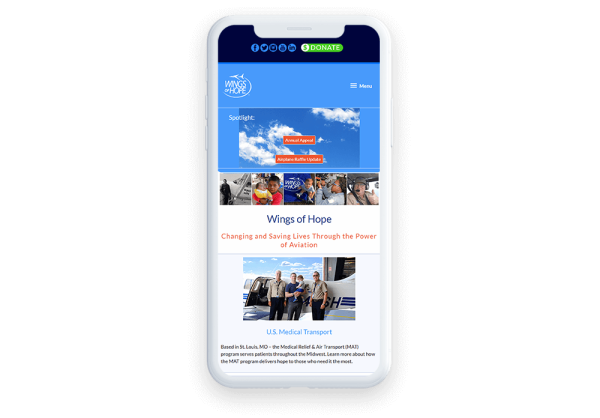
What used to be a device to make phone calls can now do it all. Think about how far we’ve come with technological advancements. Has your website come just as far? If you’re scratching your head trying to remember the last time you updated your website, it’s time for an upgrade.
According to Nonprofit Tech for Good, in 2017, 21% of online donations were made via mobile phones. Can you imagine missing out on over one-fifth of your total donations simply because your site wasn’t viewable on a phone or tablet?
That’s why it is crucial for you to properly format your website to work across all platforms that your potential donors or members could be using. The easiest way for a gut check on this is to test out your website on all types of devices to see how the site responds.
Mistake #3: Hard to Navigate
The rule of thumb here is that website visitors should be able to get where they want to go in three clicks or less. The more clicking your website visitors have to do, the more likely they are to get frustrated and navigate away from your site. What’s worse is if your website visitors can’t figure out how to navigate the site.
Make sure your homepage gives a glimpse of the key highlights, with opportunity to elaborate on other pages.
How easily can the user find what they’re looking for? Is all the important information on the home page? Is everything clearly organized in the navigation?
The most important sections of your website should be in the main navigation, like the ‘Home’, ‘About Us’, and ‘Donate’ or ‘Join Us’ pages.
Mistake #4: No Clear Call to Action
Okay, so your potential donor or member has landed on your site. Success! And let me be the first to tell you — they love everything you have to say. But then it comes time for next steps, or the ‘second date’ in this scenario. They’re looking for a clear, concise call to action that tells them exactly what to do. But what happens if they never find it? Your website visitor could give up altogether.
Make sure that when the time comes and your website visitors are ready to take the next steps, you have clearly outlined what they should do. Make sure the ‘Donate’ button or the ‘Join’ button is on every single page. Plus, you’ll want to make sure the color stands out, as well as matches your branding.
If you’re looking for more inspiration on this, check out these donate pages that are seriously awesome. You can thank us later!
Mistake #5: Unclear Messaging
Even if it comes from the heart, the wrong message can miss the mark. Much like having no clear call to action, unclear messaging will send your potential donors and members packing. Stick to this rule of thumb about member sites: your website should answer the question, “What value are you going to provide for members?”
When writing your messaging, put yourself in the website visitor’s shoes by asking the questions, “What are they looking for?” and “What will make them care about our mission?” Consider each type of visitor that may come to your site:
- Existing donors or members: Current supporters may visit your website looking for the latest updates on events, campaigns, volunteer opportunities, and programs. On relevant campaign pages and blog posts, ensure that your messaging is geared towards active supporters who want to know how their funds are being used.
- Potential supporters: When a user finds your organization for the first time on social media or another site, they’ll go straight to your website to find out if you’re a nonprofit they’d like to support. Explain your work in a compelling way for these prospects that pulls them in and makes them want to learn more.
- Sponsors or grantmakers: Corporate sponsors, foundations, and other grantmakers will go to your website to find additional information about your organization and determine if they want to fund your nonprofit. Make sure that your mission statement and overall messaging are up-to-date and clearly explained for these important funders.
Think about where users will be coming to your website from, too. For example, if you use the Google Ad Grant to target audiences who are unfamiliar with your nonprofit but are searching for relevant terms, tailor the messaging on your landing pages to what those users might want to see. Choosing the right keywords and aligning your landing pages to them is one of the challenges of Google Ads, but putting yourself in prospective supporters' shoes will help immensely.
No matter which audience you’re targeting, don’t forget to keep your messaging concise. It’s easy for you to speak from the heart about your organization, which can often mean including more details than necessary or relevant. Your website copy should be to the point and intentional with every word so you don’t lose any readers.
Mistake #6: No Case for Support
If a website doesn’t make a case for support, is it even a website at all? Well, I guess the answer is that it’s not a very effective website. This is where you should make an emotional appeal.
Dedicate a page explaining exactly why people should join or donate. What exactly will that donation go toward? What are the benefits to the person donating? How would their membership/donation support your work? What difference will it make?
Check out this example of a case for support by Joe Garecht with 7 key components: an emotional opening, mission and vision, explanation of programs, history of the org, proof of impact, financial needs, and means of support.
If you’re looking for more inspiration, check out some of your favorite organizations’ cases for support. I particularly like Habitat for Humanity’s Case for Support page. Notice that they specifically call it the “Case for Support” page and clearly lay out what they are asking for from additional supporters.
Mistake #7: No ‘About Us’ Page
Dedicate a page to explaining what your organization is all about. This could include your history, your mission, your accomplishments and goals. It should be clear to someone visiting your website for the first time what exactly your organization does, and where your fundraising dollars are going.
Just because your homepage does a good job of including important information doesn’t mean your potential donors or members don’t need or want a back story.
Check out these absolute musts for your website so you don’t leave anything out, including the ‘About Us’ page, events and more.
Mistake #8: Hard to Use Forms
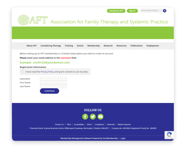
Take what you’ve done and ask yourself how you can make it even more simple. Whether this be a membership application, a donation form, or an opportunity to get involved, all forms should be simple and easy to understand for the average person. Remember, just because you’re in the nonprofit world doesn’t mean your website visitor knows all of the jargon and slang.
Consider hosting a focus group where you ask people to fill out the form. Note what struggles they have with completing the form, ask them how easy the form is to use, and consider what improvements you could make.
Mistake #9: No Call to Stay in Touch
Having no next steps on your website is like saying “we’ll catch up soon!” to your date with no means of when or where. What happens? You end up losing touch until months later when you suddenly realize it’s been months and you definitely didn’t follow up. So what should you be doing?
Be sure to include links to your social media, email newsletter sign-up, and other ways to stay in touch, so your website visitors can easily stay connected once they navigate away. You could also consider targeting social media advertising toward website visitors that have already checked out your website, so your organization stays top of mind.
The Gist
Having a website for your organization that does all of the right things isn’t easy, but you’ll now be better equipped to avoid these common mistakes.
Follow these rules and get on your way to a website that captivates potential members and donors by telling your authentic story, guiding action, providing clear calls to action and messaging, and staying top of mind with potential members and donors.

Tatiana Morand is the SEO & Content Manager at Wild Apricot, the #1 Membership Management Software for small organizations. When she's not creating content to support revenue and membership growth, she's drinking coffee and working on her fantasy novel.