

When it comes to optimizing your nonprofit website, the most effective tips often don't just come from generic advice found online. Instead, they stem from analyzing the strategies and designs of highly successful websites within the nonprofit sector. One such exemplary website is Charity: Water.
Following best web design practices is essential for creating an attractive and effective nonprofit website. A well-designed site directly impacts user experience, engagement, and credibility. It ensures that visitors can easily navigate and find the information they need, reducing frustration and increasing the likelihood of them staying longer. Key elements such as a clean layout, intuitive navigation, streamlined donation process, and mobile responsiveness are crucial for meeting the diverse needs of users.
Additionally, a visually engaging design with high-quality images and consistent branding captures attention and delivers professionalism, building trust and credibility with visitors. By adhering to these principles, a website can not only attract and retain visitors but also encourage them to take desired actions, such as making a donation, signing up for an event, or subscribing to a newsletter, ultimately contributing to the organization’s goals.
Lessons from Charity: water: The Good and the Not-So-Good of This Popular Nonprofit Website
Franklin, Tennessee, USA
Charity: water is a non-profit organization founded in 2006 that provides drinking water to people in developing nations. The Charity: water website stands out as a prime example of effective web design for nonprofit organizations. From Morweb's design gurus’ perspective, we appreciate the thoughtful and user-centric approach they have taken. Here are some key design elements and features that make this site exemplary.
1. High-Quality Imagery
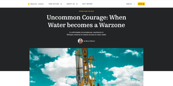
The use of high-resolution images is one of the first things that grabs attention. These images not only enhance the visual appeal but also effectively tell the story of the communities benefiting from Charity: water's efforts. Each photo is carefully chosen to evoke emotion and connect visitors to the cause.
2. Clear Typography and Vibrant Colors
The typography on the Charity: water website is clear and easy to read, which is crucial for accessibility and user experience. The fonts are modern and stylish, yet highly functional. Complementing the typography, the site uses a vibrant color palette, primarily blues and yellows. These colors are not just aesthetically pleasing but also serve to highlight key areas and calls to action, guiding users through the site intuitively.
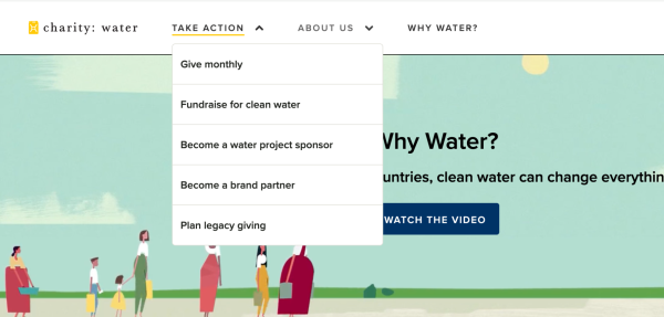
3. User-Friendly Navigation
Navigation on the Charity: water website is straightforward and intuitive. The layout is well-organized, allowing users to find information effortlessly. Whether a visitor is looking to learn more about the organization, read success stories, or make a donation, the path to each destination is clear and uncomplicated. This user-centric design approach helps retain visitors and encourages them to engage more deeply with the content.
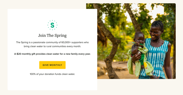
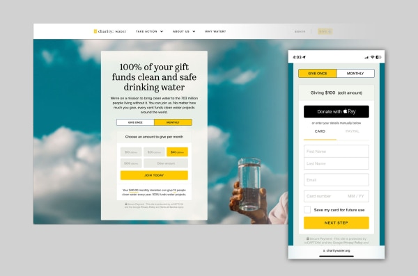
4. Easy-to-Use Donation Process
One of the standout features is the streamlined donation process. The designers have made it incredibly simple for users to contribute, which is essential for a nonprofit. By reducing the steps required to make a donation and presenting clear options, the website removes potential barriers that might deter users from giving. This ease of use likely contributes significantly to their fundraising success.
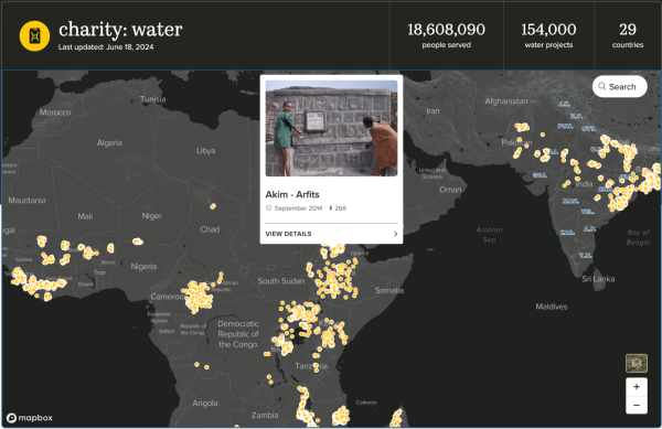
5. Interactive Project Map
The interactive project map is a fantastic feature that adds both transparency and engagement to the website. Visitors can explore the locations of Charity: water’s funded projects around the world, seeing firsthand the impact of their donations. This feature not only builds trust but also provides a dynamic way for users to connect with the organization’s mission and results.
By combining high-quality visuals, clear typography, vibrant colors, user-friendly navigation, an easy-to-use donation process, and an interactive project map, the Charity: water website effectively engages visitors and drives action. It’s a perfect example of how thoughtful design can enhance both user experience and organizational success.
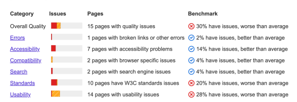
Areas for Improvement
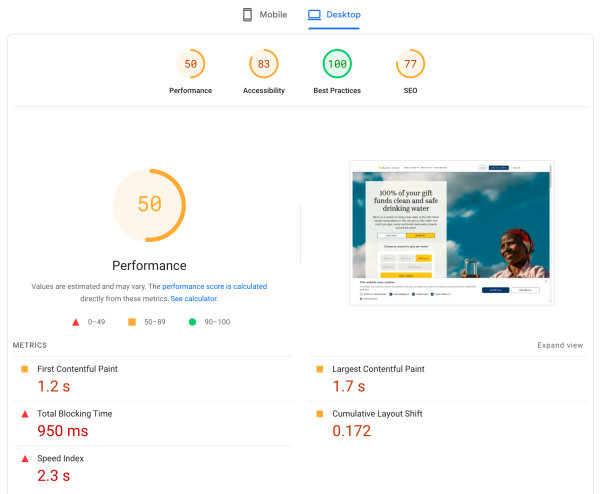
1. Load Times and Mobile Optimdization
Optimizing image sizes and implementing lazy loading techniques could improve load times, especially for users with slower internet connections. Additionally, further refinement for mobile devices could enhance usability. This might include simplifying navigation and ensuring touch targets are adequately sized.
2. Integrating Social Media: Instagram Feed
Integrating an Instagram feed into the Charity: Water website could significantly enhance user engagement and showcase real-time updates and success stories. With over 500K followers on Instagram, it's critical to highlight this visual and social engagement. By featuring a live Instagram feed, visitors can see the latest photos and videos from the field, follow the organization's activities, and get a personal look at the impact of their contributions. This integration keeps the content fresh and dynamic while encouraging visitors to follow Charity: Water on social media, thereby increasing their reach and community engagement.
3. Accessibility
Ensuring all elements meet the highest accessibility standards (WCAG 2.1 AA or AAA) can enhance usability for individuals with disabilities. This includes better contrast ratios, keyboard navigation, and screen reader compatibility. Making your website accessible to everyone is crucial.
4. List View & Search Features in the Our Work Map Section
We love the map feature in the "Our Work" section, which beautifully illustrates the global reach of Charity: water's projects across various countries. The statistics on the number of people reached, water projects completed, and countries served are also highly impactful. However, this feature could be further enhanced by offering the same map content in a list view. This would be particularly useful for mobile users. The list view could include:
- Custom Search Filters: Allow users to filter projects by country, search by radius, and specify types of projects (e.g., hand-dug wells, drilled wells, rainwater catchments).
- Priority Areas: Highlight towns, cities, or areas most in need of water, showing where help is needed the most.
- Quicker Content Engagement: A list view would provide a faster and more detailed user experience, making it easier for users to explore and understand the specifics of each project.
Conclusion
Charity: water's website is already a strong example of effective design. Addressing the areas of load times, mobile optimization, accessibility, and community engagement could further enhance user experience and drive more organic traffic. Based on Morweb's professional nonprofit website design experience, these improvements could potentially increase traffic by 10-20%.
By learning from the dos and don'ts of successful websites like Charity: water, your nonprofit website can become a powerful tool to convey your mission and engage your audience. Let it shine!